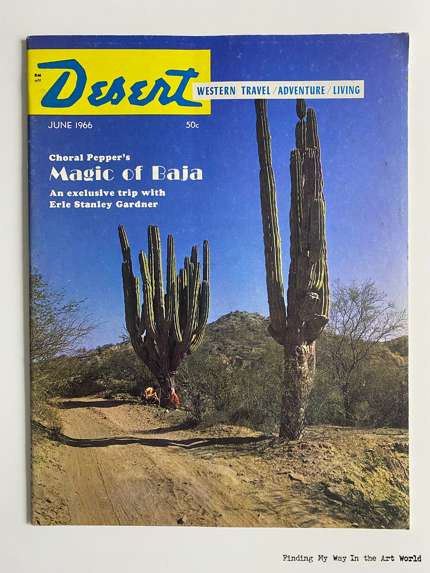
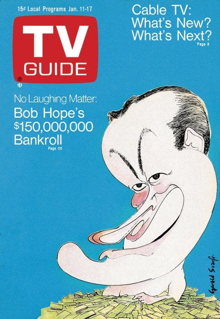
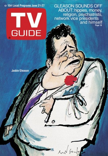
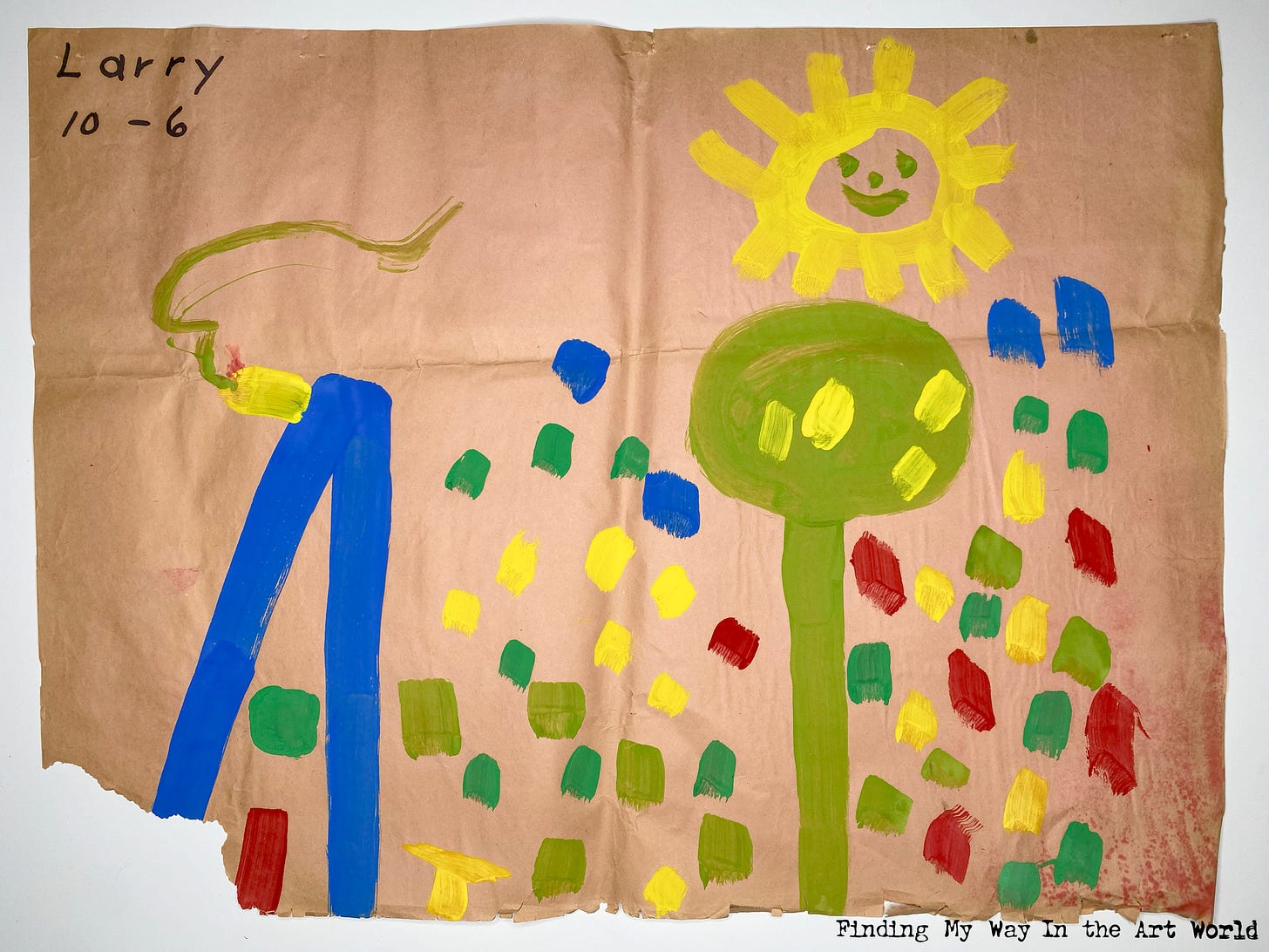
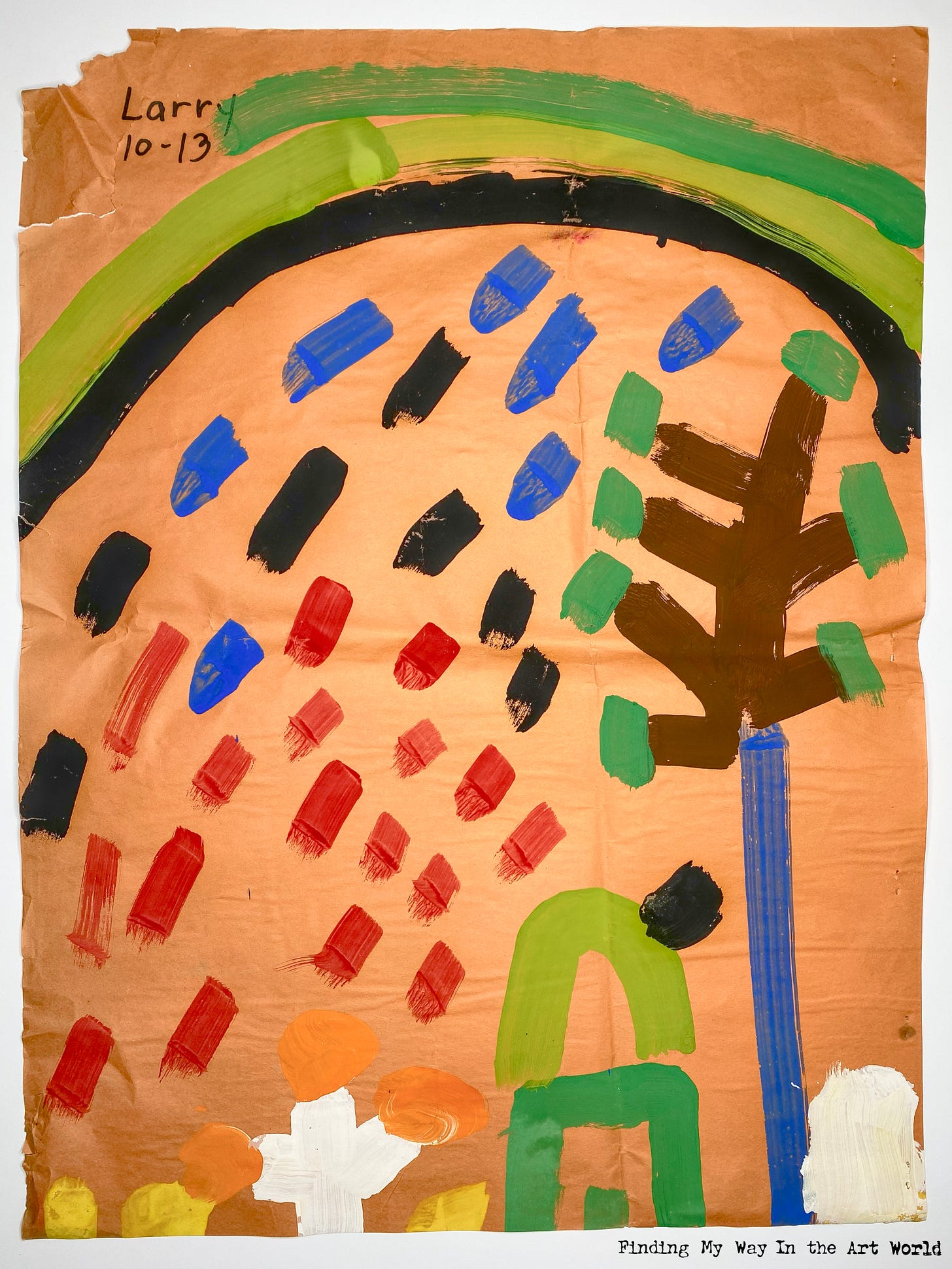
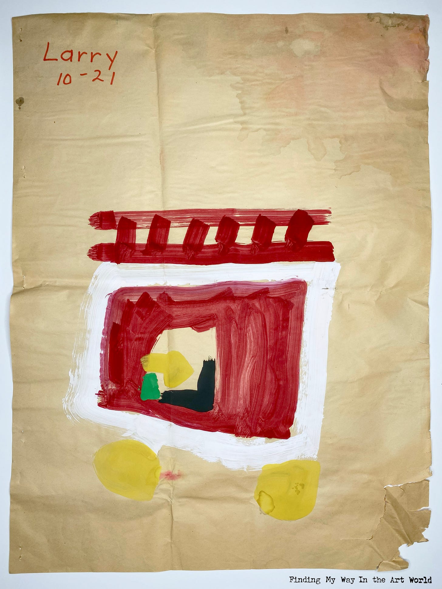
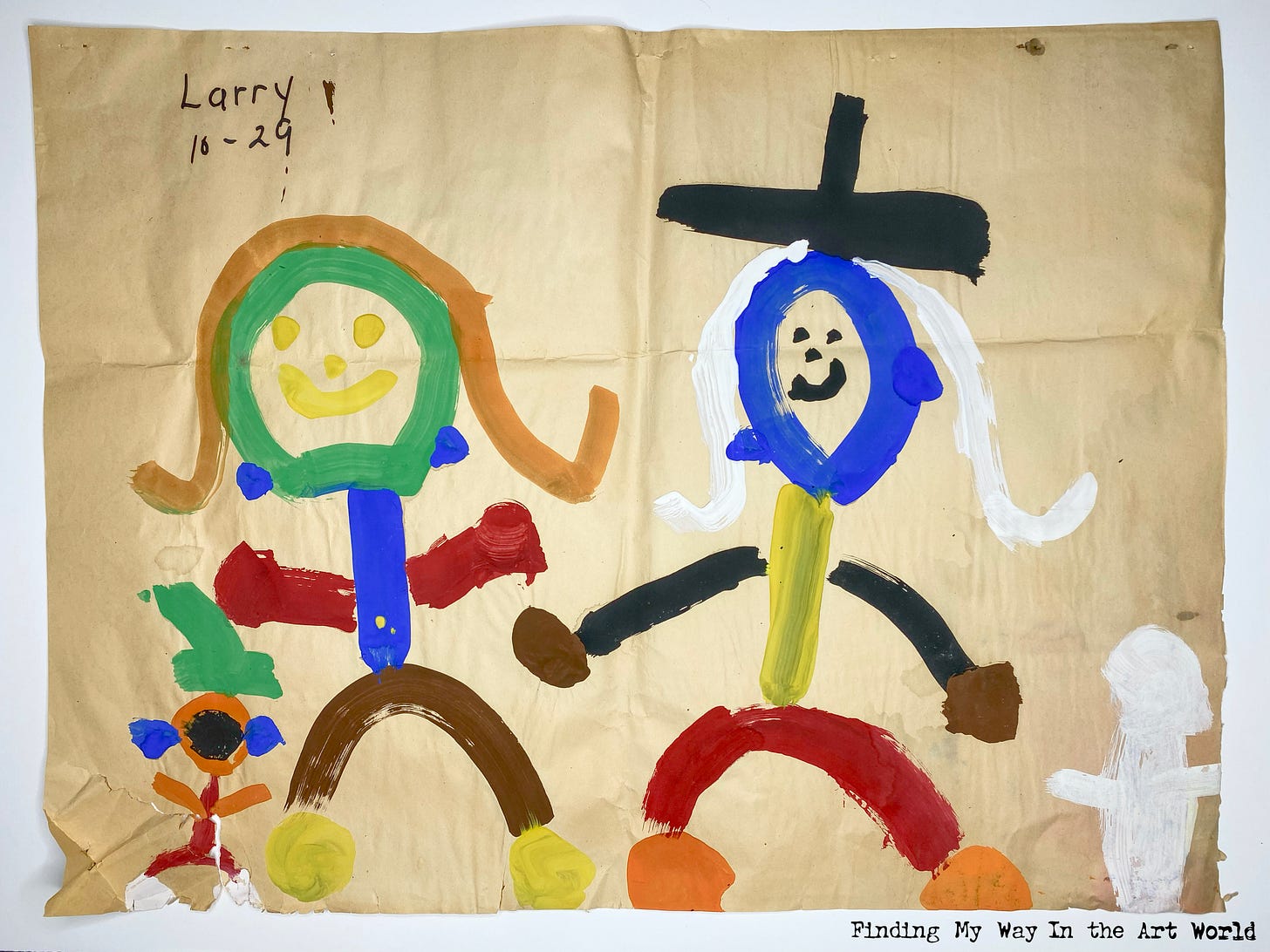
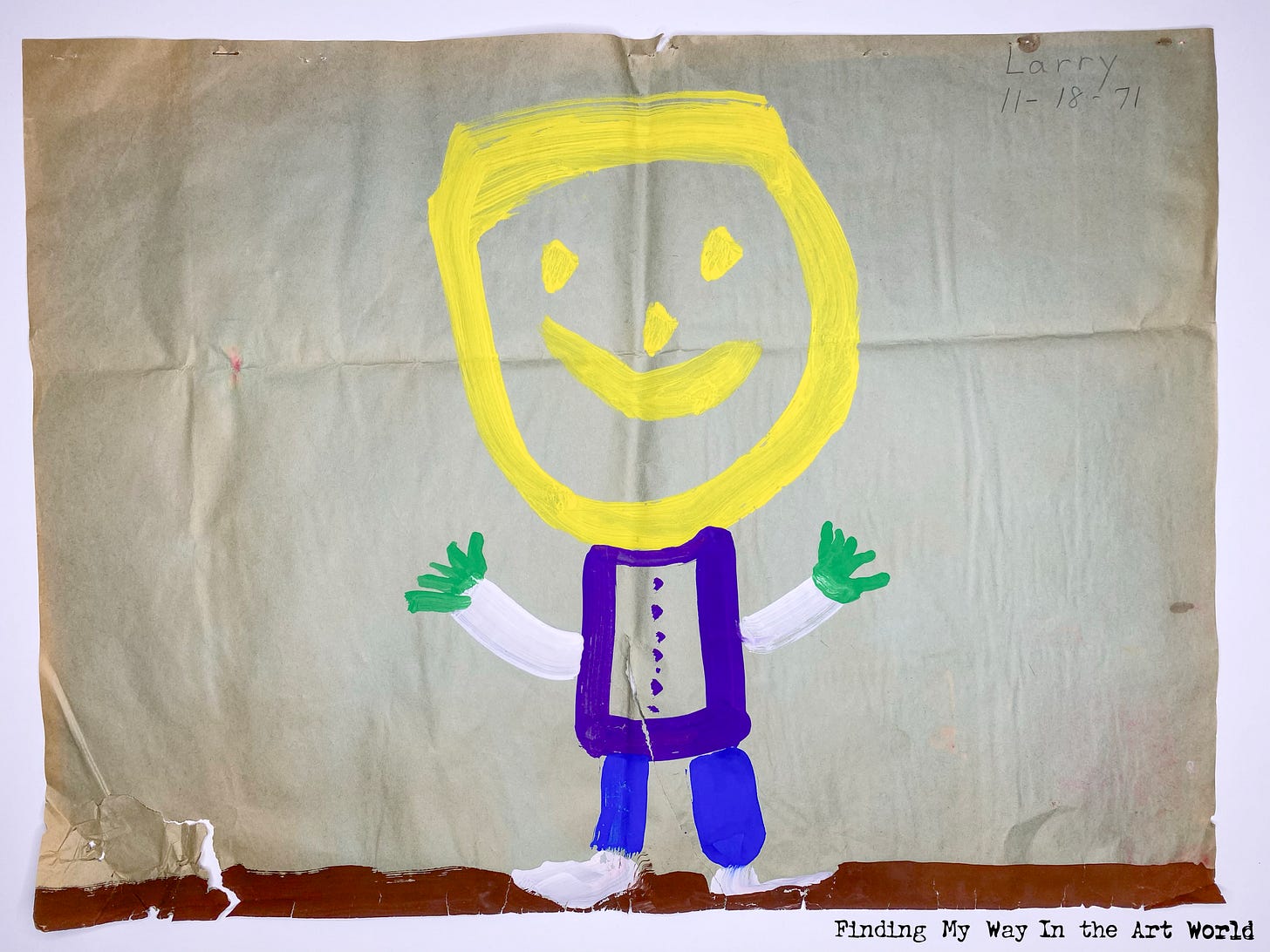
Life Events | Products | Music | Television | Movies | Styles | Printed Matter | World Events | The Resulting Art
Life Events of 1966-1971
The Family Arrangement
Paragraph 1.1
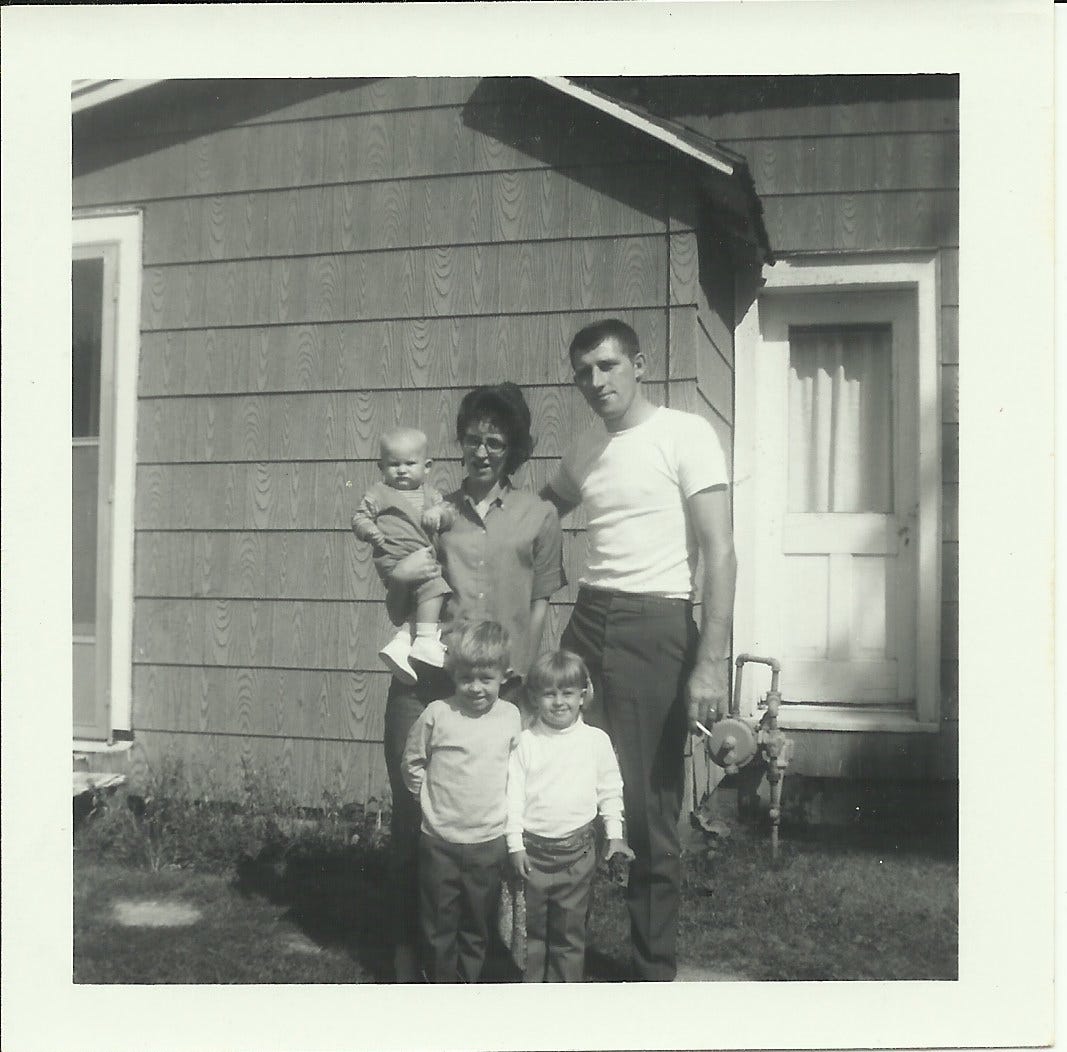
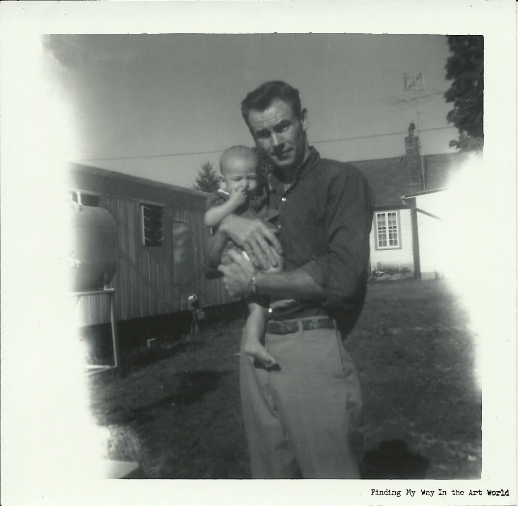
My parents, Larry Dean Hunt and Mary Louise Waller, were both born and raised in Indiana, USA.1 They married on July 3, 1959.
1.2
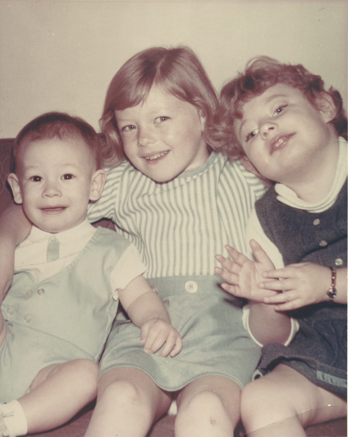
Their first child, my sister Lori Diane, was born on September 2, 1961. Tanya Dawn followed on September 6, 1962. Tanya, whom we called Tonie, was born with cerebral palsy and microcephaly, conditions that left her with the mental development of a 6-month-old for her entire life. As a result, my mother had to care for her daily, feeding and changing her. Tonie never learned to crawl, and only began sitting up independently at around age 3 or 4.
1.3
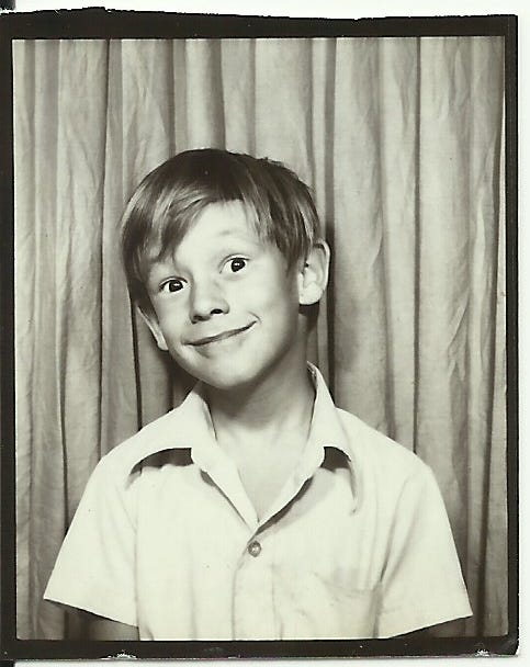
I was born, also named Larry Dean Hunt, on March 14, 1966, at 3:14 AM in Wabash, Indiana. [Map it]. My parents didn’t like the idea of calling me “Junior” because my dad and I shared the same name, so they made it clear to the family that I would be known as Larry Dean Hunt II.
1.4
My mother also mentioned that I was born with a layer of skin, or what she called a “veil,” over my face—an odd fact without special significance.
1.5
I don’t subscribe to New Age beliefs. I don’t have a dreamcatcher above my bed, nor do I have special crystals that hang from the rear-view mirror in my car. I do find it of interest, however, in the way that elements are arranged; the arrangement of things. For me, it’s about how these things create mental images when combined, not any otherworldly or spiritual significance.
1.6
That being said, our family consisted of two parents (a male and a female) and three children (two girls and one boy). This formed a structure that, in psychological and mathematical terms, can be represented as 2 + 3 = 5.
California Dreams
1.7
In September 1966, when I was just six months old, my parents packed up our family and moved from Lagro, Indiana (population: 562) to California. With only $200 to their name, they towed a trailer behind their 1955 Chevy.
1.8
This move gave my childhood a distinctly Californian flavor, which, over time, would blend with other influences in my simmering life-soup. As I reflect, I can now compile the recipe for this homemade dish, and while sipping on the memories, I've rediscovered some forgotten ingredients. I've included all of it, so that the full course can be savored and appreciated. But I have tried to keep this story fat-free. Everything included is meaningful, even if its significance isn’t obvious at first—so stick with me.
1.9
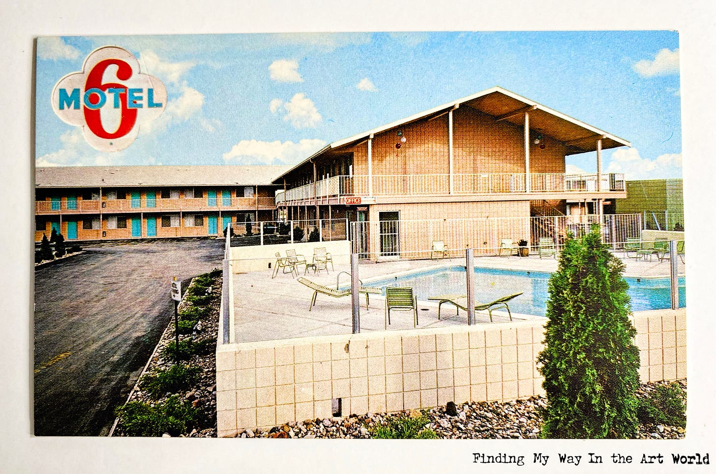
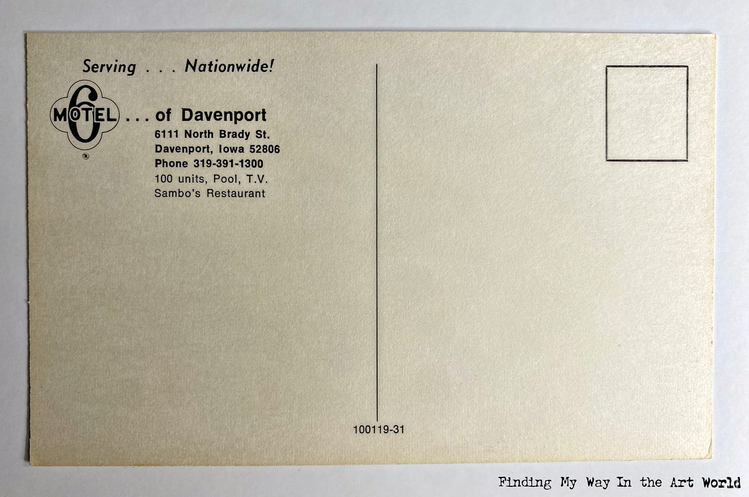
Our journey west included a stop at a Motel 6, which, believe it or not, cost just $6 a night back then. My parents headed for Los Angeles, unaware of California’s vast layout.
Prospecting From a Mining Town
1.10
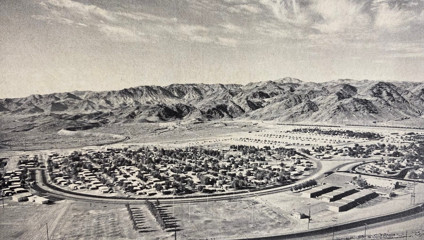
With plans already in place, we headed to Eagle Mountain [Map it], where my mom's father, Jim Waller Sr., lived with his wife, Charlotte, and their daughter, Jeanette Francis (or Frankie). Eagle Mountain was a small desert town where everyone who lived there worked at the Kaiser Steel Corporation iron mine.
1.11
During this time, my dad made several trips to Anaheim [Map it], staying with my mom’s uncle Ed Whinery and his wife, Thelma (we all called her Thelm), while looking for a job in the Los Angeles area. [Map it].
1.12
After a few weeks in Eagle Mountain, a disagreement arose between the adults, and with the cramped space of the single-wide trailer there was just not enough room for the five of us and the three of them. We ended up packing up and leaving. I was even caught eating dog food during our stay there. The struggle is real!
Our Desert Past. PUSH PLAY > TO FIND YOUR WAY: Learn more about the history of Eagle Mountain, California. (2 minutes, 44 seconds)
Video content description:2
1.13
My parents decided to drive to Los Angeles to find a place to live and continue job hunting. On the way, we exited the freeway while passing through Riverside. [Map it].
The Riverside Hotel
1.14
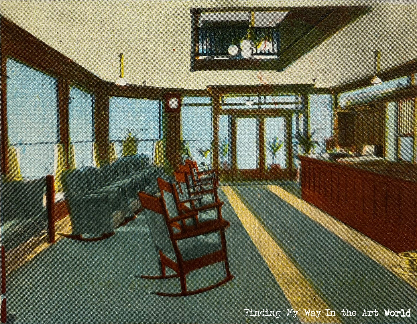
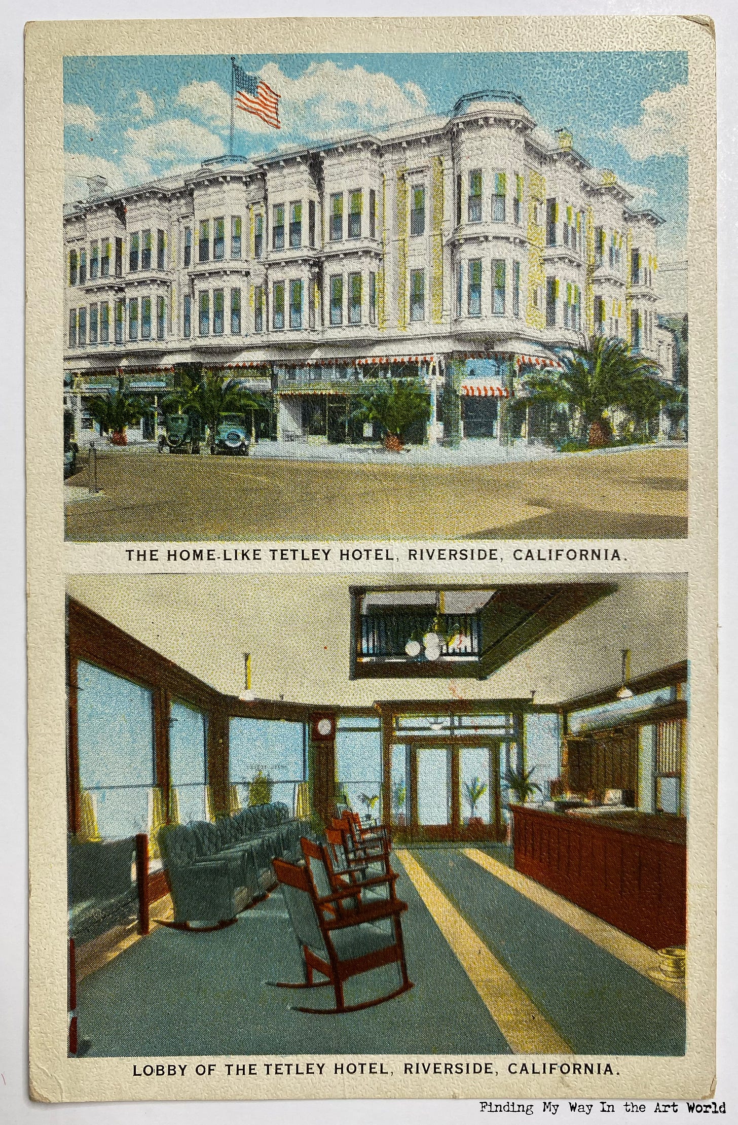
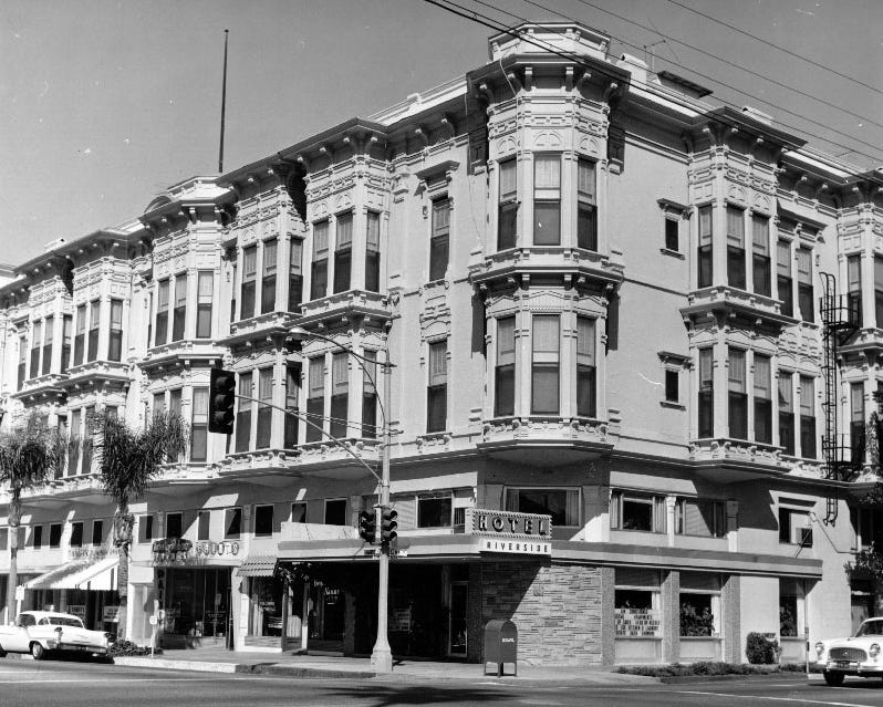
It was October, 1966 when we arrived in Riverside, California, and stayed at the Riverside Hotel - a place where my parents could keep us kids safe until my dad found a job. The room at the Riverside Hotel was very large and was supplied with a hot plate. The cost to rent the room was only $30 for a full month.
1.15
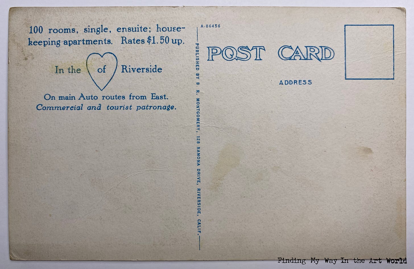
The Riverside Hotel was built in 1887 and was located next to the YMCA building. Originally it was the Arlington Hotel, then the Tetley Hotel, then finally the Riverside Hotel. It advertised 110 large and well lit rooms, private telephones, Simmons beds, with 23 baths (marketed as “bath connections”). It had the “coolest and nicest lobby in the city, fine dining room and cocktail lounge.”3
1.16
The hotel desk clerk in the lobby tried to help my dad to find a job. My dad had to decline however, because the job ended up being at a nudist colony, of all places.
1.17
My mom was terrified in what she considered a big city. The only time us kids would be able to go out was when my dad would take us to an upper floor where the laundry room was. Money was tight, and we lived on bologna sandwiches and rice.
1.18
Still looking for work, my dad checked Honeywell in Torrance, and FMC in Riverside. But no, none of them were hiring. He almost got a job with Hoover vacuums. He had taken their sales class, and just before his first day in sales, Lily Tulip called. Whew! He did not want to be a door-to-door vacuum salesman.
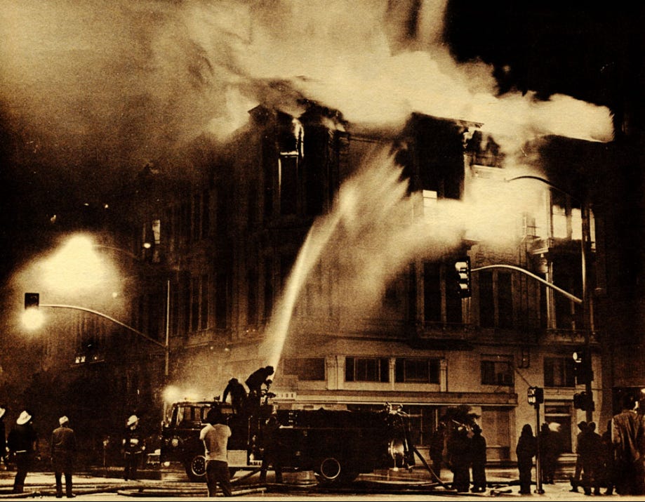
A Job and a Home
1.19
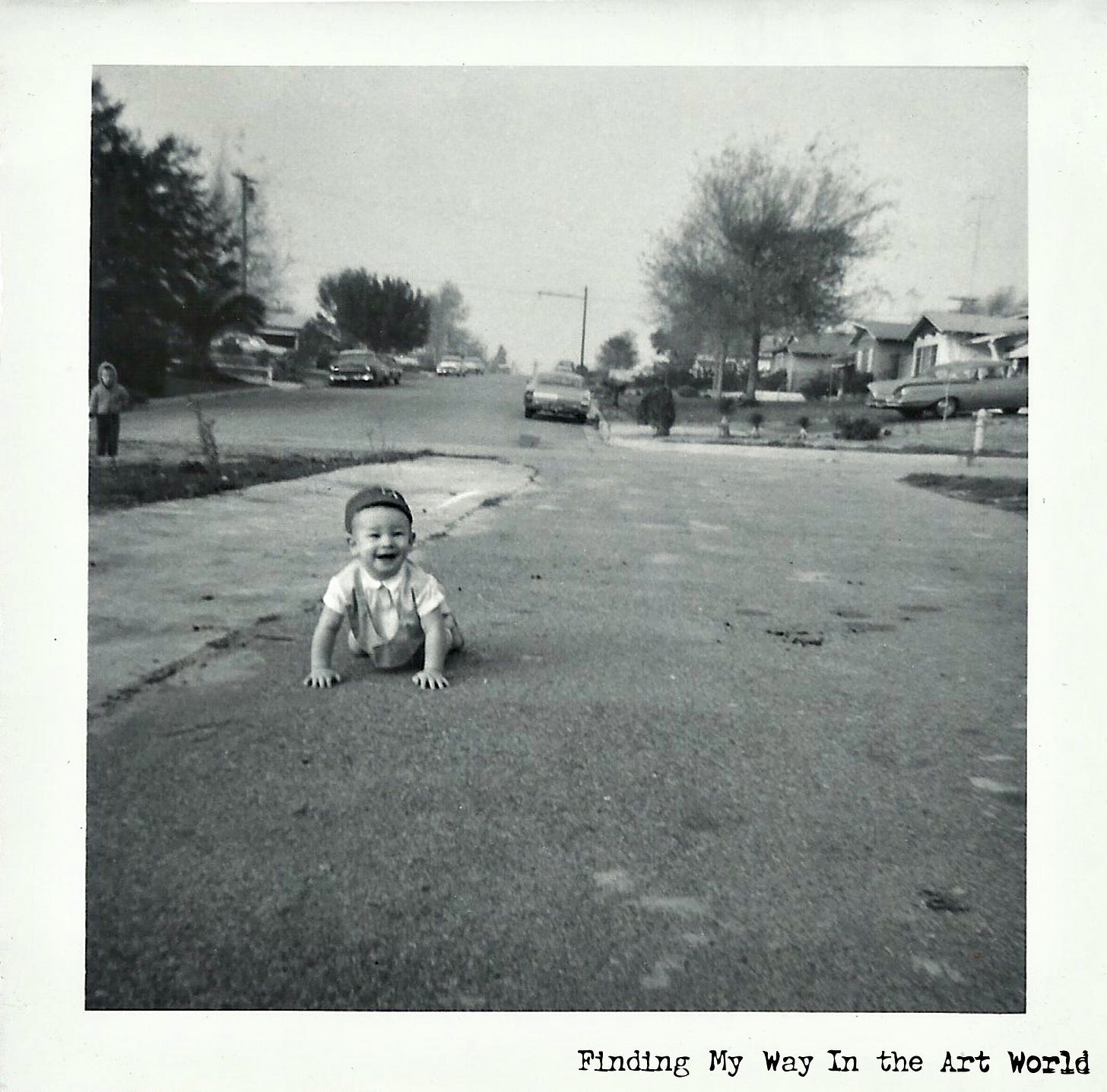
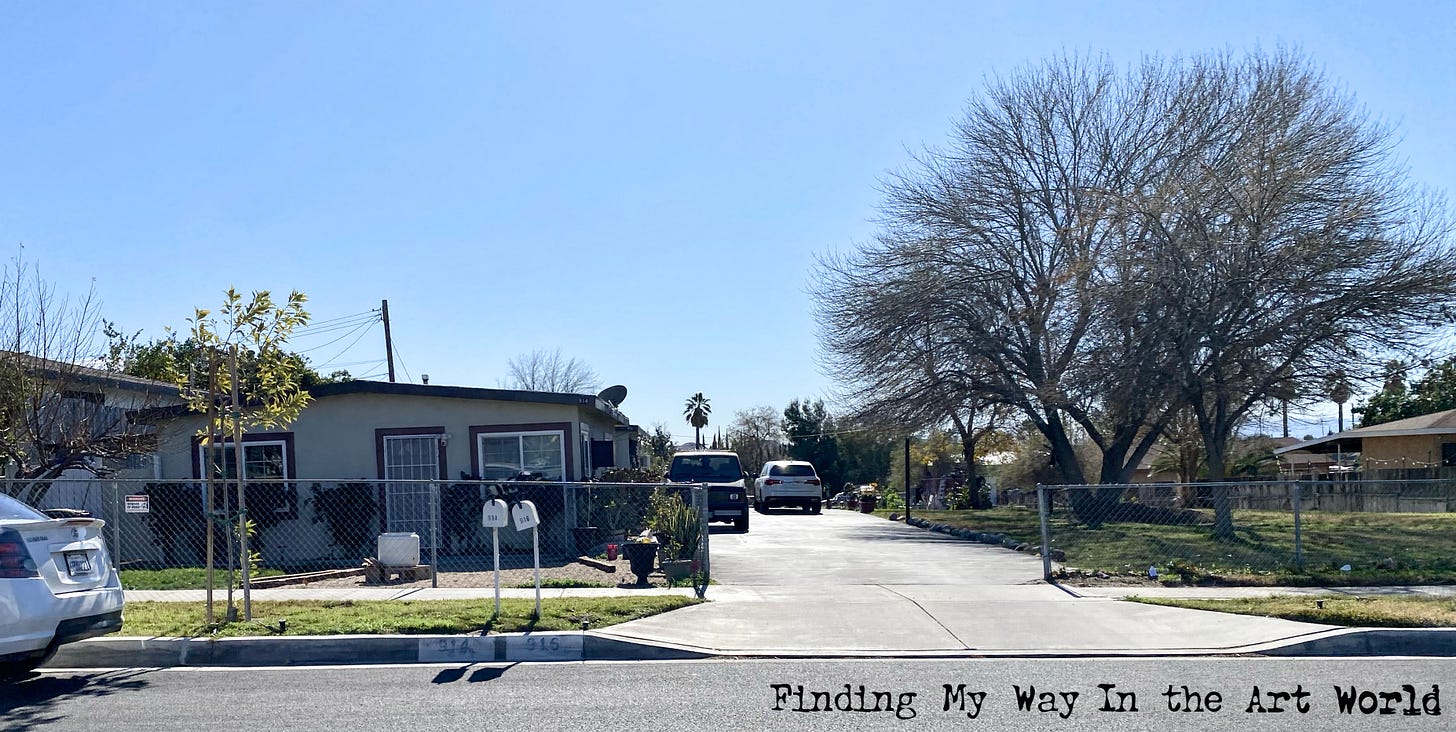
Between November 1966 and April of 1967, we lived in a duplex at 914 West Laurel Street in Colton, California. To begin with, we had no furniture and slept on the floor. But we had the necessities: Blankets, pillows, pans, dishes, cooking utensils, and a lamp.
On our first night, there was no heat in the house, and so my parents put all of us kids in the corner of the room, with the two of them on each side of us, and all of the blankets covering everyone.
My mom found out about spanish rice from a neighbor and it became a regular feature on our table after that. To this day my dad hates spanish rice.
Southern California Amusements
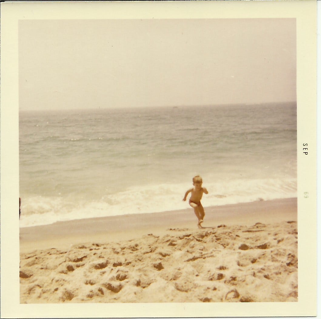
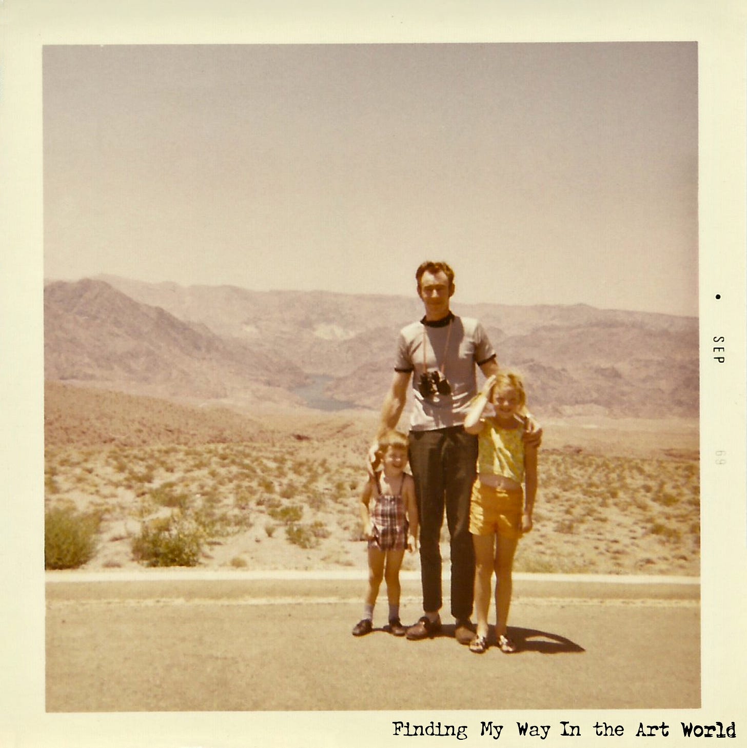
One of the amazing things about Southern California is the sheer variety of landscapes and attractions you can explore, all within just a few hours' drive. Best of all, these adventures didn’t have to cost much—a full tank of gas, a fresh roll of film, and a bag packed with bologna sandwiches were all we needed to set out. During these years, we experienced everything from the sparkling Pacific Ocean, where we swam at sun-drenched beaches, to the rugged, arid desert landscapes further inland. With cameras and binoculars around our necks, we were ready to capture the beauty of these contrasting environments, creating vivid memories of a region that offered so much excitement and wonder.
For a family that had moved from a small town back east, Southern California felt like a playground of endless possibilities. My parents took us to so many interesting places, and there was always something new to see. One of our favorite destinations was Knott’s Berry Farm in Buena Park, not far from Disneyland. The park’s charming Western town theme captured our imaginations, with its saloons, mining shacks, roller coasters, and even a fake cemetery called Boot Hill. I especially loved the shop where you could stand behind a painted wooden prop, choosing a character to "be" for a photograph. Those family photos ended up in the albums we kept on the coffee table, and I often flipped through them, enjoying the paintings of those props.
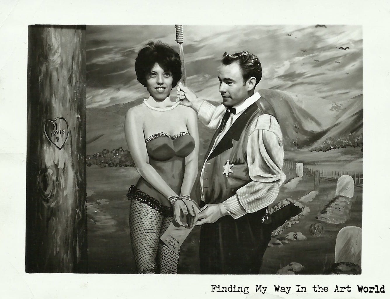
So, here is a good place to start talking about art.
Art In the World Around Us
Art and illustration in advertising and marketing have transformed art into an everyday experience, seamlessly integrating it into the fabric of daily life. From product packaging and billboards to digital banners and social media campaigns, artistic elements are everywhere, shaping consumer perceptions and driving engagement. These visuals are designed to capture attention quickly, convey messages efficiently, and evoke emotional responses, making them a powerful tool in influencing behavior. However, because these artworks serve a commercial purpose and are so ubiquitous, the public often takes them for granted, viewing them as functional rather than as creative expressions.
This constant exposure to commercial art has, paradoxically, dulled the public's recognition of it as "art." Unlike pieces displayed in galleries or museums, advertising art is rarely appreciated for its aesthetic or technical merits; instead, it’s evaluated by its effectiveness in selling a product or promoting a brand. This utilitarian view can obscure the skill, creativity, and innovation involved in creating such visuals. While this integration has made art more accessible and commonplace, it has also diminished its perceived value, relegating it to the background of daily life rather than something to be celebrated and admired. This shift reflects how art, in its commercialized form, has become both omnipresent and, in many cases, invisible.
As we consider this aspect of the art world, it is important to pay attention to what is happening all around us, every day. This book will examine in detail the art used in advertising and marketing from the late sixties and forward. Is it wrong to use artistic abilities to market a product? This is another significant question this book will explore, as it is one I have grappled with personally over the years. By delving into the intersections of art, commerce, and ethics, we will better understand the role of creativity in shaping our daily lives and societal values, and the influence it has had on me.
But now back to our story. Where was I? Oh, yes…
Uncle Ed and Aunt Thelm
My uncle Ed and aunt Thelm lived in Anaheim, in a trailer park close to Disneyland. On some weekends we would travel the Santa Ana Canyon Road between Riverside and Anaheim to go visit them. (This road has since been replaced by the 91 freeway.)
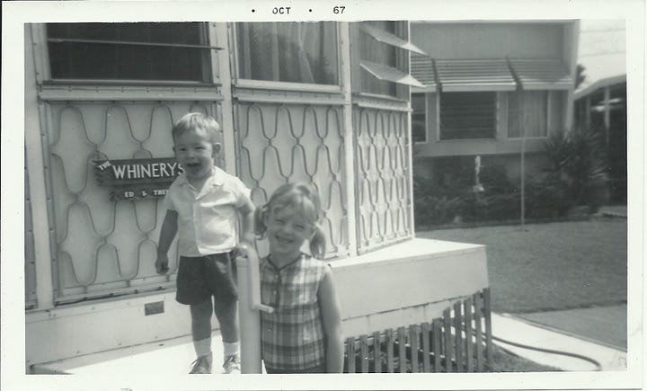
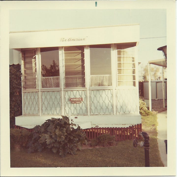
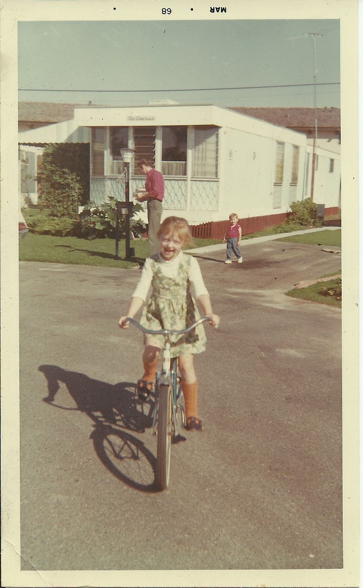

Floral Anaheim. PUSH PLAY > TO FIND YOUR WAY: Enjoy what it was like at uncle Ed and aunt Thelm’s trailer space in Anaheim, California, 1967. (2 minutes, 13 seconds)
Video content description: 4
On our way there, we would always see a house that had what looked like a giant arrow stabbed through its roof. An odd roadside sculpture that fascinated me. As we passed, my dad would always ask if we had seen the Indians who shot the arrow.
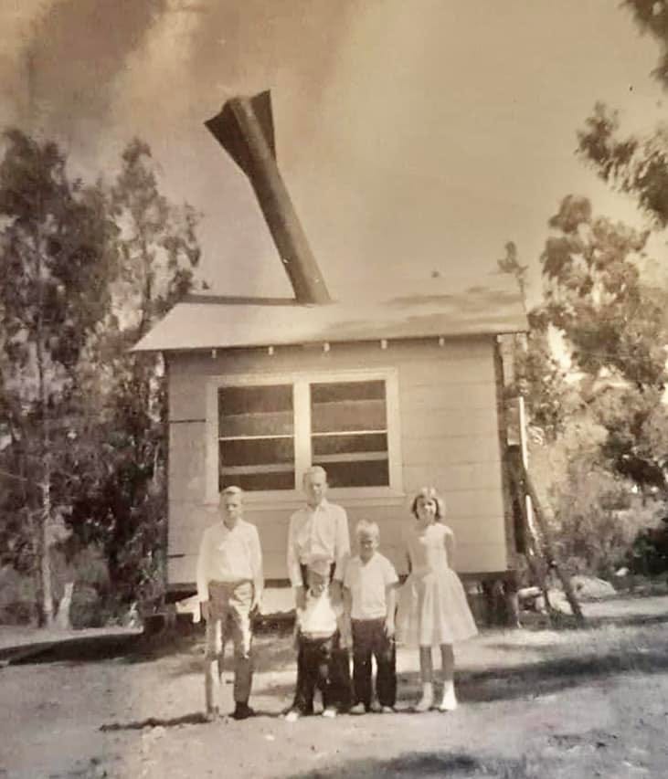
Bring Back Those Days. PUSH PLAY > TO FIND YOUR WAY: Uncle Ed and aunt Thelm visits, first in Anaheim, California and then in Colton, California, 1967. (5 minutes, 21 seconds)
Video content description:5
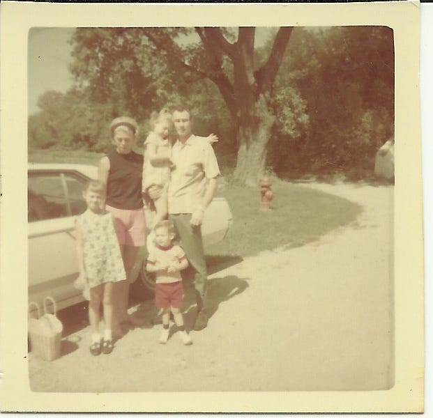
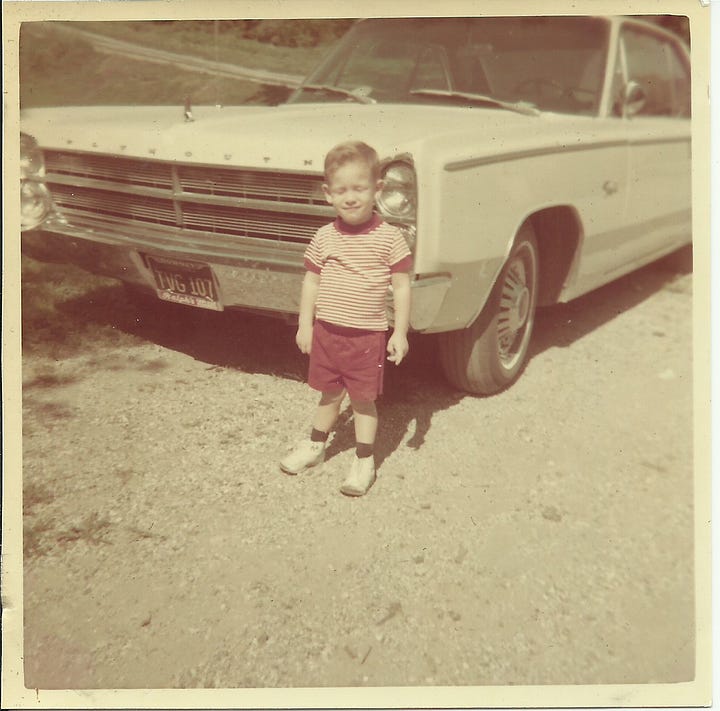
The Riverside Mall. PUSH PLAY > TO FIND YOUR WAY: Experience the styles, people, and architecture in Riverside, California, 1967. (3 minutes, 57 seconds)
Video content description:6
Lily Tulip
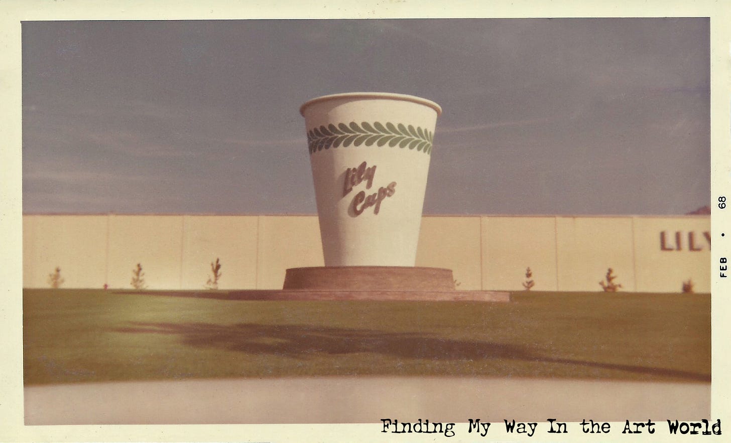
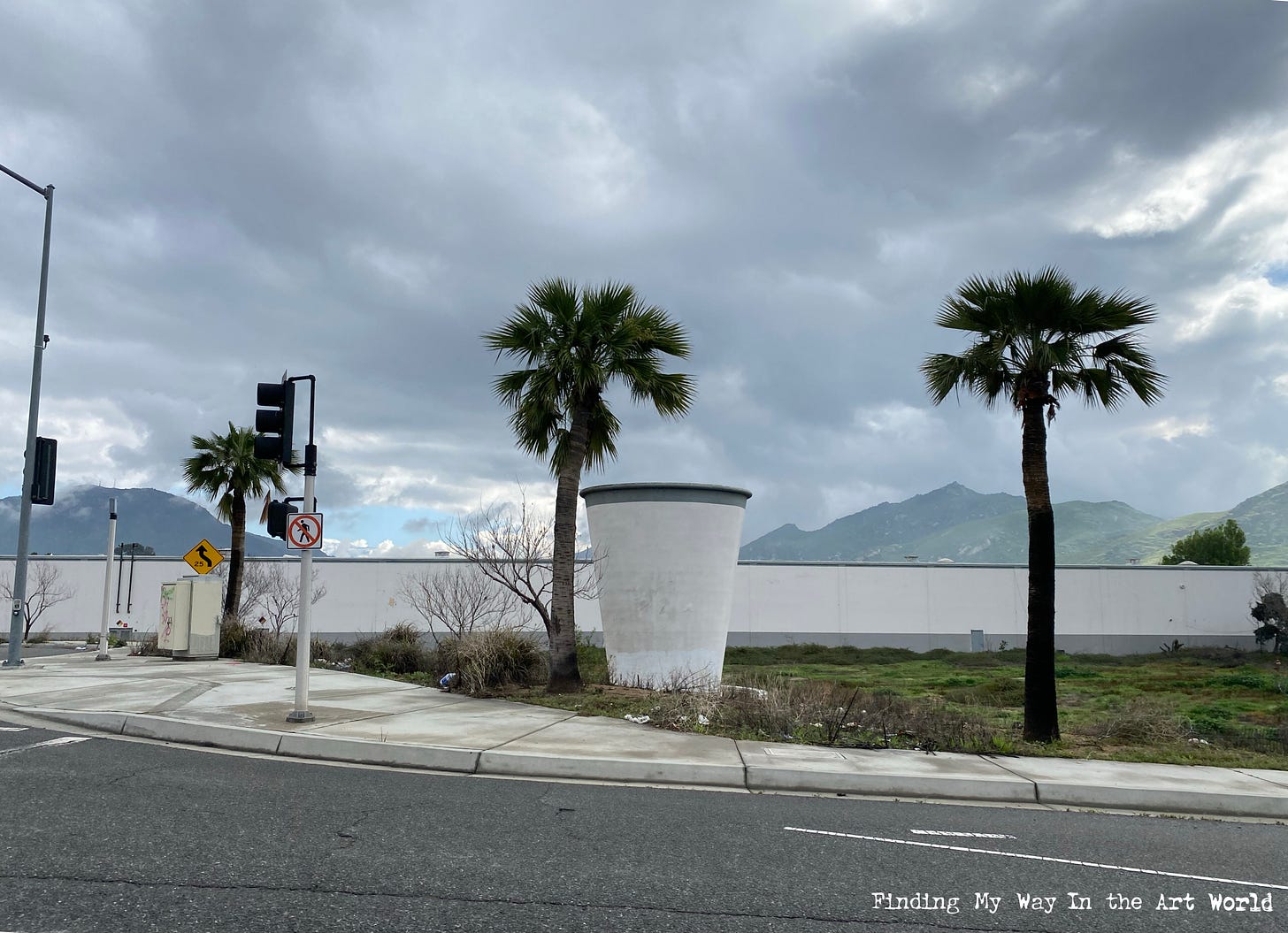
By 1968, and at least until September of 1969, we lived on Rubidoux Avenue in Riverside [Map it]. During this time, my dad worked at Lily Tulip, a prominent company in Riverside known for manufacturing paper cups. Founded in the 1920s, Lily Tulip became one of the leading producers of disposable paper products, helping to popularize the convenience of paper cups across America. Its innovative designs and focus on mass production made it a household name, especially during the mid-20th century when disposable products were booming. When we would drive to pick my dad up after work, I was always captivated by the enormous concrete sculpture of a paper cup, proudly emblazoned with the Lily Tulip logo, standing as a testament to the factory’s importance in the community. For a young boy, that iconic cup felt monumental, a vivid marker of my dad’s work and the place that played a role in shaping our daily lives.
The Tucker Family
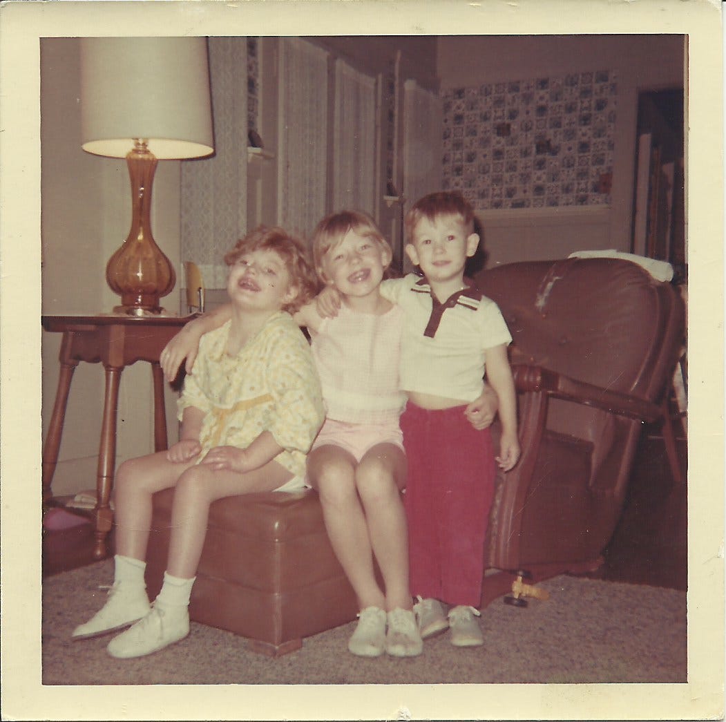
As the Hunt family, we regularly got together with the Tucker family, creating a close-knit bond that enriched our lives. Rex Tucker, one of my mom's brothers, had moved his family to California from Indiana shortly after my parents did. Their children—Rex Junior, Teresa, Willie, and Kenny—became my closest cousins. To avoid confusion, since both families had firstborn sons named after their fathers, I was called Larry Dean, while Rex Junior was called Rex Allen. (This wasn’t universal, though—my Aunt Debbie called me Lawrence, and Aunt Oliena affectionately referred to me as Deano.) Rex Allen was about nine months older than me, and as a result, he and I spent the most time together, forming a special bond within our already tightly connected families.
The Salton Sea
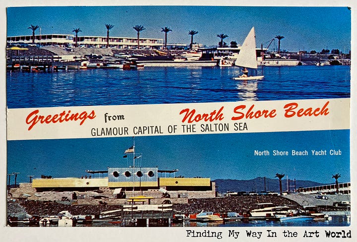
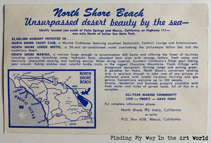
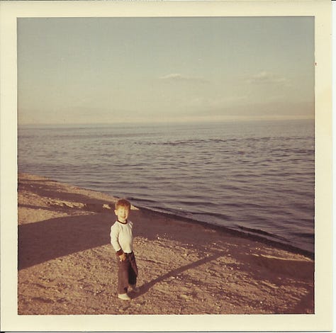
The Salton Sea, located in Southern California, was formed in 1905 when a breach in irrigation canals connected to the Colorado River caused massive flooding, filling the Salton Basin. Originally a dry lakebed, the area transformed into a 360-square-mile inland sea over two years. In the mid-20th century, the Salton Sea became a popular recreation destination, attracting visitors with its resorts, fishing opportunities, and water sports. However, without a natural outlet, the sea became increasingly saline as agricultural runoff and evaporation concentrated the water. By the late 20th century, rising salinity and pollution led to ecological collapse, with mass fish die-offs and health hazards from toxic dust storms. Once a vibrant destination, the Salton Sea is now a symbol of environmental mismanagement and remains the focus of ongoing restoration efforts to address its complex challenges.
Salton Sea Dreams. PUSH PLAY > TO FIND YOUR WAY. A compilation of the many times my family visited the Salton Sea in California. Includes real-life video and AI-generated video to animate still photos. (2 minutes, 13 seconds)
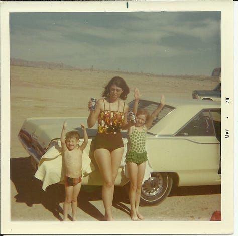
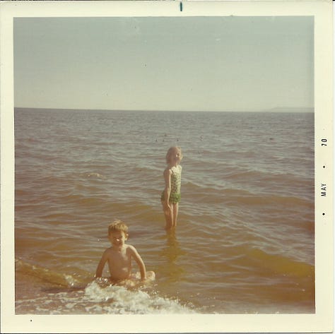
Our Front Yard Palm Tree
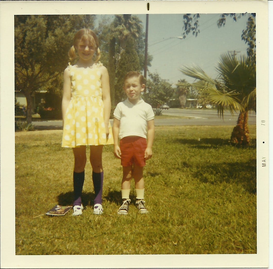
In 1970 and 1971, we lived on Canterbury Road in Riverside, a time filled with growth, family adventures, and cherished memories. Whatever challenges or negative moments may have occurred during those years, I was blissfully unaware of them. My siblings and I were raised, protected, and cared for by two loving parents who gave us a stable foundation and wonderful experiences that enriched our development.
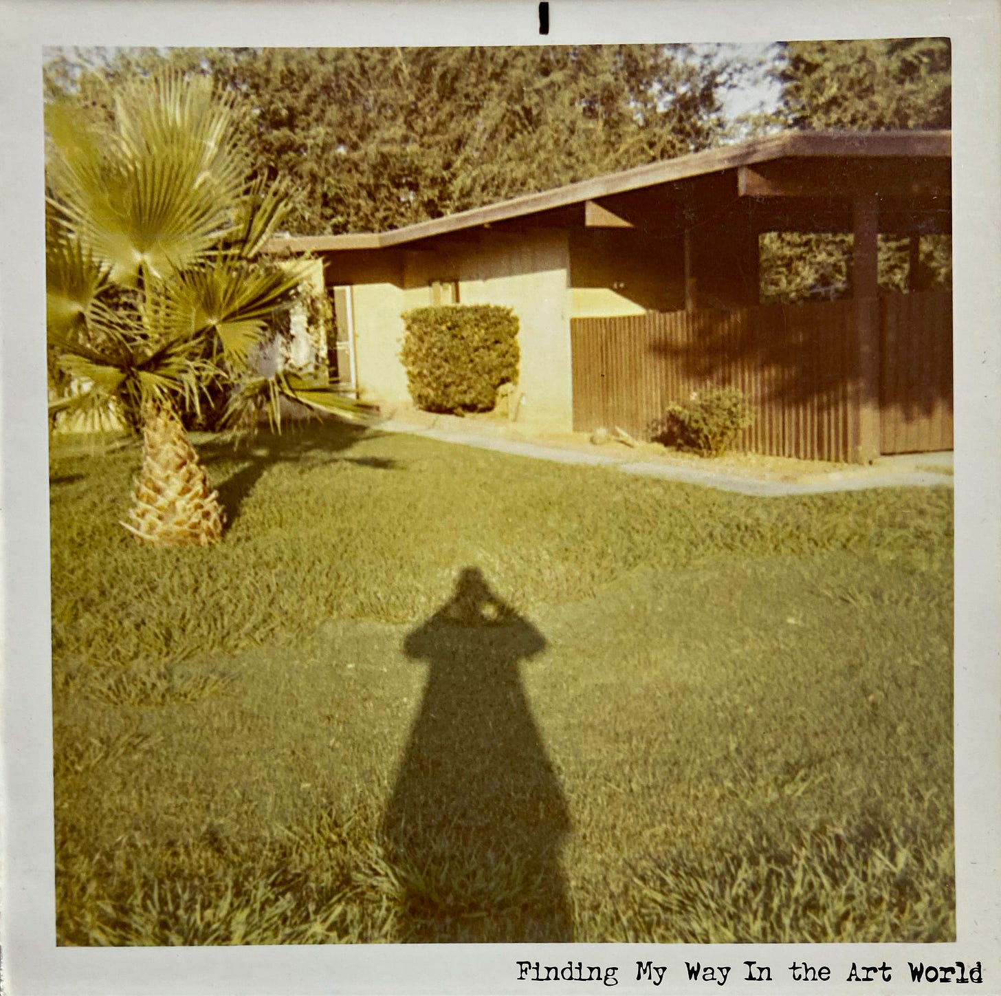
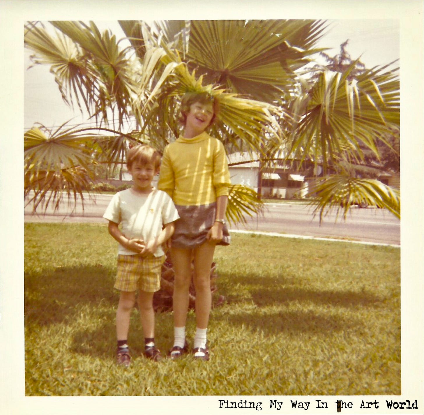
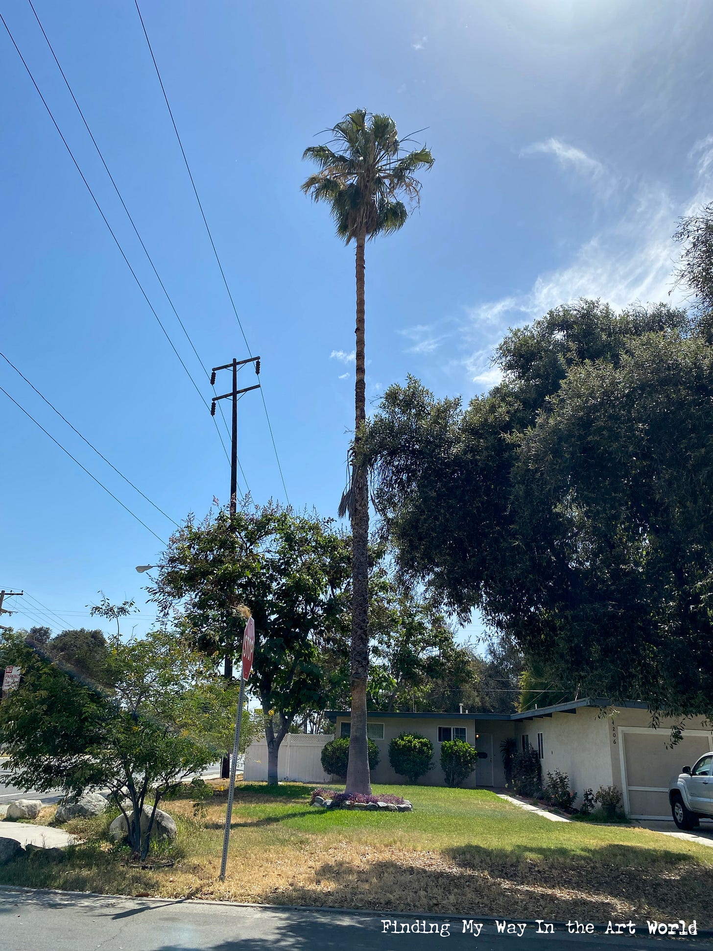
I remember how my dad, always thinking about how to make our home a better place, planted a small palm tree in the front yard in 1970. At the time, it was just a modest little tree, but it symbolized his hope and dedication to creating a welcoming, nurturing home for us. Today, my wife Chanelle and I strive to provide the same for our own children, building on the legacy of love and support we were fortunate to inherit. There were no harmful cycles to break, no traumas to overcome—just the simple beauty of living, learning, and growing together as a family, with roots planted as firmly as that little palm tree in our front yard.
Indiana Trips
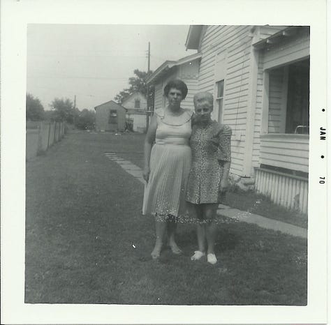
Even though we had left Indiana for California, we still visited back there when we could. My dad’s parents were there, my mom’s mom was there, other relatives were there as well. The relationships were not severed. We visited them, and over the years, different family members came to California to visit us and see the attractions.
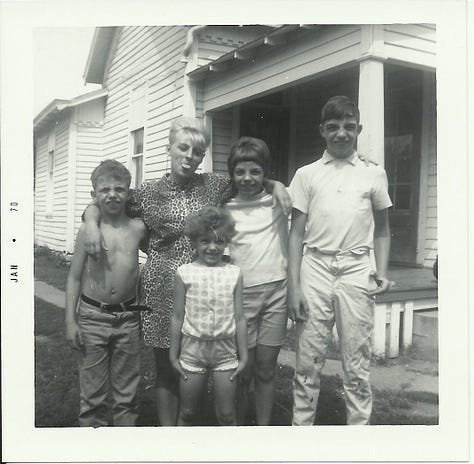
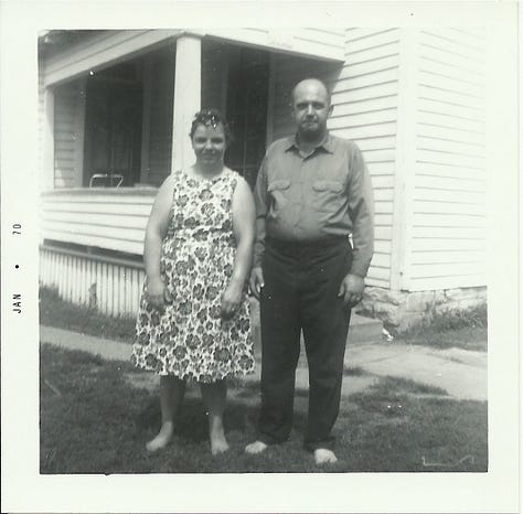
Here’s something I’ve realized from reflecting on all of this: if my childhood had been nothing but sitting around the house and watching TV (and believe me, the TV was on from morning until bedtime), there would be little to remember. The monotonous, uneventful moments of life fade away—they don’t stick in our memories. What we truly carry with us are the experiences that break the routine, the moments that spark curiosity, joy, or even challenge. To build a treasure trove of vivid memories, we need to actively engage with life. Don’t let time slip away by doing nothing; make the effort to seek out experiences that will enrich your story.
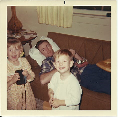
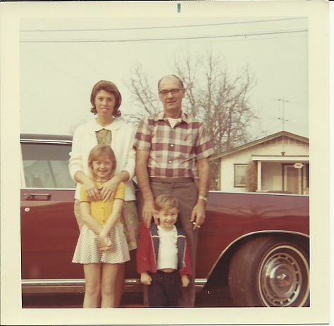
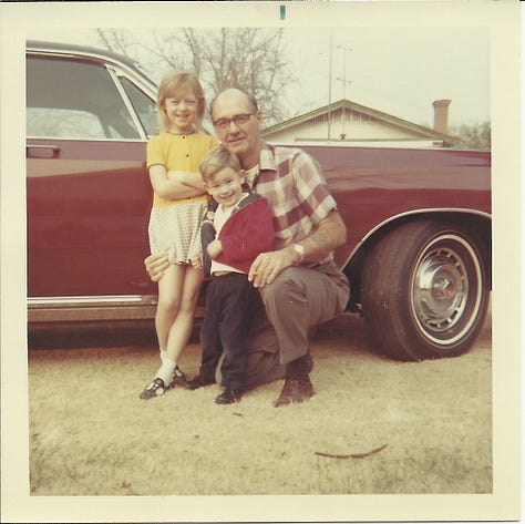
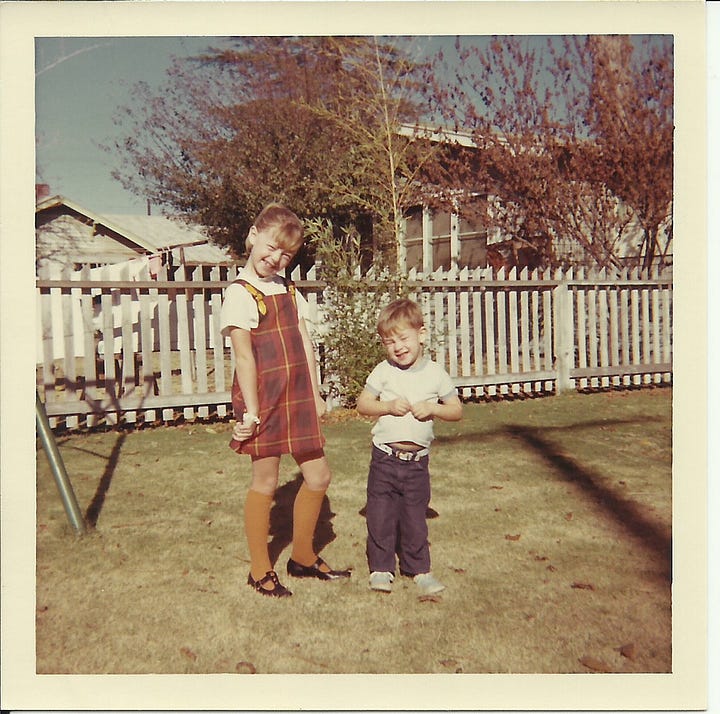
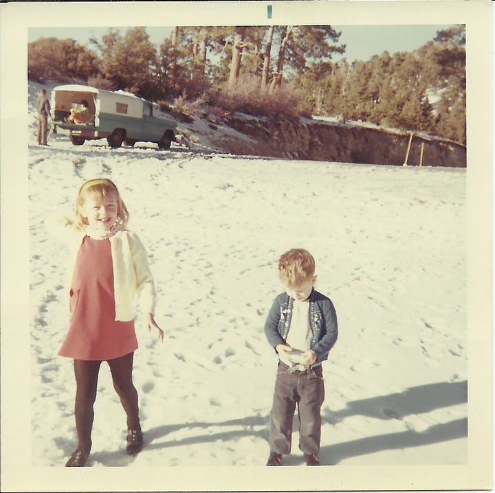
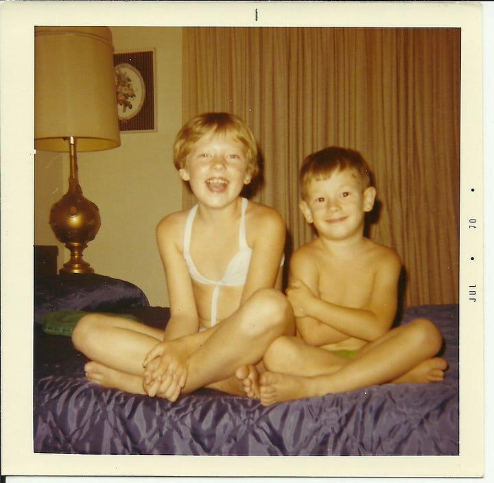
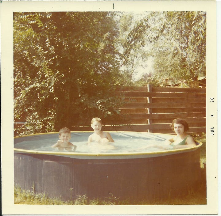
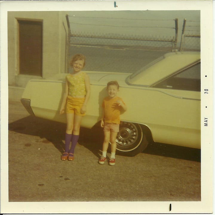
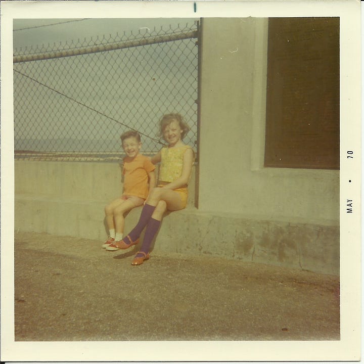
The Cabazon Dinosaur
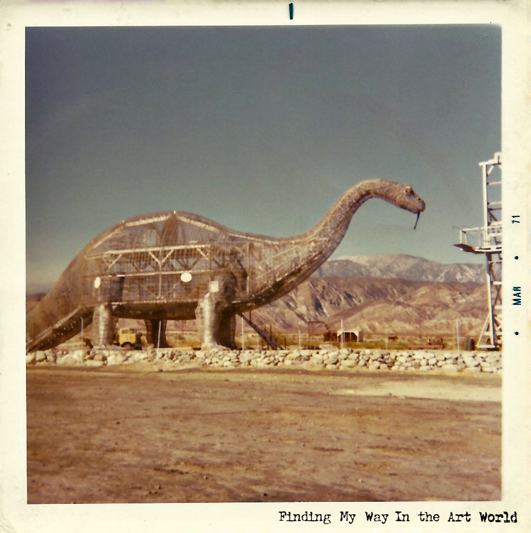
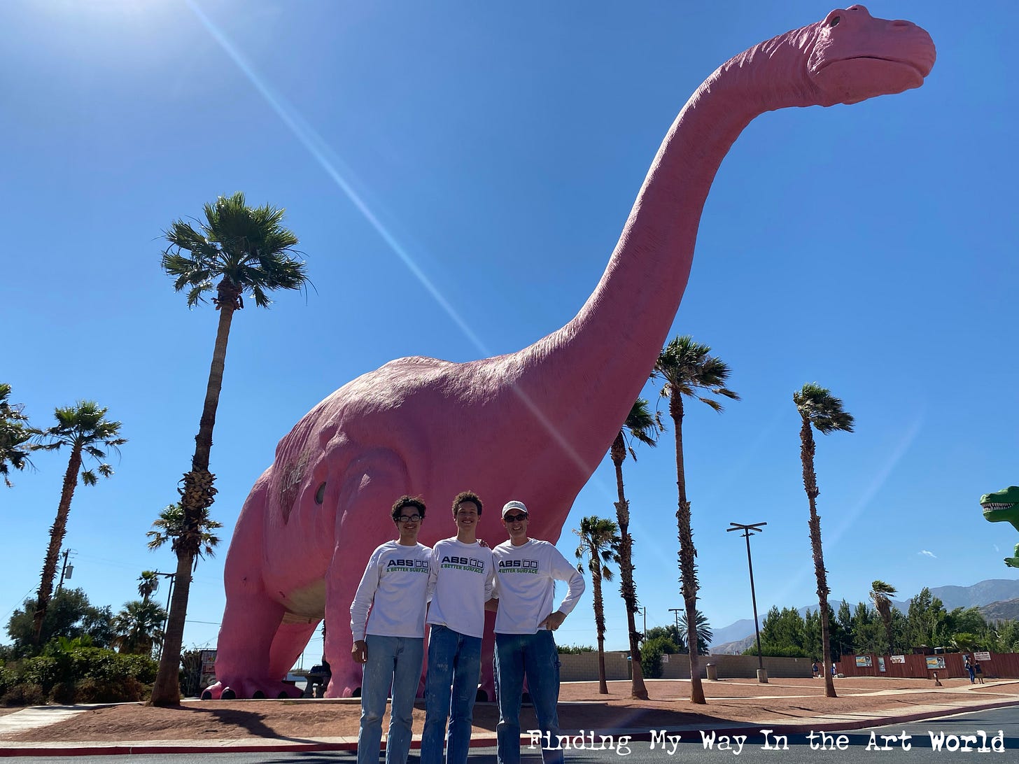
In 1971, in Cabazon, California, a massive and captivating sculpture began to rise—a towering dinosaur set against the stark desert landscape near the freeway. We stopped there several times on our way to Palm Springs and the Salton Sea, and I was mesmerized by its sheer size and presence amidst the barren surroundings. Designed by Claude K. Bell, a former Knott’s Berry Farm sculptor, the dinosaur, known as Dinny the Dinosaur, was built to attract visitors to Bell’s nearby Wheel Inn Restaurant. Bell envisioned the structure not just as a roadside curiosity but as a future museum to house exhibits on creationism and paleontology. I remember my dad pointing out what he jokingly called a "tongue" hanging from the dinosaur’s mouth, which added a playful element to our visits and made the experience even more unforgettable. That giant dinosaur, with its blend of whimsy and wonder, became a lasting symbol of adventure and curiosity in my childhood memories, embodying the unique charm of roadside Americana.
School Begins
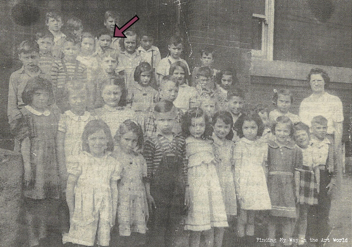
It was time to start school, and my earliest memory of kindergarten was at Jefferson Elementary School in Riverside, California, in room K2. I vividly remember my first day—the nervous energy, the unfamiliar faces, and the overwhelming fear of being without my mom. She brought me to the classroom, and I kept turning to the back of the room, reassured by her presence as my safety net. But then the inevitable happened: I turned to look, and she was gone. A classic mom trick, one that my wife and I have since employed with our own children. That day, I cried a lot, overwhelmed by the unfamiliarity and the sudden realization that my full-time days of carefree play were over.
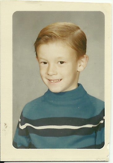
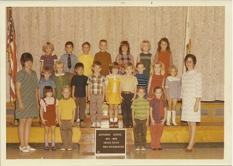
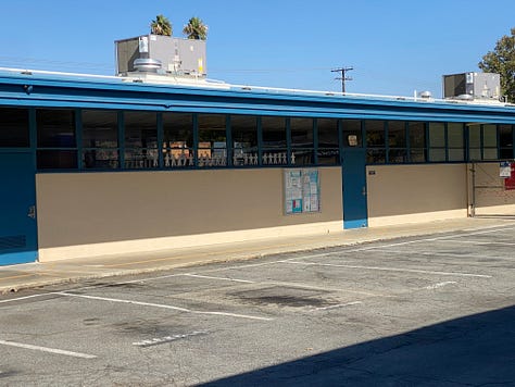
Kindergarten marked a stark transition into a new world, filled with the responsibilities and challenges of schoolwork and forging new relationships with people I’d never met before. It was an introduction to the child-sized version of the "real world," where routines, rules, and learning replaced the endless freedom of early childhood. How would this go? Would I find my place in this new environment? That first day was just the beginning of navigating the complexities of growing up and finding my way.
Jefferson Elementary School. PUSH PLAY > TO FIND YOUR WAY: View the school in Riverside, California, October 28, 2023. (9 seconds)
Products
In the late 1960s and early 1970s, American families were increasingly targeted by a surge of marketing strategies designed to shape consumer behavior and drive purchases. Television commercials, print ads, and jingles became omnipresent, using catchy slogans and relatable scenarios to convince families they needed certain products to improve their lives. Marketing campaigns emphasized convenience, modernity, and status, urging families to buy everything from prepackaged foods and household appliances to new cars and the latest fashion trends. Brands often played on emotions, promising happiness, togetherness, and success through their products. For children, Saturday morning cartoons were interwoven with advertisements for toys and sugary cereals, making consumption a key part of childhood culture. The era marked a shift toward more sophisticated advertising techniques, including celebrity endorsements and aspirational messaging, which ingrained consumerism deeply into the fabric of American family life.
Cereals
Breakfast cereals became a staple in American households, particularly for children, thanks to their colorful packaging, sweet flavors, and clever marketing. Cereal boxes were designed to be as engaging as the product itself, featuring bright, eye-catching artwork, mascots like Tony the Tiger and Cap’n Crunch, and bold typography. Kids eagerly read the back of the box while eating their cereal, which often included puzzles, riddles, trivia, or short comics to entertain them during breakfast. Many boxes also promoted special offers, such as mail-in prizes, collectible toys, or stickers, fueling excitement and loyalty to specific brands. These designs turned breakfast into a daily ritual of fun and discovery, making cereals like Frosted Flakes, Cheerios, and Lucky Charms a cultural phenomenon that shaped childhood memories.
Cigarettes
In the late 1960s, smoking cigarettes was a widely embraced pastime and deeply ingrained in American culture, symbolizing sophistication, rebellion, and social connection. It was common to see people smoking at home, in workplaces, and public spaces, as it was considered both fashionable and relaxing. Advertising campaigns glorified the habit, with iconic slogans like "Come to where the flavor is" for Marlboro and "Winston tastes good like a cigarette should" making brands like Marlboro, Winston, Camel, Kool, and Salem household names. Smoking was not just a habit but a cultural phenomenon, often linked to popular media where celebrities and movie stars were seen puffing away, reinforcing its allure. For many, lighting up a cigarette was a ritual that accompanied coffee breaks, social gatherings, or moments of reflection, symbolizing freedom and individuality in an era marked by profound cultural shifts.
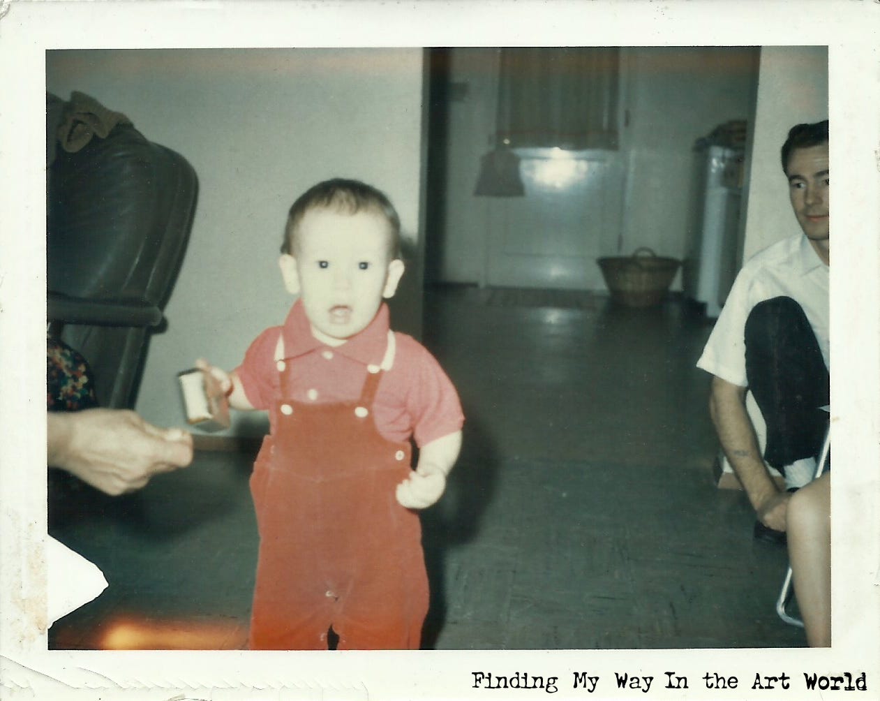
At the time, my parents were cigarette smokers, so ashtrays and burnt-out matches were a constant presence around the house. Whenever no one was looking, I would sneak a used matchstick, put it in my mouth, and eat the residue off the end—it tasted oddly good to me. (Play-Doh modeling clay was another strange indulgence of mine; its salty flavor was irresistible whenever I could sneak a piece.)
Camel Cigarettes
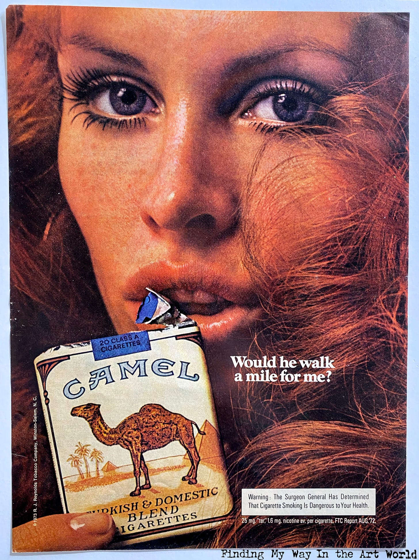
My dad smoked Camel cigarettes, and he often turned their packaging into a quirky conversation starter with Lori and me. Pointing to the illustration on the front of the pack, he would ask, “If you were stranded out here in this desert, would you take shelter under the shadow of the pyramid or the camel?” After we gave our answers, he’d flip the pack to reveal the back and declare with a grin, “Not me! I’d head straight for this great oasis over here.” It was a simple game, but it stuck in my memory as one of the many ways he made everyday moments more fun and engaging.
Beer
Beer was always a part of our family life, woven naturally into gatherings and everyday moments, but it was never abused—no one was getting drunk or out of control. Growing up, beer was simply there, a familiar presence at barbecues, family dinners, and relaxing evenings. When I was old enough, I began drinking beer myself, following the example I’d seen my whole life. From 1966 onward, certain brands became iconic fixtures in our home: Budweiser with its bold red and white label, Miller High Life, proudly calling itself "The Champagne of Beers," Coors with its crisp mountain imagery, and Schlitz, once dubbed "The Beer that Made Milwaukee Famous." These brands were as much a part of our household as any other staple, symbolizing tradition and simple enjoyment.
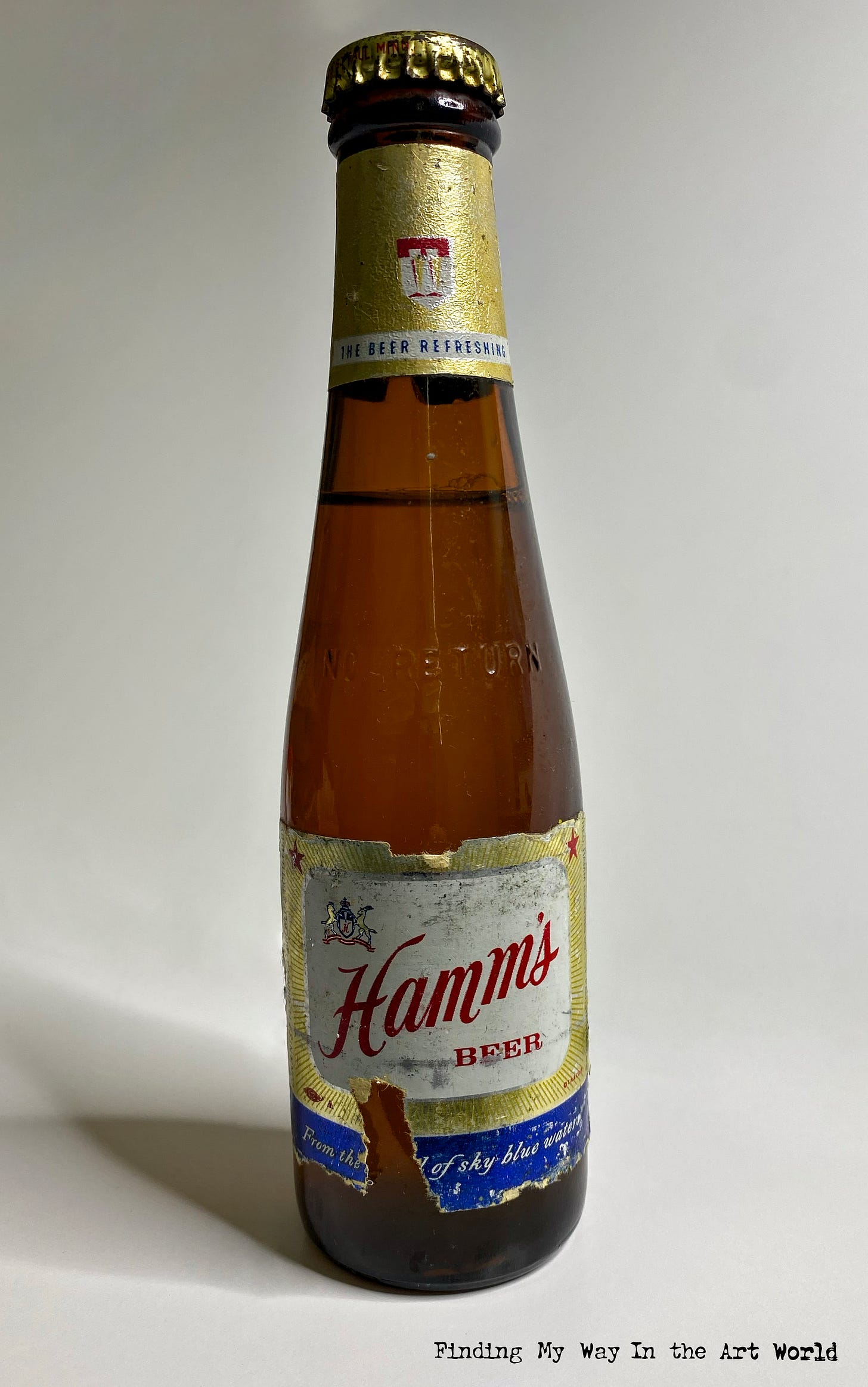
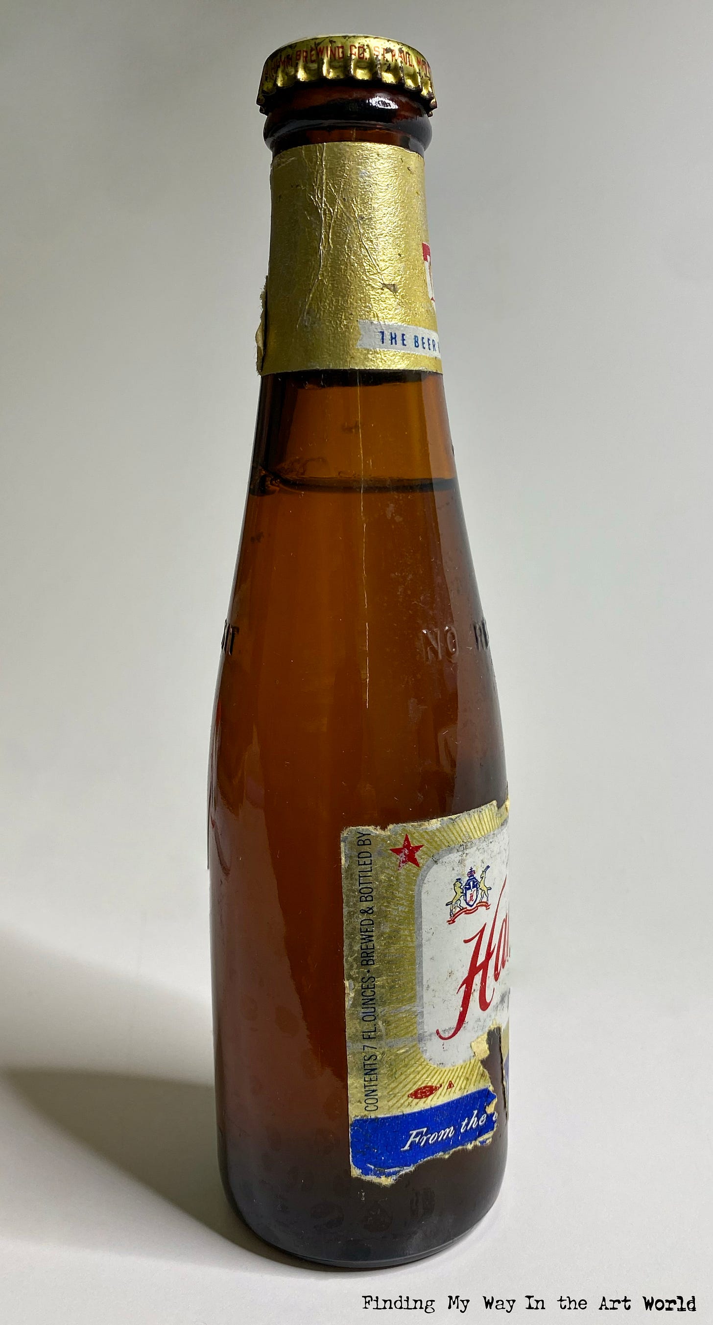
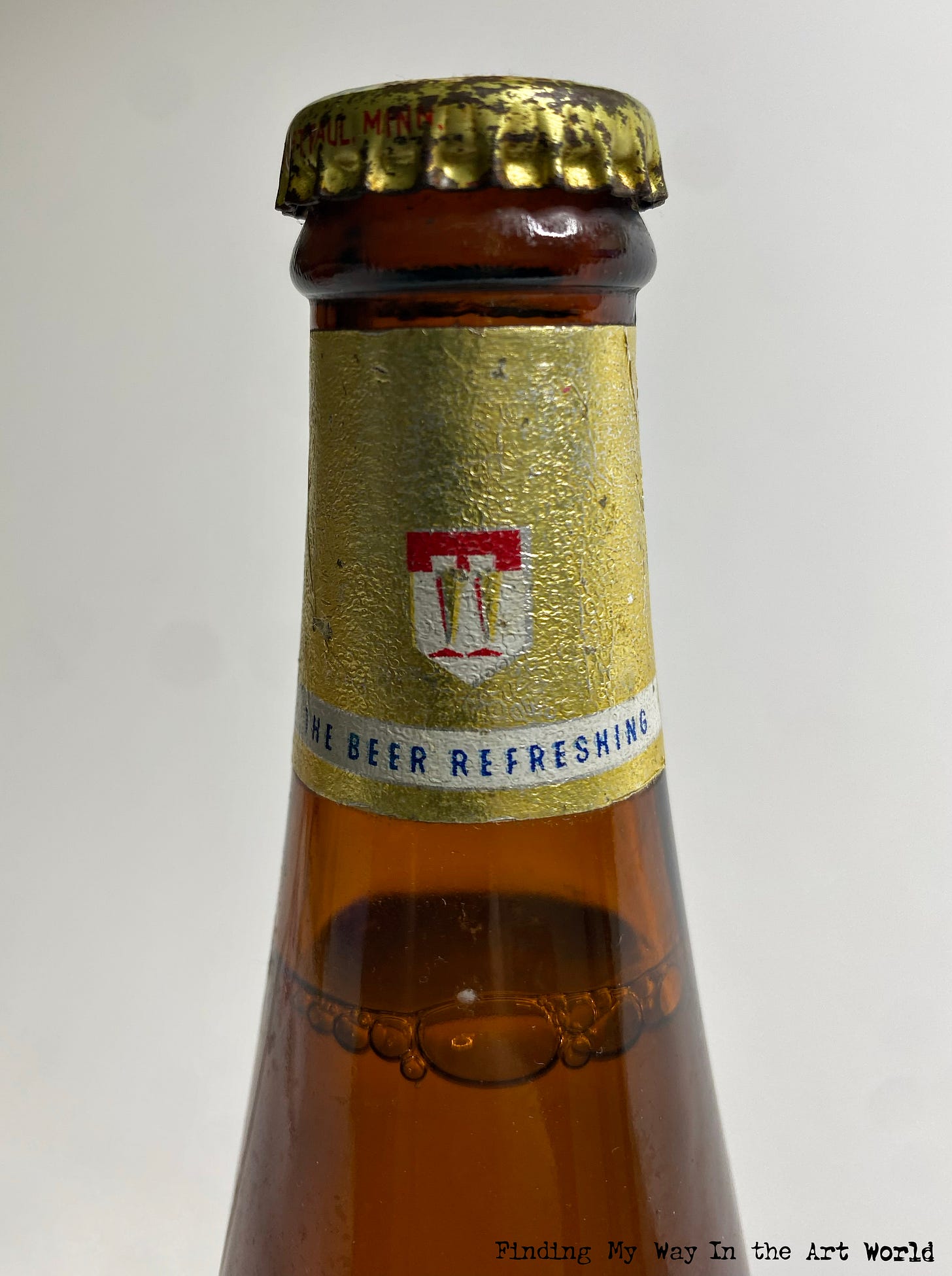
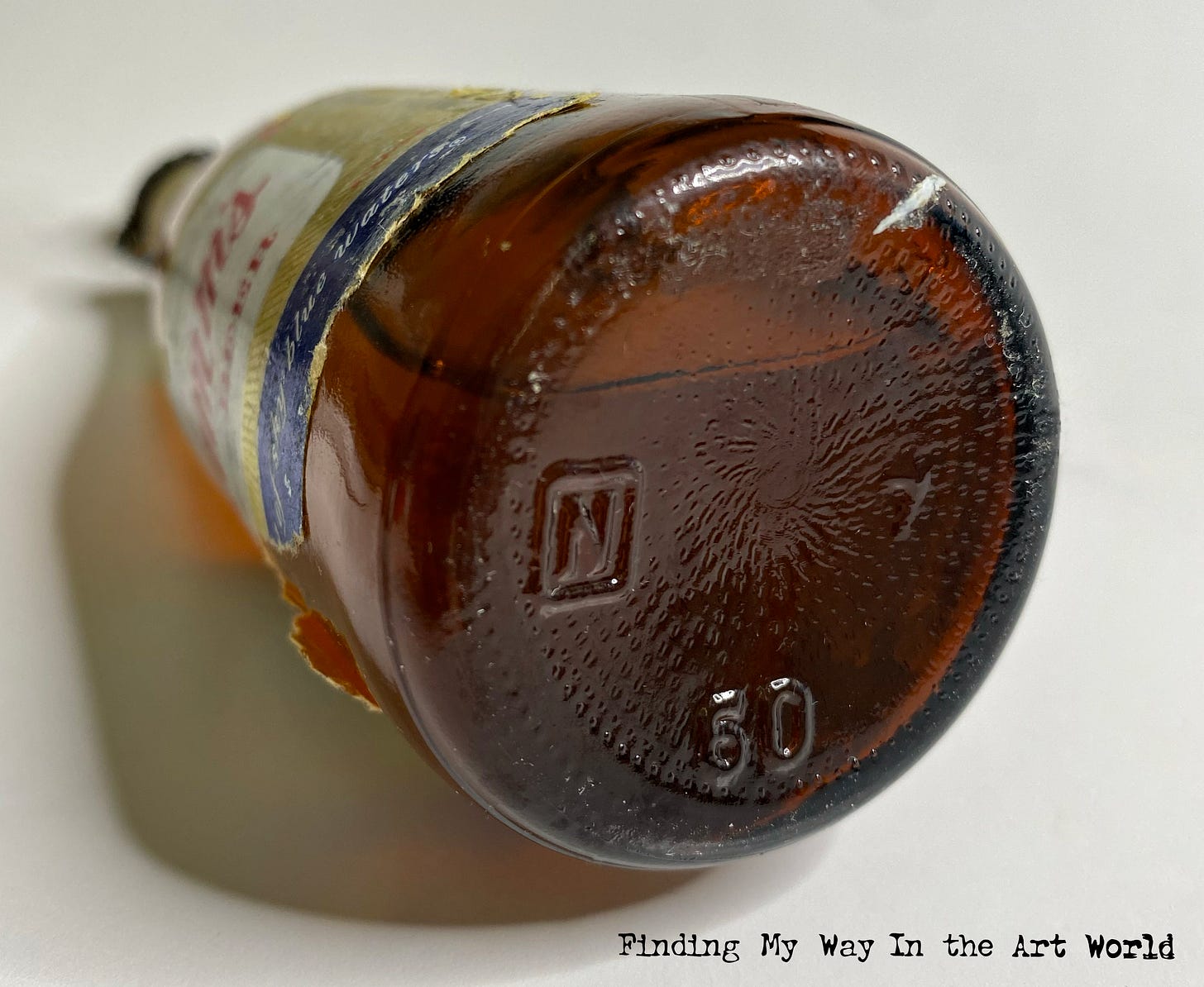
The Hamm’s Beer Bottle
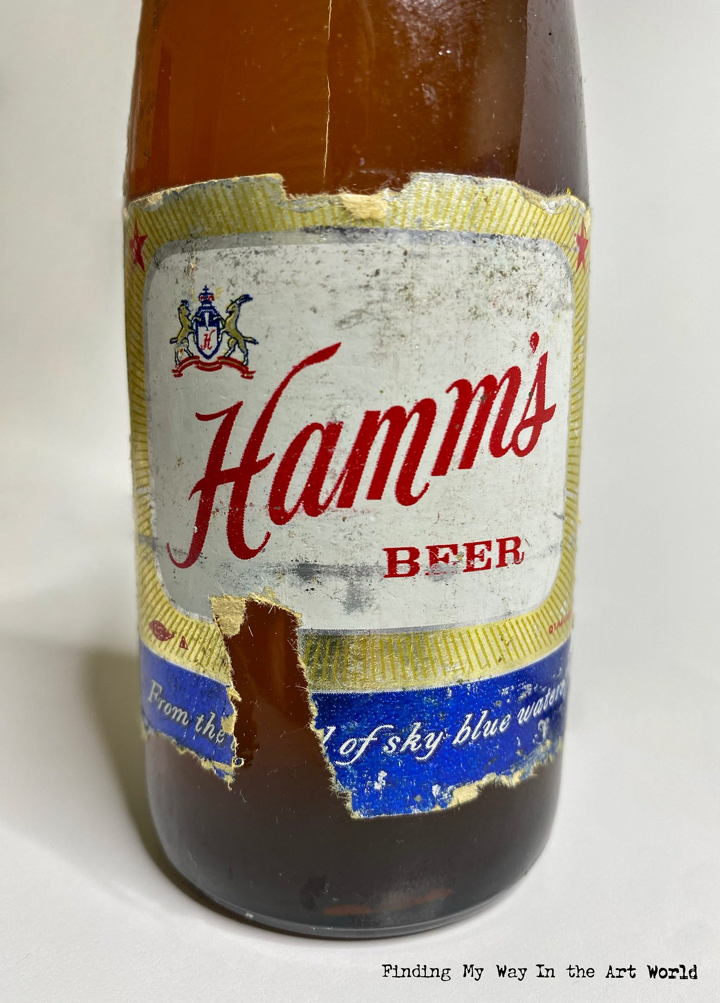
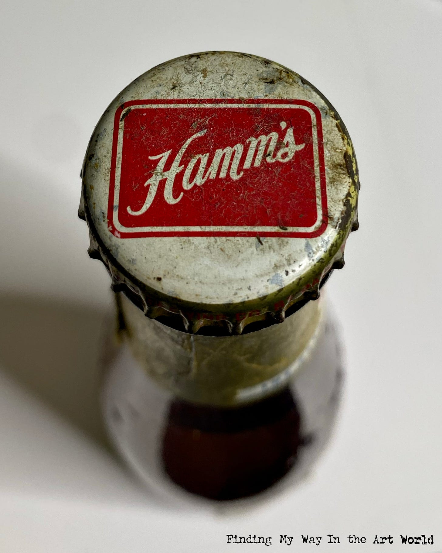
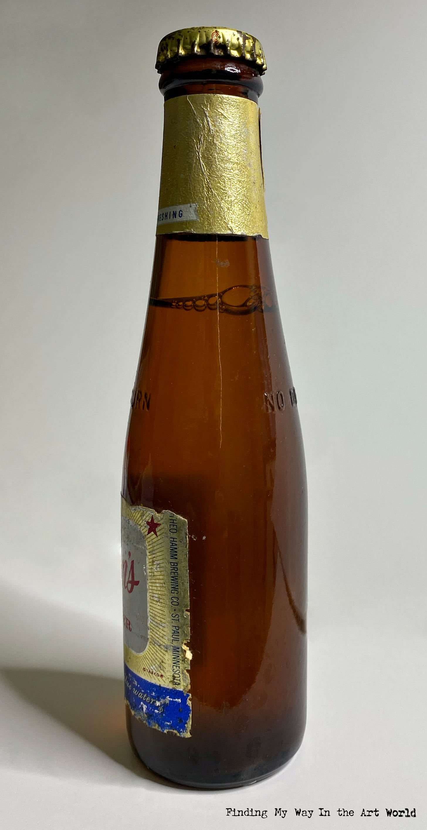
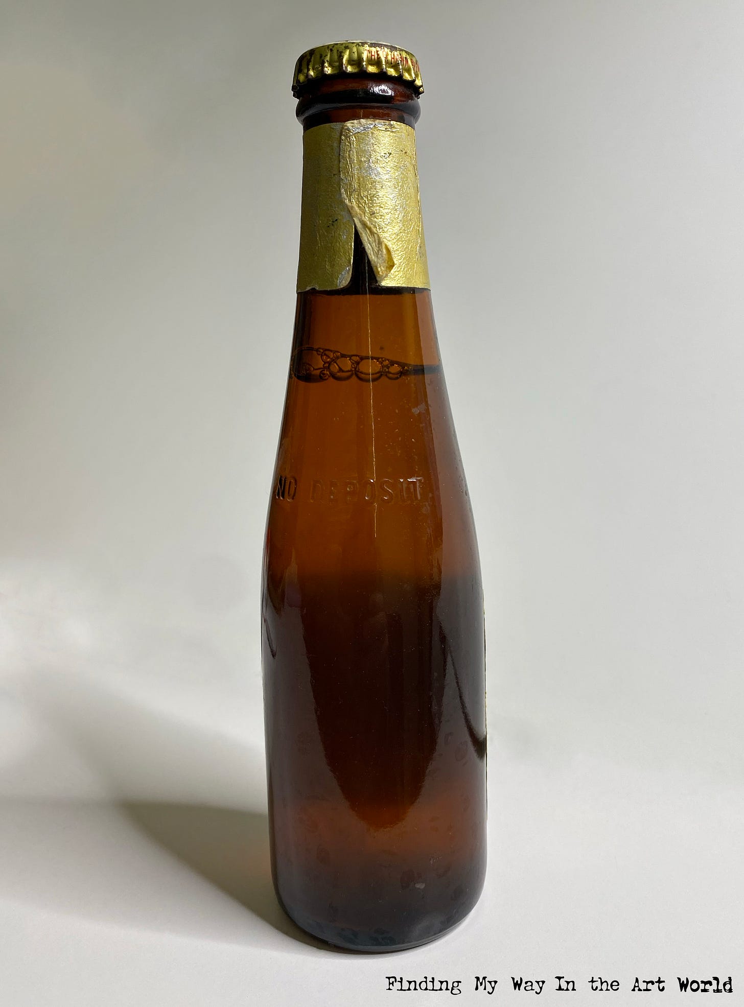
In 1958, when my dad was just 20 years old, he brought home a six-pack of Hamm's beer while living with his parents, Grandpa and Grandma Hunt. He drank five of the bottles, but the sixth one was left in the refrigerator—and there it stayed. For years, this single bottle of Hamm's beer remained untouched, becoming an unintended relic in my grandparents' home. After Grandpa Hunt passed away, Grandma Hunt continued to keep the bottle in her refrigerator, an unspoken heirloom of sorts.
When Grandma Hunt passed away, my parents took the bottle from the refrigerator in Indiana and brought it with them to their home in California. Over the years, as my parents moved from place to place, the Hamm's beer moved with them, traveling as a quiet but enduring memento of family life and homes shared across decades.
In 2024, my parents handed this peculiar piece of family history down to me. Now, the bottle rests in our refrigerator, a curious and sentimental legacy. It’s more than just an old bottle of beer—it’s a symbol of memory, of the homes we’ve lived in, the family we’ve lost, and the odd little traditions that somehow take root and stay with us. Decades after it was first chilled, this one bottle of Hamm's continues to hold a unique place in our family’s story, a reminder of beer culture and the unexpected ways objects can carry meaning through time.
View additional photos of the Hamm’s beer bottle: 7
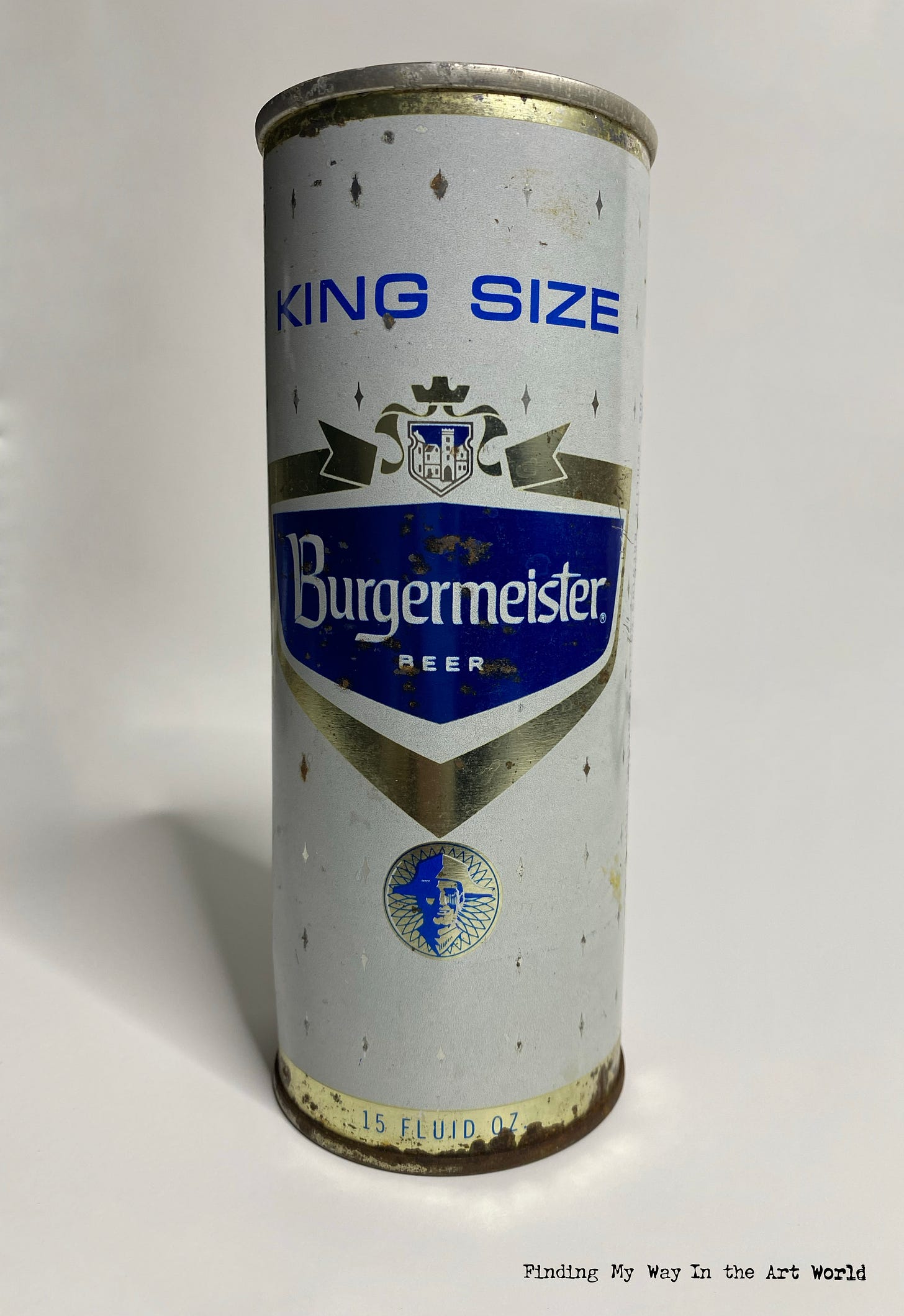
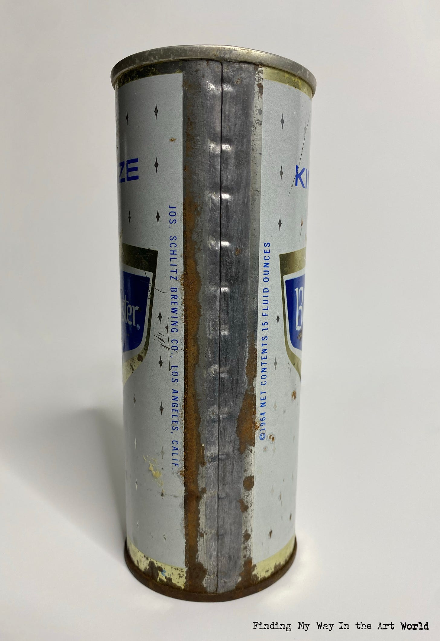
Burgermeister Beer
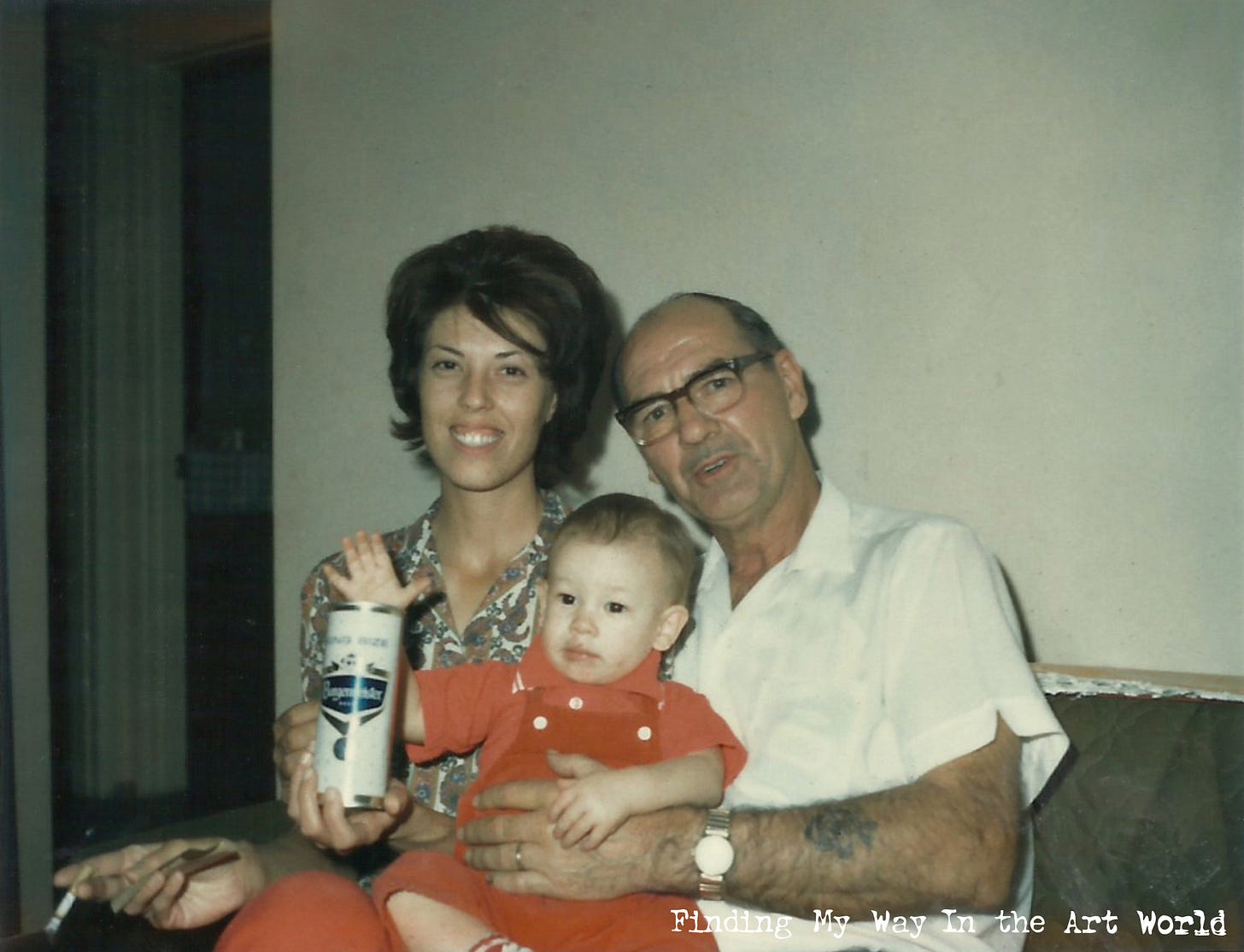
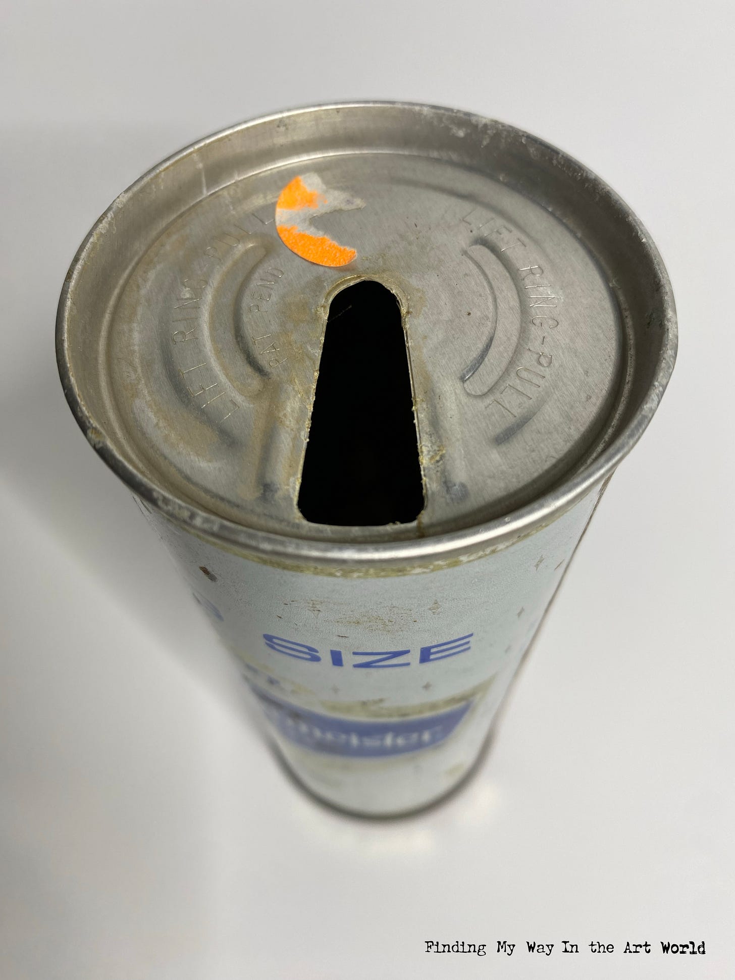
Burgermeister Beer, affectionately known as "Burgie," was a popular American lager with roots in San Francisco, California. Established in 1884 by the Enterprise Brewing Company, the brand gained recognition for its crisp, straightforward flavor and affordability, making it a favorite among working-class drinkers. The name “Burgermeister,” meaning “mayor” in German, reflected its old-world charm and European brewing heritage. Its can design evolved over the decades, but by the mid-20th century, it featured bold, blocky lettering with a crest-like logo, giving it a distinctive and recognizable appearance. In the 1950s and 1960s, Burgermeister became well-known through catchy advertising slogans and jingle-heavy radio and TV spots. Although the brand was eventually acquired and phased out in the 1970s, it remains a nostalgic symbol of mid-century American beer culture.
View additional photos of the Burgermeister beer can: 8
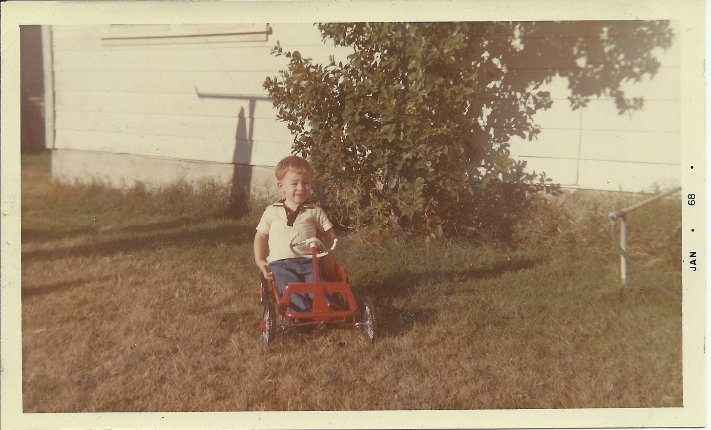
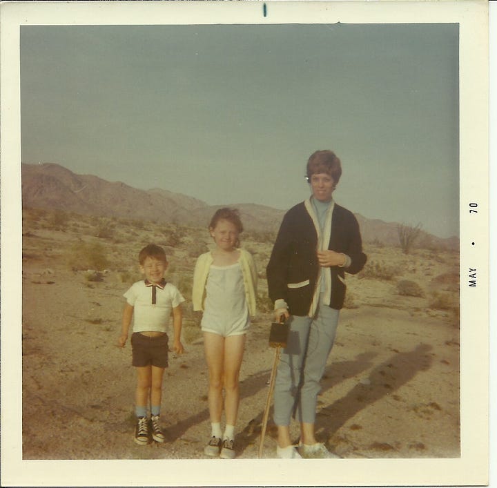
Go-cart
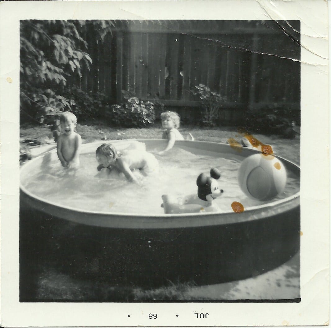
Mickey Mouse and Disney
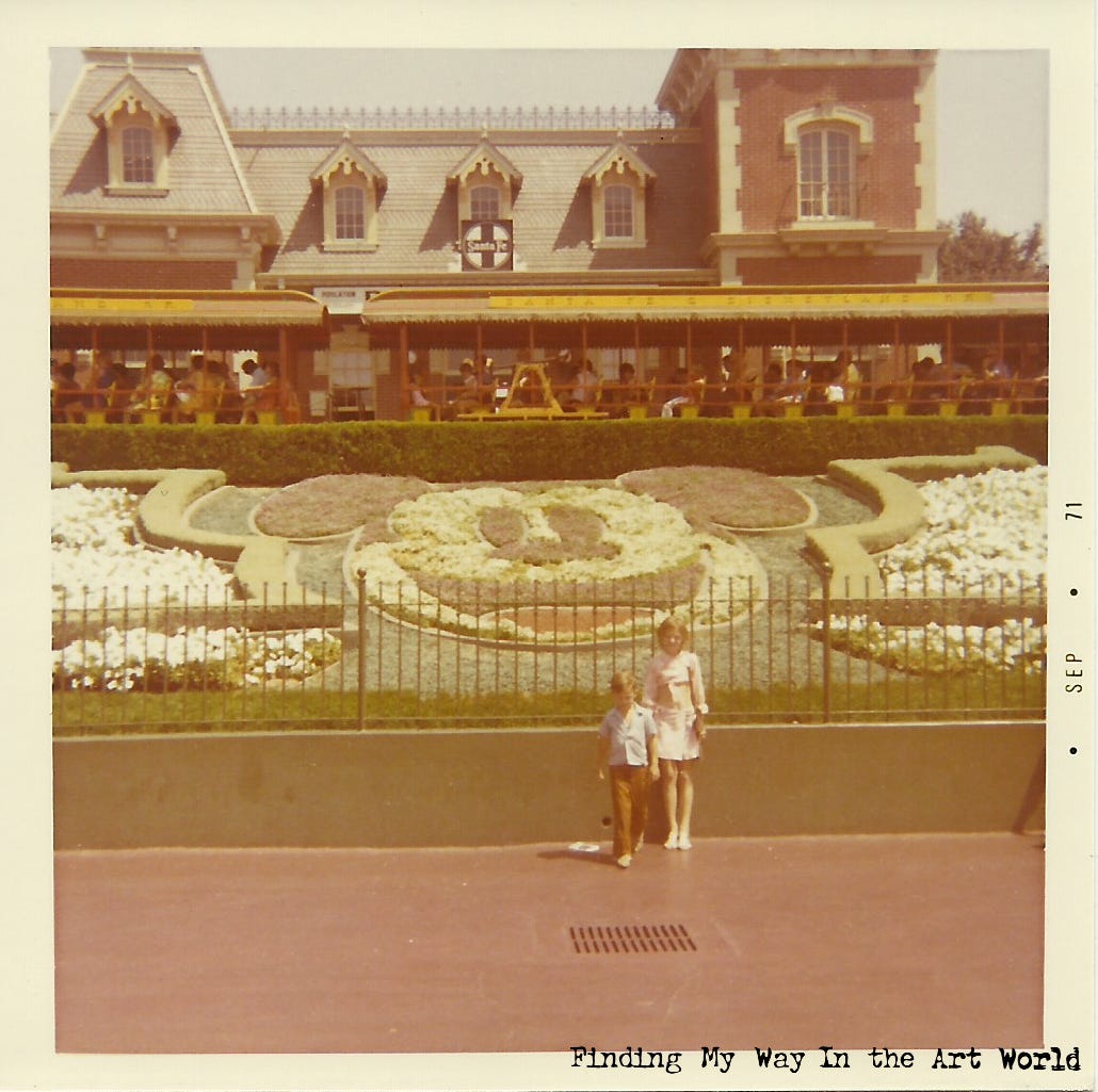
Mickey Mouse and Disney's marketing empire had a profound impact on American culture, solidifying Disney as a cornerstone of childhood and family entertainment. Mickey Mouse, already a global icon, became the centerpiece of an ever-expanding range of merchandise, from lunchboxes and clothing to toys and household items, ensuring the character was woven into the daily lives of families. The opening of Walt Disney World in 1971 further amplified Disney’s influence, creating a new cultural pilgrimage site while promoting the brand's wholesome, magical image. Television played a significant role, with shows like The Wonderful World of Disney keeping Mickey Mouse and the broader Disney brand at the forefront of family entertainment. Disney's marketing strategies emphasized nostalgia for parents and wonder for children, ensuring that Mickey Mouse remained a beloved symbol across generations, while driving the consumption of Disney products and experiences on an unprecedented scale.
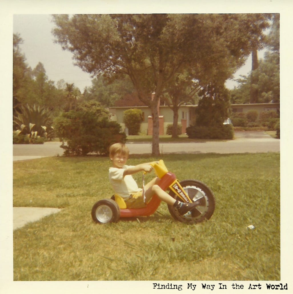
Big Wheel
What sort of mobile device were kids begging for in 1970? The Big Wheel was the vehicle of choice for most kids my age.
The Big Wheel tricycle was invented in 1969 by Ray Lohr, an employee of Louis Marx and Company. Its design was groundbreaking, featuring a low-slung, plastic frame with a large front wheel and two smaller rear wheels, offering a fun, safe, and thrilling riding experience for children. The toy quickly gained popularity due to its affordability, durability, and unique ability to let kids "drift" and spin out on sidewalks and driveways, a feature that made it feel more adventurous than a traditional tricycle. By the mid-1970s, the Big Wheel had become a cultural phenomenon, often seen in television commercials and toy catalogs, solidifying its status as a must-have for kids. Its simple, yet innovative design has left a lasting legacy, remaining a nostalgic favorite for generations.
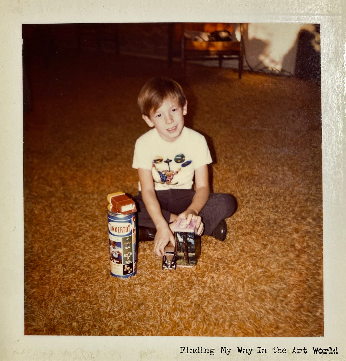
Tinkertoy
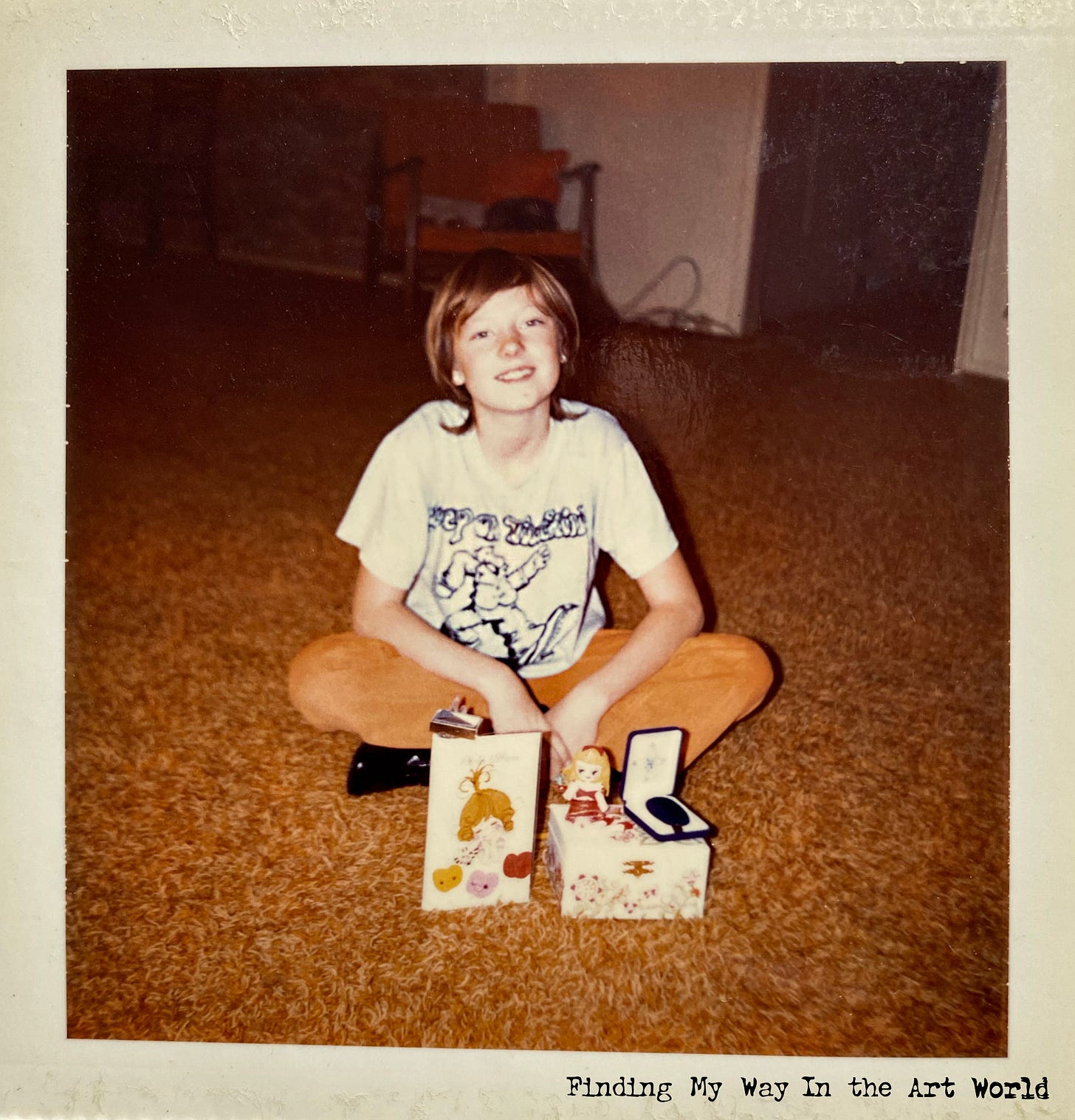
In 1971, receiving a Tinkertoy set as a gift would have been an absolute delight for a young boy, sparking endless possibilities for creativity and imagination. The cylindrical cardboard container, emblazoned with colorful illustrations of inventive contraptions, was a treasure chest of wooden spools, rods, and connectors just waiting to be transformed. It wasn’t just a toy; it was an open invitation to build bridges, towers, cars, or anything a mind could conjure. The smell of the freshly painted wood and the satisfying click of pieces snapping together made the experience tactile and immersive. Tinkertoy encouraged hands-on problem-solving and storytelling, as each creation came to life through play. It was more than a toy—it was a tool for dreaming big and bringing those dreams to life.
View the gifts that Lori and Tonie received at that time:9
Music
Growing up, vinyl records and the radio were as integral to our family life as the television, weaving music into the fabric of our daily routines. The crackle of a needle on a record, the vibrant album covers propped against the stereo, and the familiar voices of radio DJs filled our home with sound and color, shaping memories and sparking conversations. Each album we played and every song we heard became a backdrop to our lives, influencing our moods, celebrations, and even quiet moments. In this book, I’ll delve into the musical memories that left a lasting impression on me, showcasing how music not only entertained us but also became a cornerstone of our shared experiences.
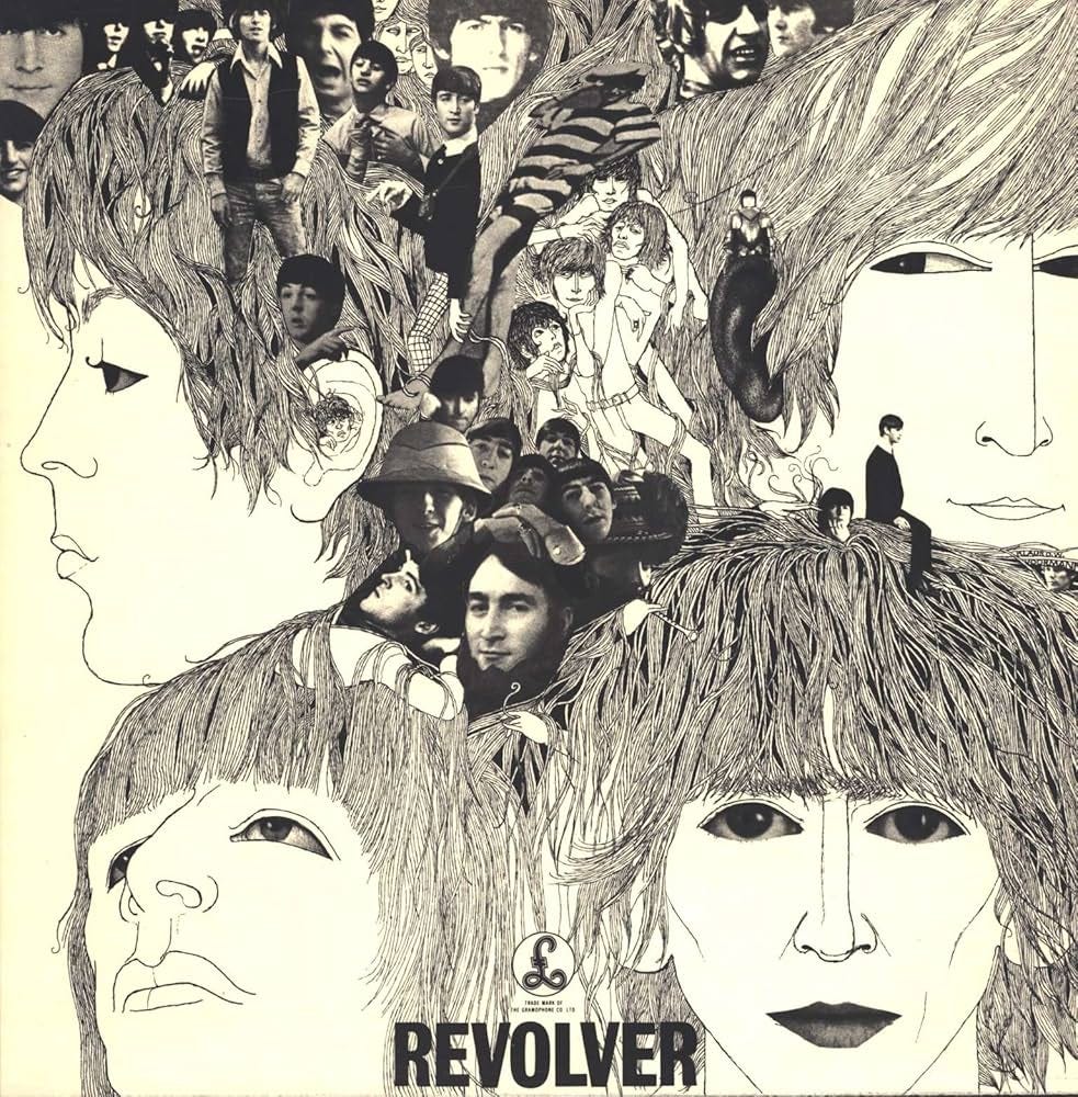
Revolver - The Beatles (August 5, 1966)
View additional album images:
The album cover for Revolver by The Beatles is an iconic piece of artwork designed by Klaus Voormann, blending surrealism with pop art. It features striking black-and-white pen-and-ink illustrations of the band members' faces, interwoven with a collage of smaller photographs and abstract elements. The intricate line work emphasizes the individuality of each member while creating a cohesive, dreamlike composition. The scattered photographic elements, cut from real images of The Beatles, add depth and texture, evoking the experimental and boundary-pushing nature of the album’s music. The title "Revolver" is understated, placed subtly at the bottom, allowing the mesmerizing artwork to take center stage. This cover became a visual representation of the band's evolution and innovative spirit during the mid-1960s.
Listen to the album on YouTube here.
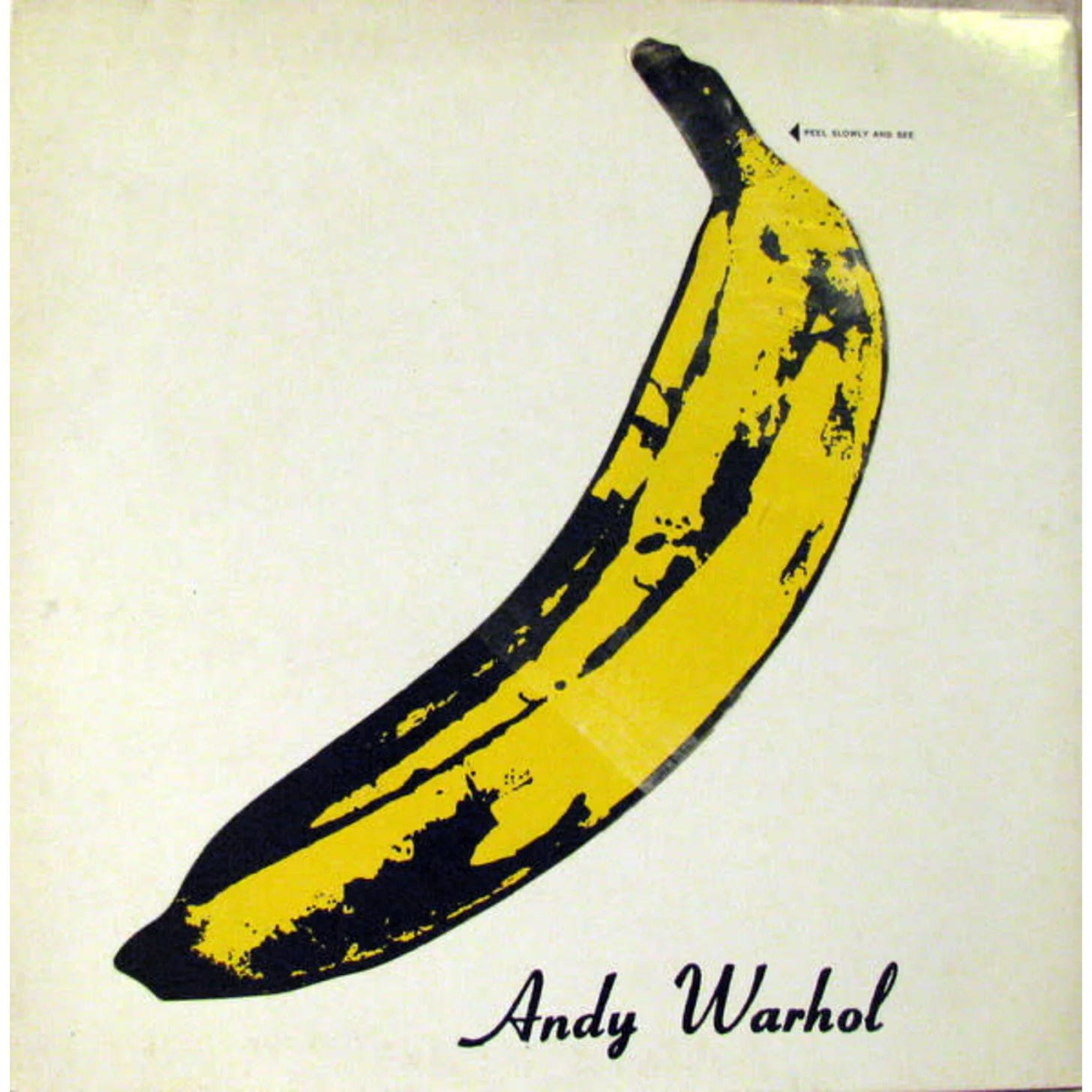
The Velvet Underground & Nico - The Velvet Underground (March 12, 1967)
View additional album images:
The album cover for The Velvet Underground & Nico is an iconic piece of pop art created by Andy Warhol, who also served as the album’s producer. The minimalist design features a bright yellow banana on a plain white background, with Warhol's signature below. A playful and interactive element is included with the words "Peel Slowly and See," inviting listeners to peel back a sticker revealing a flesh-colored banana underneath—an innovative and provocative touch that aligns with the album's avant-garde nature. The simplicity of the imagery contrasts with the groundbreaking and experimental music within, making the cover a symbol of the counterculture of the 1960s. Warhol’s distinctive pop art style and the controversial nature of the album have cemented this cover as one of the most recognizable in music history.
Listen to the album on YouTube here.
This book will also highlight popular album covers from the periods discussed, showcasing the artwork that defined the visual culture of the music industry at the time. Even if I didn’t personally own some of these albums, their cover art influenced me in various ways, as it was widely accessible and promoted through numerous outlets. Record stores prominently displayed covers to entice buyers, while TV commercials and music programs featured performers presenting their latest releases. Music magazines regularly ran articles and advertisements spotlighting album art, and friends or relatives often shared their collections, providing further exposure. Additionally, the Columbia Record Club monthly magazine, which my mom received as a member, offered yet another window into this rich visual landscape. These covers were more than packaging; they were part of the cultural zeitgeist and a significant source of artistic inspiration.
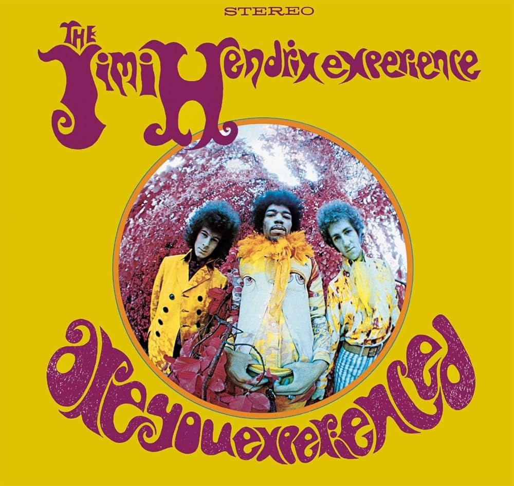
Are You Experienced - The Jimi Hendrix Experience (May 12, 1967 (UK); August 23, 1967 (US))
View additional album images:
The album cover for Are You Experienced by The Jimi Hendrix Experience is a vibrant, psychedelic masterpiece that captures the spirit of the late 1960s. Against a striking yellow background, the band members—Jimi Hendrix, Mitch Mitchell, and Noel Redding—are framed within a circular photo surrounded by rich, surreal hues of magenta foliage. Hendrix is positioned front and center, exuding charisma with his flamboyant attire, while the groovy, warped typography of the album title arcs across the bottom in bold purple, reflecting the countercultural and mind-expanding themes of the music. The design perfectly complements Hendrix's groundbreaking blend of rock, blues, and psychedelia, making the album cover as iconic as the revolutionary sound it represents.
Listen to the album on YouTube here.
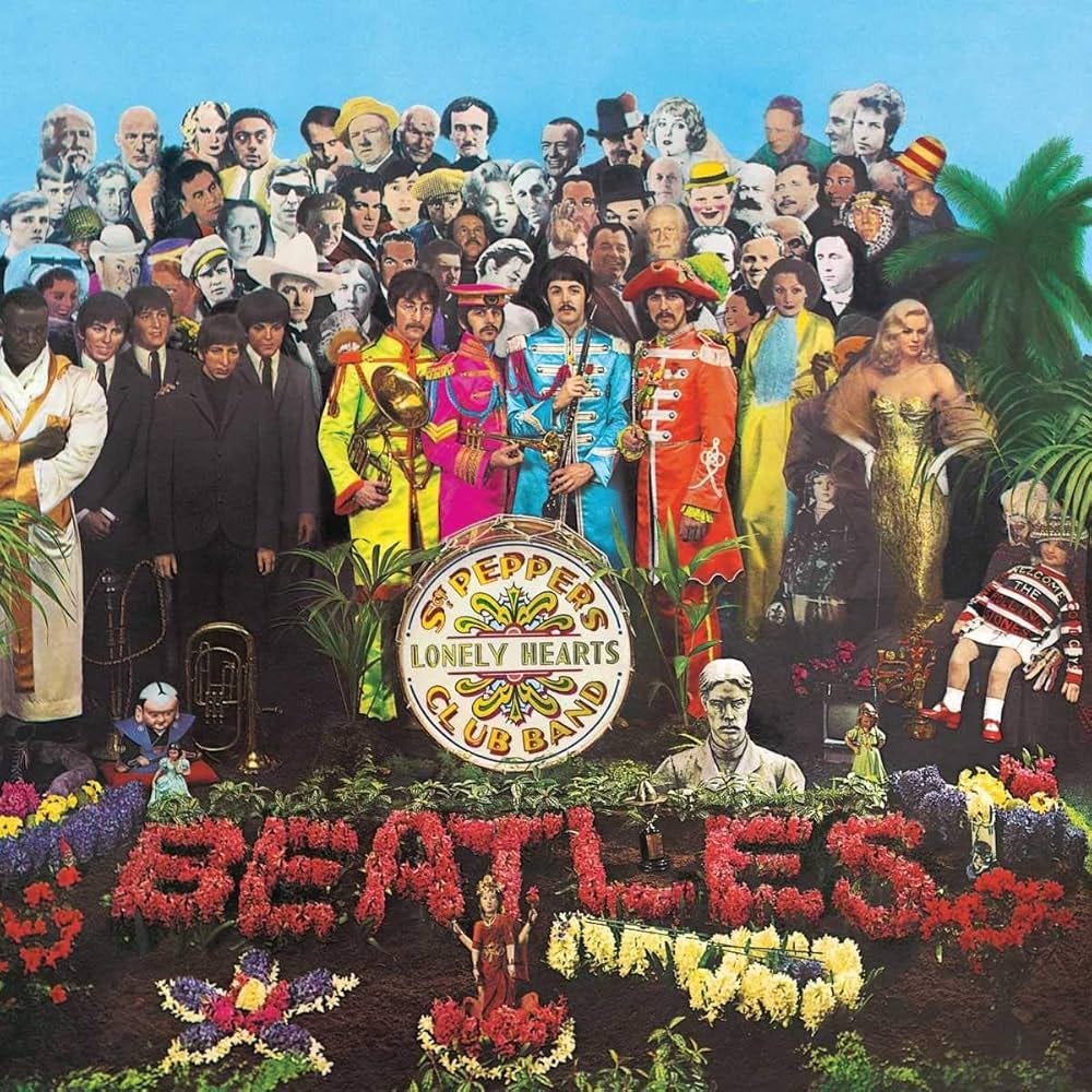
Sgt. Pepper's Lonely Hearts Club Band - The Beatles (May 26, 1967 (UK); June 2, 1967 (US))
View additional album images:
The album cover for Sgt. Pepper's Lonely Hearts Club Band by The Beatles is one of the most iconic pieces of pop art in music history. Designed by Peter Blake and Jann Haworth, it features a vibrant collage of cut-out figures from history, culture, and entertainment, arranged behind The Beatles, who are dressed in colorful, ornate military-style costumes. Standing amidst a garden of flowers spelling out "BEATLES," the band is surrounded by an eclectic cast, including Marilyn Monroe, Albert Einstein, Bob Dylan, and child star Shirley Temple. At the center is a bass drum emblazoned with the album title in bold, swirling typography. The vivid colors, meticulous arrangement, and surreal juxtapositions encapsulate the album's adventurous, experimental spirit, reflecting the era's countercultural creativity and the band's departure from their earlier image.
Listen to the album on YouTube here.
It isn’t just cover artwork that stays with us though. An iconic album cover combines striking visuals, memorable design, and a deep connection to the music it represents, often becoming as recognizable as the songs themselves. Defined by its ability to evoke emotion, tell a story, or symbolize an era, such a cover often uses bold imagery, innovative typography, and thoughtful composition to stand out. It becomes "iconic" because it resonates with people on a cultural or personal level, cementing its place in collective memory. For an artist, these covers can create patterns or composition ideas that unconsciously influence their own work. The bold use of color, symmetry, or abstract design can serve as a blueprint for experimentation, shaping decision-making in ways that blend form and meaning to capture attention and evoke lasting impressions.
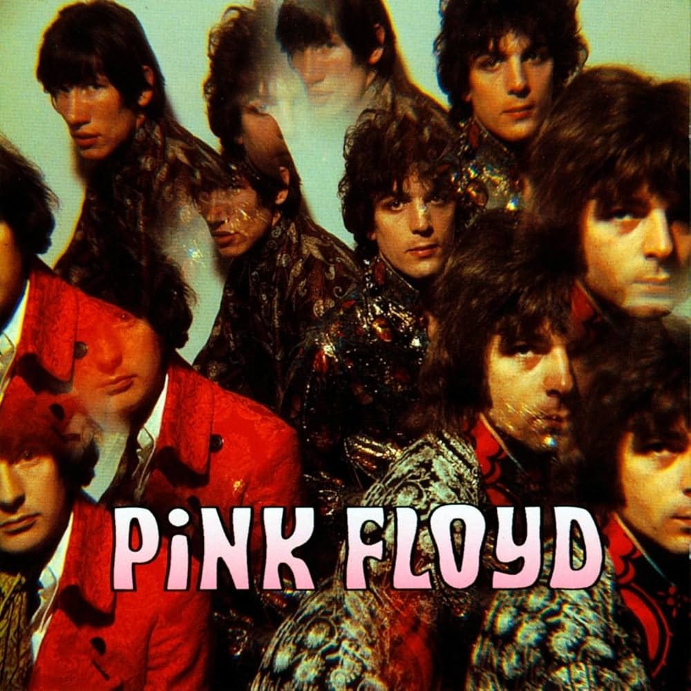
The Piper at the Gates of Dawn - Pink Floyd (August 5, 1967)
View additional album images:
The album cover of Pink Floyd's The Piper at the Gates of Dawn features a kaleidoscopic, psychedelic image of the band members, perfectly encapsulating the experimental and surreal nature of the music. The photograph, bathed in warm hues, depicts multiple overlapping images of the band members dressed in ornate, paisley-patterned clothing, creating a hallucinatory effect. This visual style mirrors the album’s explorations into uncharted sonic territories and the whimsical, dreamlike themes present in Syd Barrett’s lyrics. This artwork, reflective of the vibrant 1960s counterculture, sets the stage for the pioneering sounds within.
Listen to the album on YouTube here.
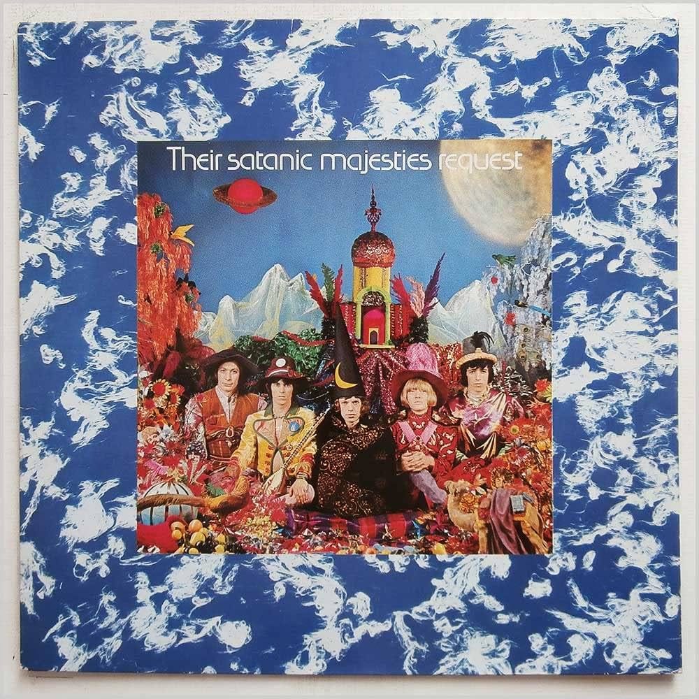
Their Satanic Majesties Request - The Rolling Stones (December 8, 1967)
View additional album images:
The album cover for Their Satanic Majesties Request by The Rolling Stones is a colorful and surreal masterpiece that reflects the psychedelic era of the late 1960s. Designed by Michael Cooper, the artwork features the band members dressed in elaborate, whimsical costumes, surrounded by a fantastical landscape of vibrant colors, ornate structures, and otherworldly elements. The central imagery resembles a kaleidoscopic fairy tale with mountains, lush foliage, and a fantastical temple in the background. The Rolling Stones appear seated in the foreground, adorned in extravagant attire, including Mick Jagger wearing a wizard's hat. The blue marbled border adds to the mystical and dreamlike quality of the piece, while the inclusion of hidden details and symbols invites closer inspection, mirroring the experimental and boundary-pushing nature of the album's music. The cover's bold, trippy aesthetic captures the spirit of its time and stands as a striking visual companion to the Stones' foray into psychedelic rock.
Listen to the album on YouTube here.
It's important to note that music records can be released in a particular year, yet you might not discover them until years later. When you finally do, they can hold significant personal meaning, even if they’re no longer the most current music of the time. To address this, I will present records according to their original release years, but I’ll also highlight those that influenced me during the specific years they became meaningful to me—whether that aligns with their release date or the year they resonated with me personally.
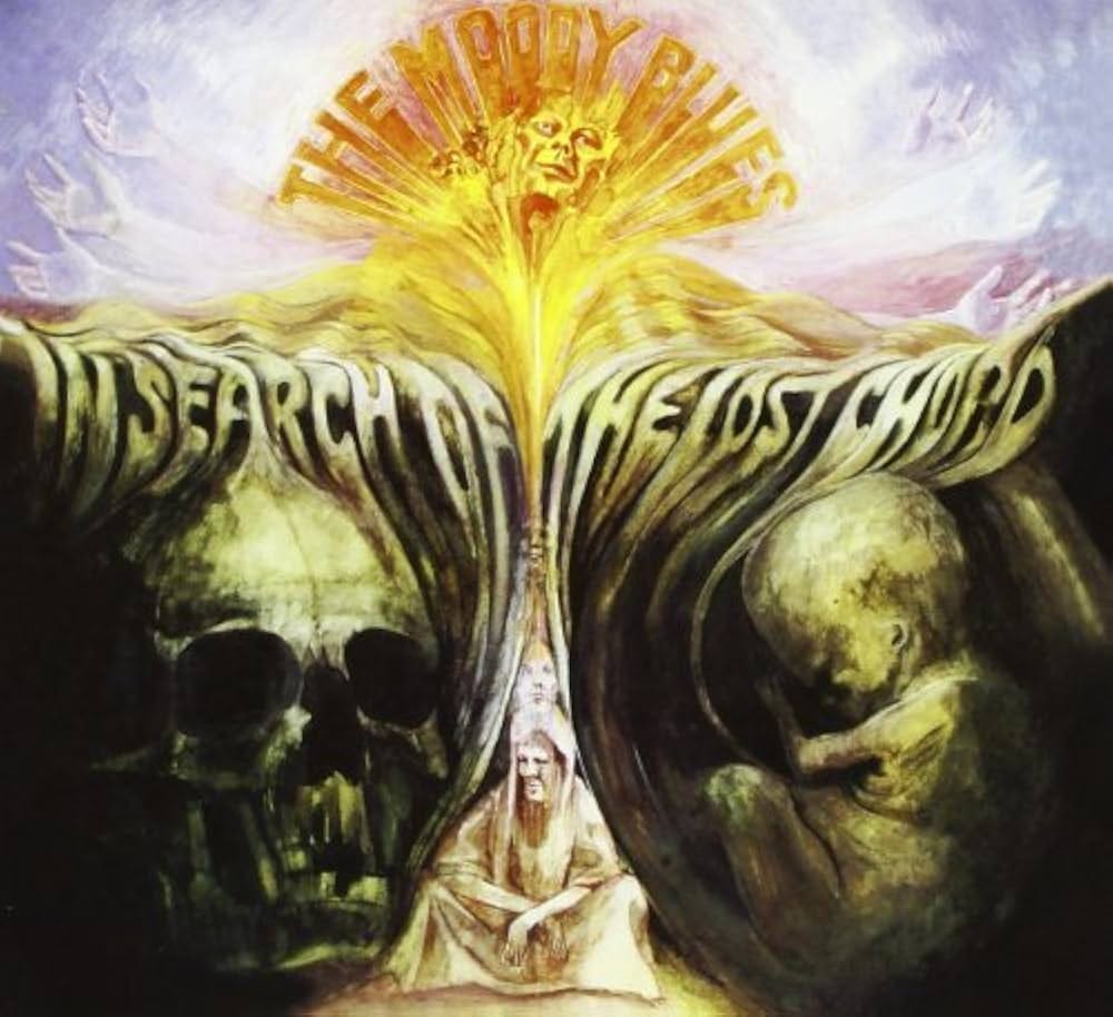
In Search of the Lost Chord - The Moody Blues (July 26, 1968)
View additional album images:
The album cover for In Search of the Lost Chord by The Moody Blues is a surreal and mystical artwork that perfectly reflects the album's themes of spiritual exploration and existential discovery. The image features a central beam of golden light radiating upward, crowned by a glowing, ethereal face that seems to symbolize enlightenment or higher consciousness. The light divides the cover into two halves: one side depicts a skeletal skull, representing mortality and the tangible, while the other shows a fetal figure curled in a womb, symbolizing creation, life, and potential. At the base of the radiant column, a seated figure appears meditative, connecting the elements of life, death, and spiritual awakening. The album's title is seamlessly integrated into the organic shapes of the artwork, adding to its dreamlike quality. The use of soft yet vivid colors and intricate detailing evokes a sense of mystery and wonder, making it a visual counterpart to the album's psychedelic and introspective sound.
Listen to the album on YouTube here.
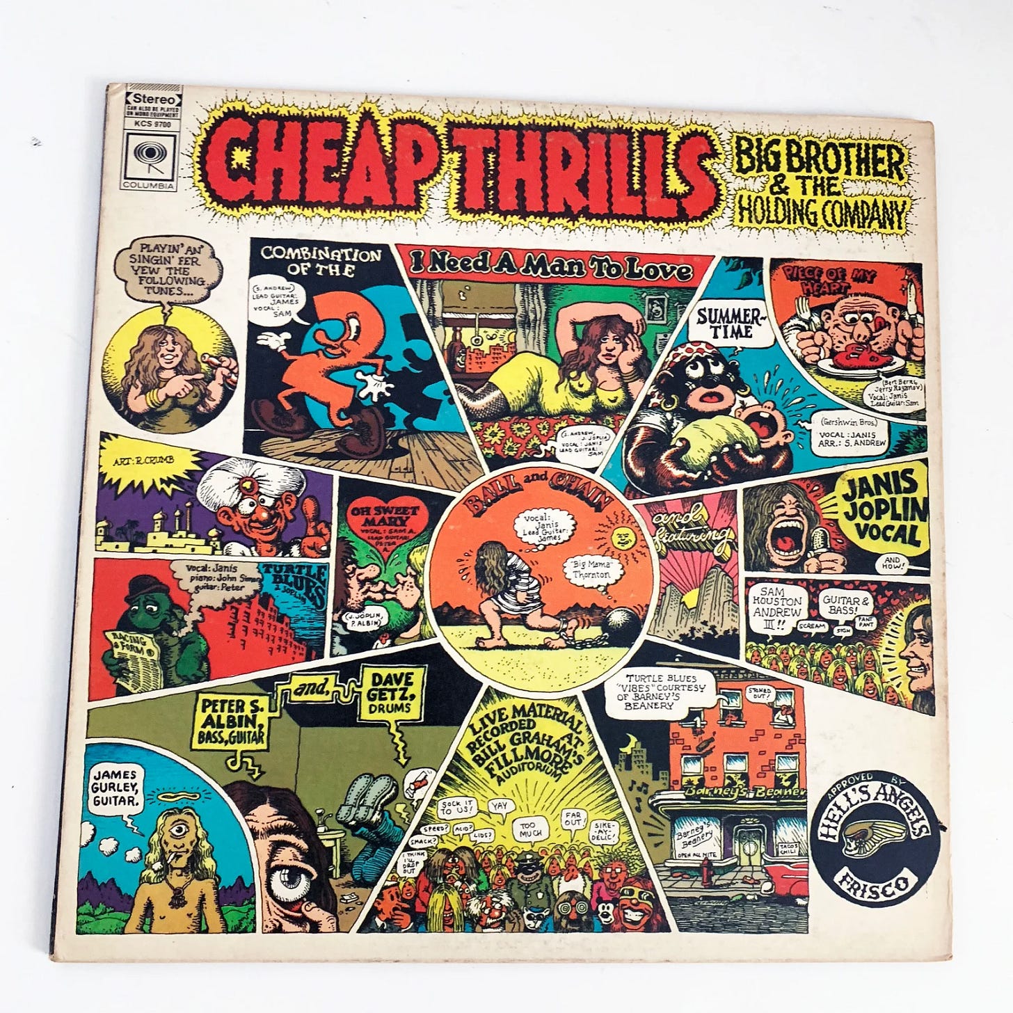
Cheap Thrills - Big Brother & the Holding Company (August 12, 1968)
View additional album images:
The album cover for Cheap Thrills by Big Brother and the Holding Company is a vibrant and chaotic comic book-style illustration created by underground cartoonist Robert Crumb. The artwork features a series of hand-drawn panels, each one bursting with bold colors, exaggerated characters, and whimsical, irreverent scenes that echo the raw, unpolished energy of the album. The panels highlight track titles like "Piece of My Heart" and "Ball and Chain," often depicted in humorous or surreal ways, with exaggerated caricatures of Janis Joplin and the band. One notable and provocative detail in the depiction of Joplin is that her nipples are visibly sticking out, a bold and risqué artistic choice that underscores the uninhibited and rebellious tone of the era. Crumb’s signature style gives the cover a countercultural, psychedelic feel, perfectly capturing the rebellious spirit of the late 1960s. The collage-like arrangement, framed by jagged lettering for the album’s title, creates a sense of movement and intensity, mirroring the emotional highs and gritty performances found in the music itself. This iconic artwork is not just a visual companion to the album but a defining piece of 1960s pop culture.
Listen to the album on YouTube here.
The Rapid Release Dates of Records
After the late 1960s, the frantic pace of album releases began to slow down somewhat for many rock bands, and they adopted a more relaxed approach to releasing records. Several factors contributed to this shift:
1. Creative and Artistic Evolution
By the early 1970s, rock music had matured as an art form, with many bands prioritizing quality over quantity. The focus shifted from quickly capitalizing on momentum to crafting more ambitious, cohesive works. For instance, albums like Pink Floyd's The Dark Side of the Moon (1973) or Led Zeppelin's Physical Graffiti (1975) reflected extended writing, recording, and production processes that required more time.
2. The Beatles' Influence After Their Breakup
While The Beatles had set a precedent for prolific output, their breakup in 1970 marked the end of that era of rapid releases. The music world began to adjust, with artists and bands taking more time to create albums. Without the pressure of competing directly with The Beatles, many acts began to work at their own pace.
3. Rise of the Album as an Artistic Statement
The album-as-a-complete-work concept gained prominence, with artists focusing on creating thematically and sonically unified pieces. This naturally required more time, as seen with albums like Fleetwood Mac's Rumours (1977) or The Who's Quadrophenia (1973). Longer production cycles allowed for more meticulous songwriting and studio experimentation.
4. Economic and Tour Considerations
As rock bands became massive touring acts, the importance of live performances grew. Touring schedules began to dominate the workload, leaving less time for rapid-fire album releases. Tours themselves became major sources of revenue and were used to promote existing albums rather than rushing to produce new ones.
5. Changing Audience Expectations
The music audience also matured, with listeners becoming more patient and willing to wait longer for new releases, especially from established artists. Fans increasingly valued quality over sheer frequency of output.
Exceptions
Of course, not all bands slowed down—some, like Creedence Clearwater Revival, continued their prolific streak into the early 1970s. However, by the mid-1970s, most major acts were releasing albums every two to three years, as opposed to the six-month cycle common in the 1960s.
In summary, after the late 1960s, the breakneck pace of album releases slowed as rock music evolved. Bands began to take their time, resulting in more thoughtfully crafted albums, longer tours, and a shift in how artists approached their careers. This ultimately allowed for the creation of many timeless and iconic records in the 1970s and beyond, as we shall see.
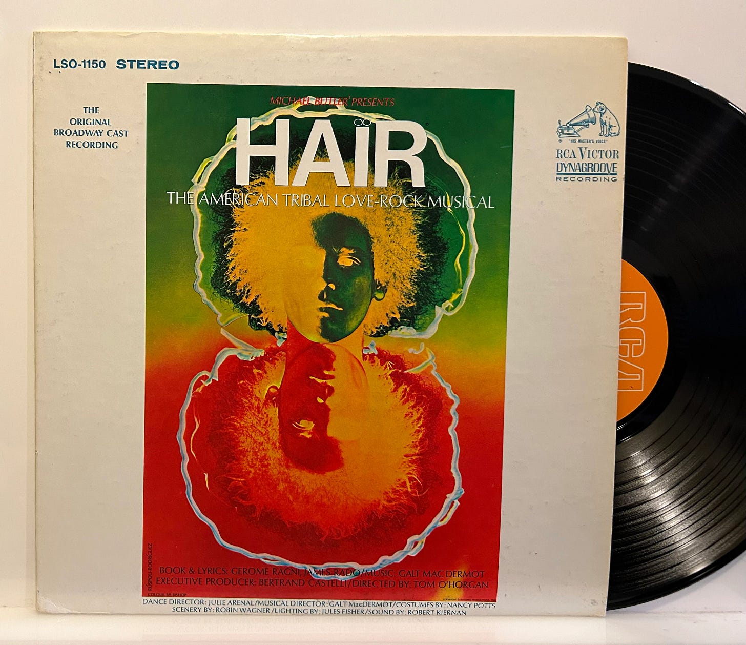
Hair: The Original Broadway Cast Recording (1968)
View additional album images: 10
The album cover for Hair: The Original Broadway Cast Recording is a vibrant, psychedelic composition that perfectly encapsulates the countercultural themes of the musical. Dominating the cover is a striking image of a person with a bold afro, rendered in an electrifying color gradient of fiery reds, oranges, yellows, and greens, creating a luminous, almost otherworldly effect. The figure’s face appears serene and introspective, while a mirrored, upside-down reflection of the head below adds a sense of duality and depth. Surrounding the central image, a glowing outline reinforces the psychedelic feel, evoking a halo-like radiance. The bold title "HAIR" is prominently displayed at the top, with the subtitle "The American Tribal Love-Rock Musical" emphasizing the production's revolutionary mix of themes. This cover design, with its vivid colors and surreal imagery, visually embodies the spirit of love, rebellion, and freedom that defined both the musical and the 1960s counterculture.
Listen to the album on YouTube here.
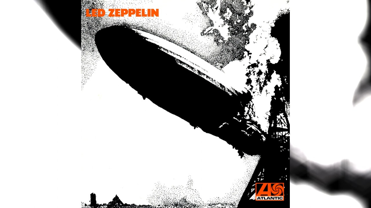
Led Zeppelin - Led Zeppelin (January 12, 1969)
View additional album images: 11
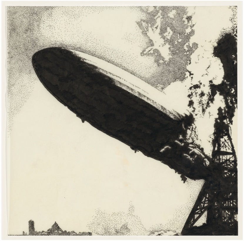
The album cover for Led Zeppelin's self-titled debut album is iconic in its stark simplicity and dramatic impact. It features a pen-and-ink illustration of the Hindenburg disaster, capturing the infamous moment of the airship's fiery descent in 1937. The high-contrast black-and-white design emphasizes the dramatic contours of the collapsing dirigible, giving it a raw, graphic quality that amplifies its intensity. The bold, orange "LED ZEPPELIN" text in the upper left corner provides the only splash of color, standing out against the monochromatic illustration and asserting the band's powerful arrival. Designed by George Hardie, the artwork is not just a depiction of historical tragedy but a metaphor for the explosive energy and groundbreaking innovation that the band would come to symbolize. The dynamic pen-and-ink style perfectly complements the album's heavy, thunderous sound, making it one of the most striking and memorable album covers in rock history.
Listen to the album on YouTube here.
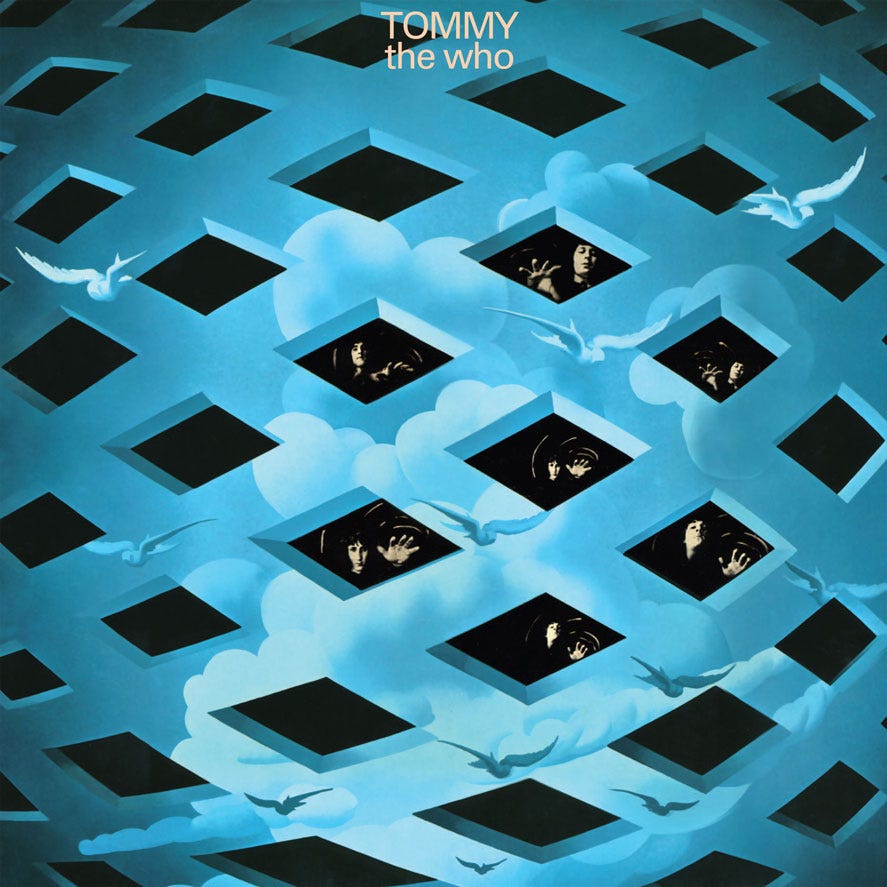
Tommy - The Who (May 23, 1969)
View additional album images: 12
The cover artwork for Tommy by The Who is a striking visual representation of the album's complex and surreal themes. Designed by Mike McInnerney, the artwork features an intricate lattice of diamond-shaped cutouts floating amidst a dreamy, cloud-filled blue sky. Each diamond opening reveals fragmented images of band members' faces, creating a sense of entrapment and introspection. The inclusion of white doves flying across the scene adds an ethereal quality, symbolizing freedom and spiritual awakening. The surreal, almost otherworldly design mirrors the rock opera's narrative of a boy's journey through trauma, isolation, and eventual enlightenment, making the artwork as thought-provoking as the music itself.
Listen to the album on YouTube here.
The Radio
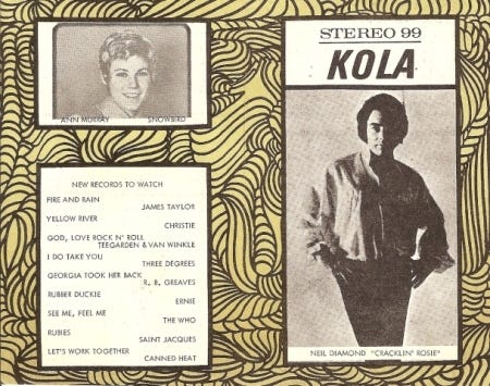
In the early 1970s, Southern California’s KOLA 99 FM was a gateway to the vibrant world of music for our family, shaping our listening habits and influencing the records we brought home. With its expertly curated playlists, the station introduced us to a wide range of rock, pop, and soul hits, creating a soundtrack for our lives. KOLA 99's charismatic DJs, warm radio jingles, and seamless flow of chart-topping songs turned car rides and evenings at home into shared musical experiences. The exposure to fresh music and rising stars often guided our trips to the record store, where we eagerly sought out the albums and singles we’d heard on air. KOLA 99 wasn’t just a radio station; it was a trusted voice in our musical discovery and a key part of our family’s connection to the evolving sounds of the era.
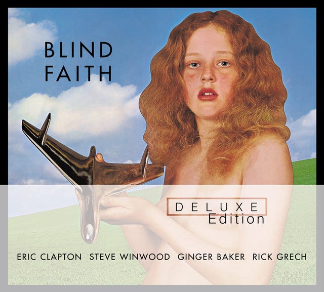
Blind Faith - Blind Faith (August 9, 1969)
View additional album images: 13
The album cover for Blind Faith's self-titled debut album features a provocative and controversial image that immediately captures attention. Created by photographer Bob Seidemann, the artwork depicts a young female, with her nude breasts showing, holding a shiny, futuristic object resembling an airplane or spacecraft. Set against a simple background of green fields and a blue sky, the composition evokes a sense of innocence juxtaposed with modernity and technological ambition. The title "Blind Faith" is understated, letting the imagery dominate and provoke interpretation. This cover stirred significant controversy upon its release in 1969, with some seeing it as an artistic statement about purity and progress, while others criticized it as exploitative. Despite the controversy, the cover remains one of rock history's most memorable and striking visual statements, reflecting the boldness of the era's artistic expression.
Listen to the album on YouTube here.
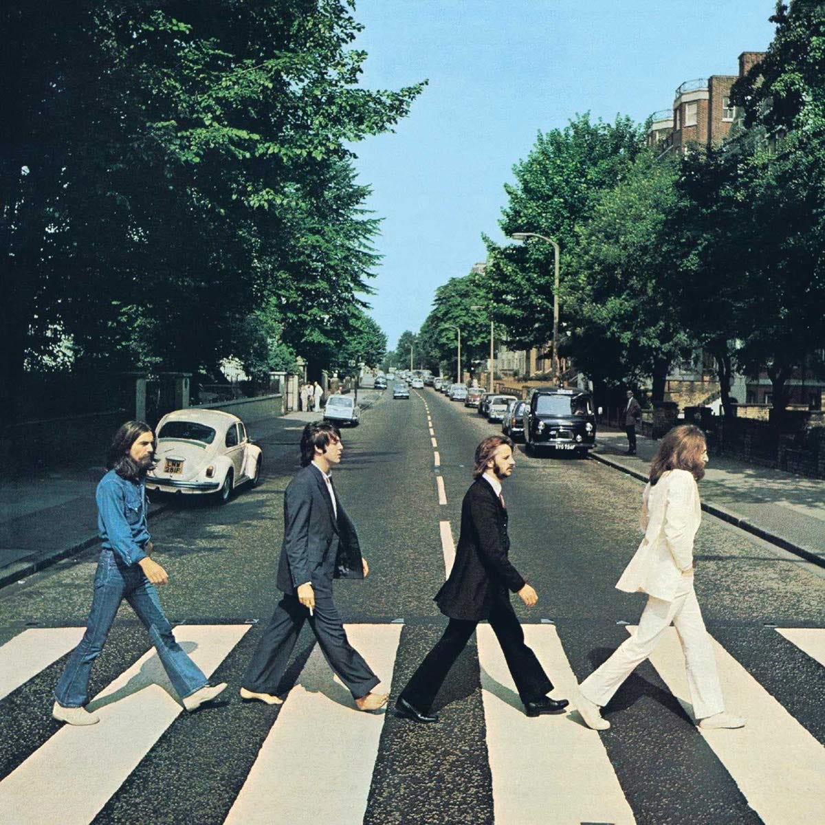
Abbey Road - The Beatles (September 26, 1969)
View additional album images: 14
The iconic cover of Abbey Road by The Beatles captures the four band members—George Harrison, Paul McCartney, Ringo Starr, and John Lennon—walking in unison across a zebra crossing outside EMI Studios on Abbey Road in London. Photographed by Iain Macmillan, the image features a crisp, sunny day and a straightforward composition, emphasizing the simplicity and familiarity of the scene. Each member's outfit reflects their individual styles, with Lennon dressed in a white suit, McCartney barefoot and holding a cigarette, Starr in a formal black suit, and Harrison in casual denim. In the background, a Volkswagen Beetle and other cars add a sense of everyday normalcy, contrasting the surreal fame of the band. This cover, devoid of text or embellishments, became one of the most recognizable and imitated in music history, symbolizing The Beatles' enduring cultural influence and marking the end of an era for the group.
Listen to the album on YouTube here.
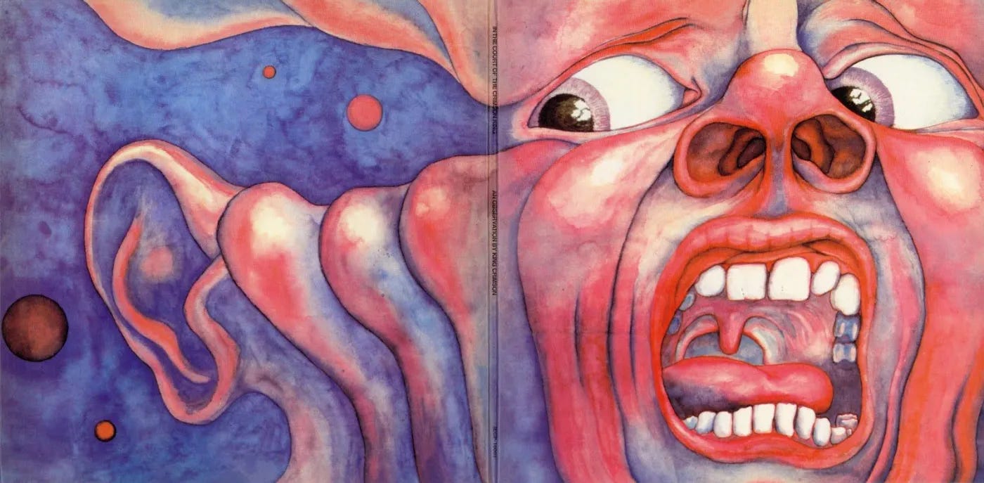
In the Court of the Crimson King - King Crimson (October 10, 1969)
View additional album images: 15
The cover of In the Court of the Crimson King by King Crimson is an unforgettable and haunting piece of art that captures the intensity of the album's themes. Painted by Barry Godber, a computer programmer and artist who tragically passed away shortly after the album's release, the artwork features a surreal and grotesque depiction of a screaming face. The bright, exaggerated colors—red, pink, and blue—accentuate the raw emotion and discomfort of the expression, with bulging eyes, flared nostrils, and bared teeth capturing a moment of existential dread. On the full gatefold spread, the face extends, revealing an ear and surreal cosmic elements that evoke both humanity and otherworldliness. The visceral, almost tortured quality of the artwork complements the groundbreaking and intense music on the album, making it a visual and auditory masterpiece. The cover has become iconic, symbolizing the progressive rock genre and remaining a touchstone of evocative album design.
Listen to the album on YouTube here.
The Influence of Songs
Between 1966 and 1971, American pop music experienced an explosion of creativity, marked by the rise of iconic hits and transformative albums. The Beatles led the charge with groundbreaking records like Revolver (1966) and Sgt. Pepper's Lonely Hearts Club Band (1967), reshaping the landscape of rock and pop. Motown continued its dominance with chart-topping acts such as The Supremes and Marvin Gaye, while The Beach Boys delivered their masterpiece Pet Sounds in 1966, blending intricate harmonies with innovative production. Pop music during this era embraced elements of rock, soul, and psychedelia, reflecting the cultural shifts and experimental spirit of the time.
In the country music scene, artists like Johnny Cash, Tammy Wynette, and Merle Haggard brought depth and authenticity to the genre. Wynette's "Stand by Your Man" (1968) and Haggard's "Okie from Muskogee" (1969) offered a blend of traditional country sounds with poignant social commentary. Meanwhile, crossover hits such as Glen Campbell's "Rhinestone Cowboy" and Lynn Anderson's "Rose Garden" hinted at the growing overlap between country and pop audiences. Both genres began to tackle socially conscious themes, responding to the Vietnam War and civil rights movements, signaling a broadening of their appeal and setting the stage for the cultural and musical evolutions of the 1970s.
Songs that had an influence during this 5 year period, whether from a record or the radio:
Hank Williams, Jambalaya (On The Bayou)
Jimmy Dean, Sixteen Tons
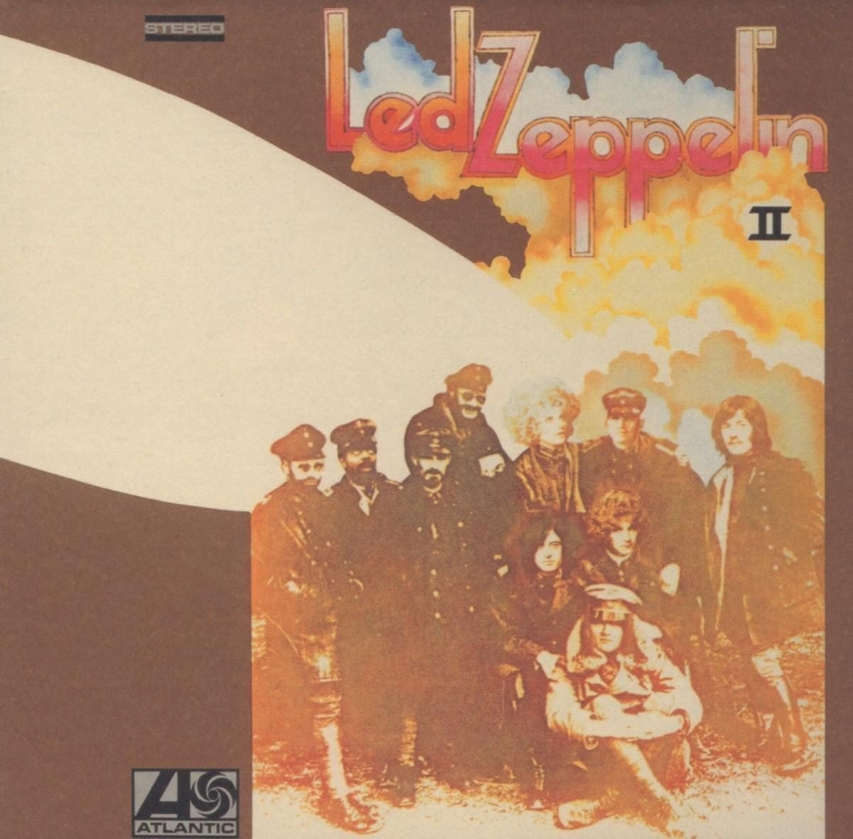
Led Zeppelin II - Led Zeppelin (October 22, 1969)
View additional album images: 16
The album cover for Led Zeppelin II features a sepia-toned montage of the band members and a group of historical figures, including a World War I-era fighter squadron, which adds an air of mystique and timelessness to the design. The artwork, created by David Juniper, was inspired by a vintage photograph of the "Jasta 11" flying squadron, which was part of the famed "Flying Circus" led by the legendary Red Baron, Manfred von Richthofen. The inclusion of Led Zeppelin's faces alongside these historical figures creates a surreal juxtaposition. The band’s name is displayed in bold, colorful, and stylized lettering at the top, with billowing clouds in the background evoking a sense of drama and grandeur. The minimalist color palette of brown, cream, and muted tones enhances the vintage aesthetic, while the collage format underscores the experimental and innovative spirit of the album itself. The artwork captures the raw energy and larger-than-life persona of Led Zeppelin during this iconic period.
Listen to the album on YouTube here.
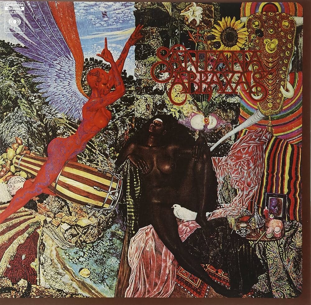
Abraxas - Santana (September 23, 1970)
View additional album images: 17
The album cover for Santana's Abraxas is a mesmerizing collage of surrealism, mysticism, and vivid color. It features a striking artwork titled "Annunciation" by Mati Klarwein, which depicts a winged red nude bare-breasted female riding a conga drum and a reclining nude bare-breasted black female draped in fabric, exuding an air of serenity and sexuality. The lush, dreamlike background intertwines natural elements like flowers and landscapes with cosmic and mystical imagery, creating a visual representation of the album's eclectic blend of Latin rhythms, rock, and spiritual themes. The intricate details and symbolic undertones of the artwork perfectly complement Santana's groundbreaking music, capturing the era's psychedelic and transcendent spirit.
Listen to the album on YouTube here.
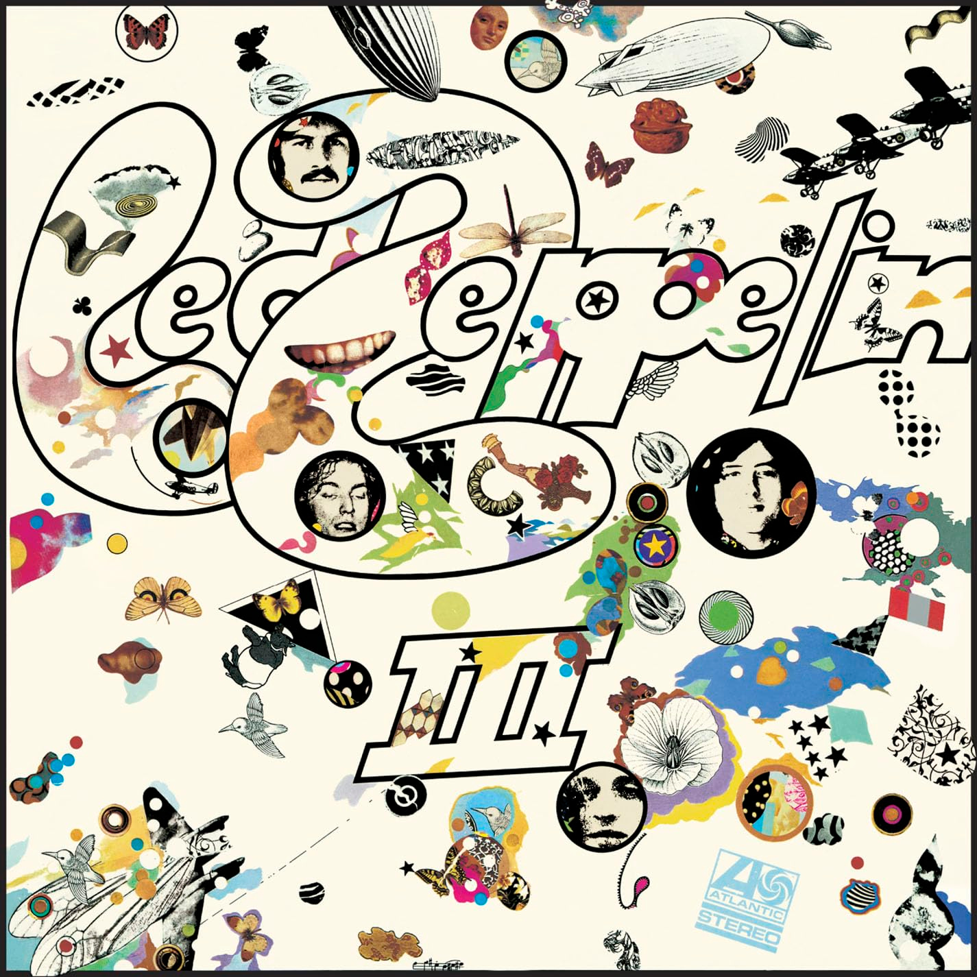
Led Zeppelin III - Led Zeppelin (October 5, 1970)
View additional album images: 18
The album cover for Led Zeppelin's III is a whimsical and visually dynamic piece of artwork that perfectly encapsulates the band's blend of experimentation and creativity. Designed by artist Zacron, the cover features an array of eclectic illustrations and collages, including butterflies, airplanes, stars, and abstract shapes, scattered across a cream background. The band's name and album title are boldly rendered in large, stylized lettering, integrated with the playful imagery. A unique feature of the cover is its rotating volvelle, a cardboard wheel embedded beneath the surface that allows the viewer to change the images visible through small cut-out windows, making the artwork interactive and engaging. This design reflects the album's eclectic mix of musical styles, blending folk, rock, and experimental sounds into a cohesive and innovative package.
Listen to the album on YouTube here.
Record Stores
In the late 1960s and 1970s, record stores became cultural hubs that did far more than sell music—they helped shape entire lifestyles. Browsing rows of vibrant album covers introduced young people to new sounds, ideas, and identities, influencing their buying habits and expanding their musical tastes beyond what was played on the radio. The imagery and fashion of rock stars and soul artists seen on album covers and promotional posters directly impacted how fans dressed and styled themselves, from bell-bottoms and fringe jackets to long hair and bold accessories. Record stores were places where youth picked up not just records but also the rebellious, free-spirited attitudes that defined the era, making them important gathering spots for anyone seeking to express individuality and align themselves with the evolving counterculture.
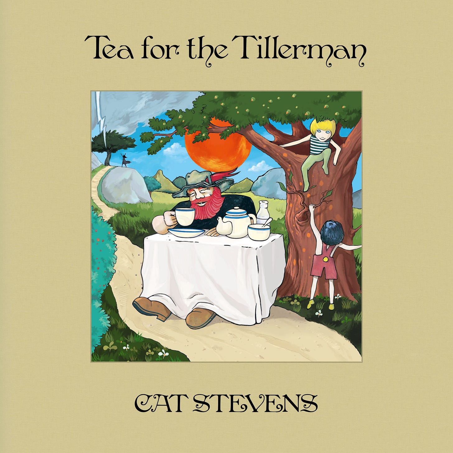
Tea for the Tillerman - Cat Stevens (November 23, 1970)
View additional album images: 19
The album cover for Cat Stevens' Tea for the Tillerman is a charming and whimsical illustration that reflects the introspective and pastoral themes of the music. The artwork, created by Cat Stevens himself, features a bearded man in a wide-brimmed hat, sitting at a table set for tea, with a vibrant red sun glowing in the background. The idyllic scene is enhanced by a child climbing a tree and another reaching for the tillerman, adding a playful yet contemplative touch to the cover. The lush greenery, winding path, and serene setting evoke a sense of simplicity and connection to nature, perfectly complementing the album's themes of reflection, spirituality, and yearning for a harmonious life. The bold yet elegant typography further emphasizes the timeless and artistic quality of the album.
Listen to the album on YouTube here.
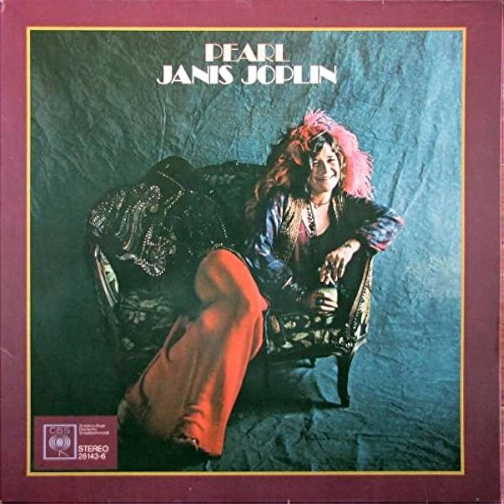
Pearl - Janis Joplin (January 11, 1971)
View additional album images: 20
The album cover for Janis Joplin's Pearl captures the singer's raw charisma and vibrant personality. Set against a textured blue backdrop, Janis is seated on an ornate vintage sofa, exuding a relaxed and confident aura. Her flamboyant attire, including a beaded jacket, flowing red pants, and signature feathered hair accessory, reflects her bohemian and free-spirited style. The warm tones of the burgundy border frame the image, adding a sense of intimacy and focus to her radiant smile and expressive presence. The cover beautifully encapsulates Joplin's larger-than-life persona and the soulful energy that defines her music, creating an iconic image that resonates with her enduring legacy.
Listen to the album on YouTube here.
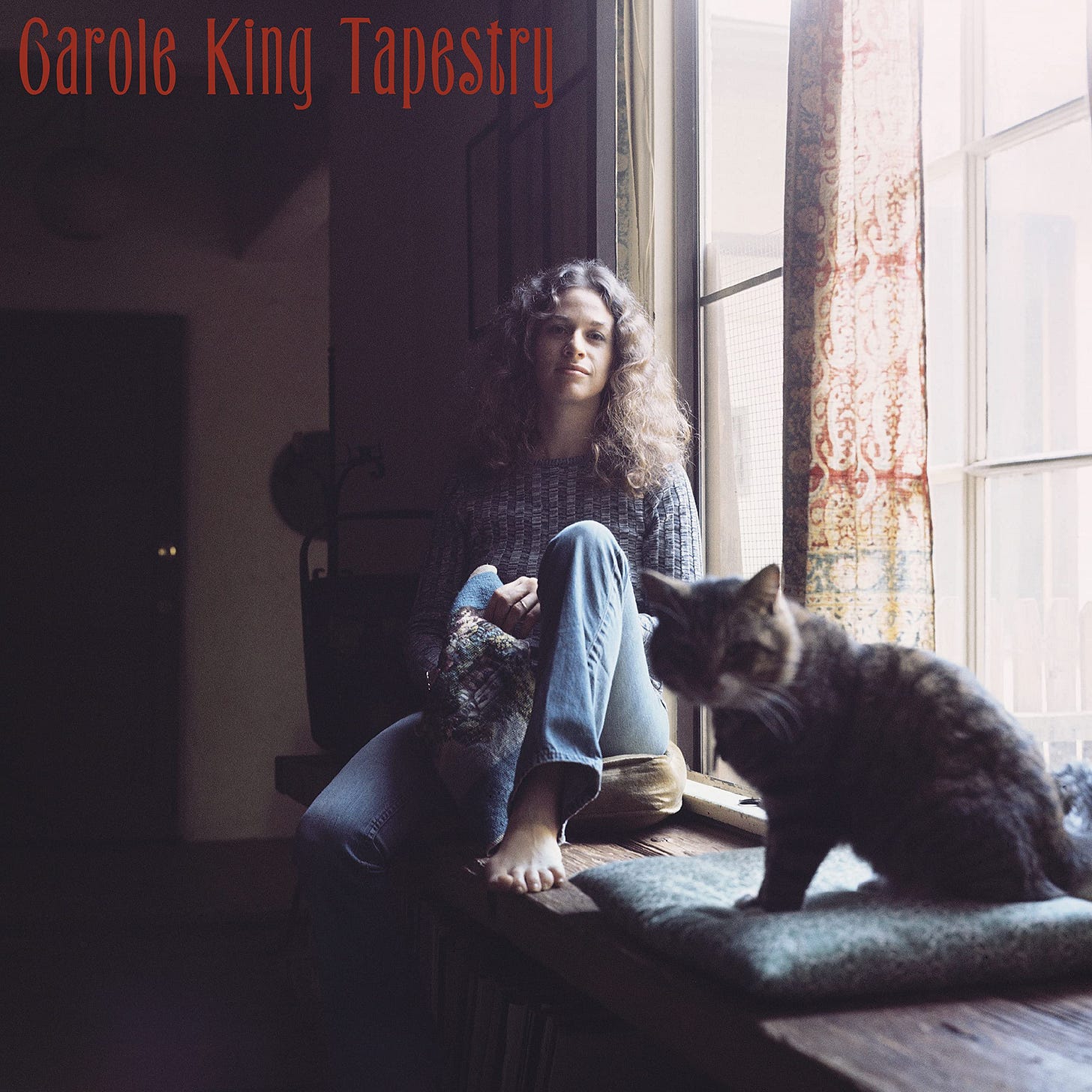
Tapestry - Carole King (February 10, 1971)
View additional album images: 21
The album cover for Carole King's Tapestry radiates an intimate and homely warmth, perfectly aligning with the soulful and introspective nature of the music within. Set in a cozy, softly lit room, Carole sits barefoot on a windowsill, exuding a relaxed, natural charm. Dressed in a casual sweater and jeans, she holds a tapestry in her lap, a subtle nod to the album's title and its intricate weaving of themes. A tabby cat sits beside her on the windowsill, adding an element of domestic serenity. The muted tones and natural light pouring through the window create a peaceful, contemplative atmosphere that mirrors the heartfelt and authentic quality of her songs. This iconic image has become synonymous with the timeless appeal of the album.
Listen to the album on YouTube here.
Record Players
In the late 1960s and 1970s, record players were more than just machines to play music—they were symbols of personal freedom and cultural identity. Having a record player at home meant having the power to curate your own experience, choosing albums that spoke to your emotions, beliefs, and dreams rather than relying solely on mainstream radio. Listening to vinyl became an immersive, almost ritualistic act that encouraged reflection, rebellion, and a deeper emotional connection to the music and its messages. This personal control over musical environment helped fuel broader attitudes of independence, nonconformity, and self-expression that defined the youth movements of the time, as well as the era’s shifting values around individuality, creativity, and social change.
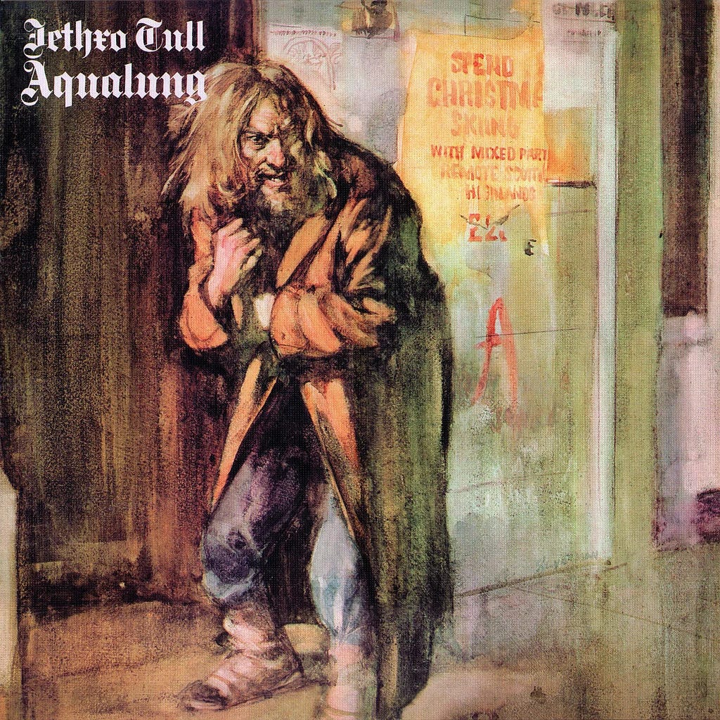
Aqualung - Jethro Tull (March 19, 1971)
View additional album images: 22
The album cover for Jethro Tull's Aqualung features a striking and evocative watercolor painting by Burton Silverman, portraying a disheveled, hunched man clutching his coat tightly against himself. His unkempt hair and beard, along with his ragged clothing, suggest a life of hardship and destitution, perfectly reflecting the album’s themes of societal marginalization and existential musings. The gritty, textured background includes a worn wall with faded posters and graffiti, adding to the urban decay and bleak atmosphere of the scene. The figure's penetrating gaze and defensive posture evoke a mix of vulnerability and defiance, capturing the complex emotions and narratives that the music explores. The raw and gritty artwork has become iconic, mirroring the introspective and critical tone of the album.
Listen to the album on YouTube here.
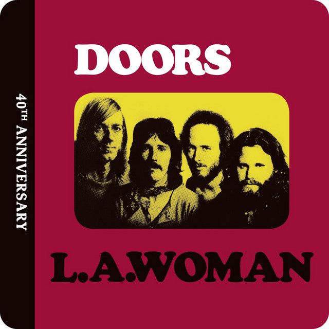
L.A. Woman - The Doors (April 19, 1971)
View additional album images: 23
The cover of L.A. Woman by The Doors features a striking and minimalist design with a bold red background framing a rectangular portrait of the band members in sepia tones, set against a yellow backdrop. The black-and-white photo captures the intense, enigmatic expressions of the four members—Jim Morrison, Ray Manzarek, Robby Krieger, and John Densmore—reflecting the album's raw and gritty vibe. The typography is bold and straightforward, with "DOORS" prominently displayed above the photo and "L.A. Woman" in a wide, curved font below, emphasizing the record's urban, edgy identity. The simplicity of the design contrasts with the band's complex, layered music, making it an iconic visual representation of the album's place in rock history.
Listen to the album on YouTube here.
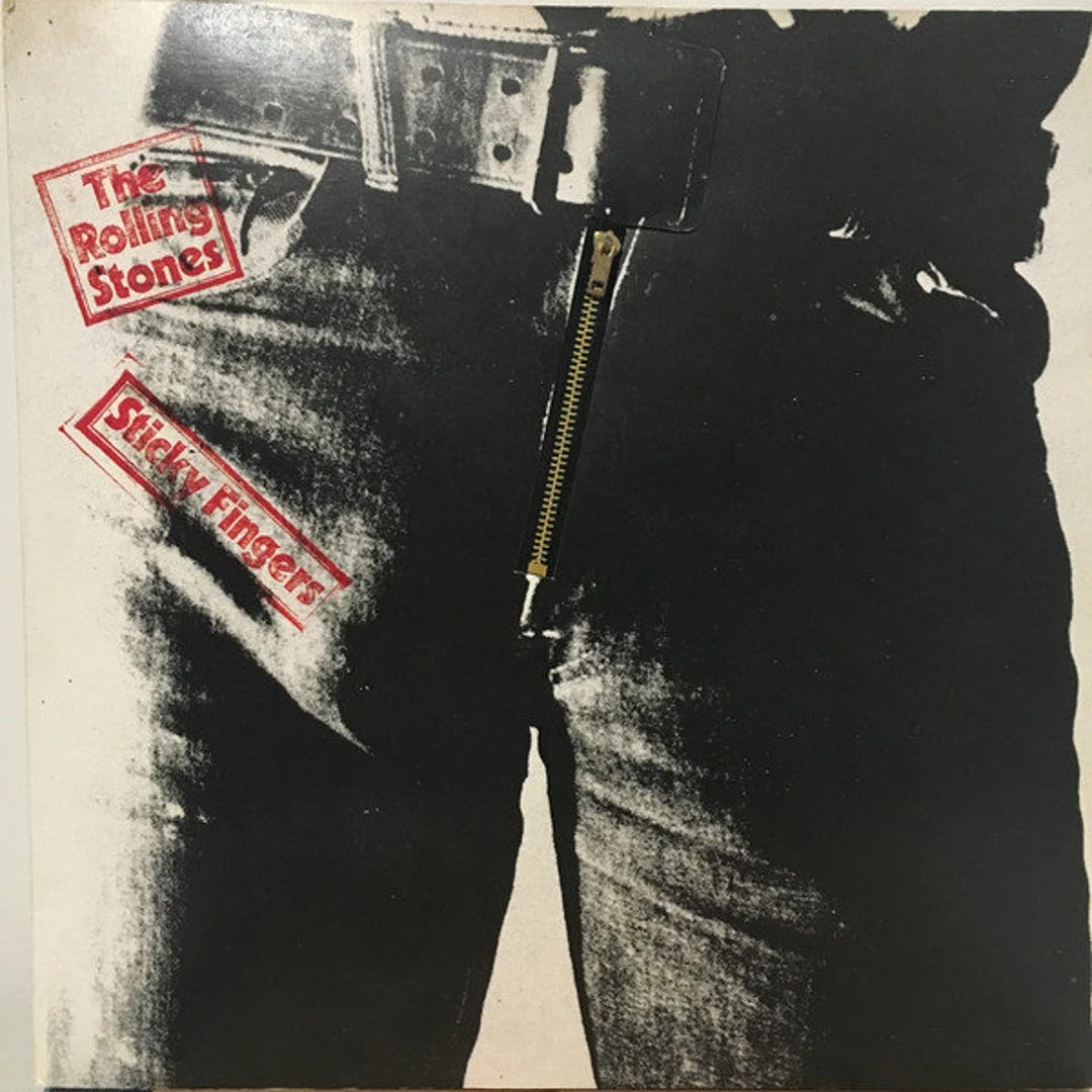
Sticky Fingers - The Rolling Stones (April 23, 1971)
View additional album images: 24
The album cover of Sticky Fingers by The Rolling Stones is one of the most iconic and provocative designs in rock history. Created by artist Andy Warhol, the cover features a close-up black-and-white photograph of the crotch area of a pair of jeans, complete with a functioning metal zipper. The design deliberately emphasizes a prominent male genitalia bulge, a purposeful addition that heightened the cover's controversial and sexually charged nature. The bold red typography of the album's title and the band's name contrasts sharply against the grayscale image, emphasizing its edgy aesthetic. The zipper, which could be unzipped to reveal an inner layer of fabric and a suggestive photograph, pushed boundaries of album packaging and was a bold statement of the band's rebellious and sensual image. This design captured the essence of rock 'n' roll's raw energy and countercultural defiance of the 1970s.
Listen to the album on YouTube here.
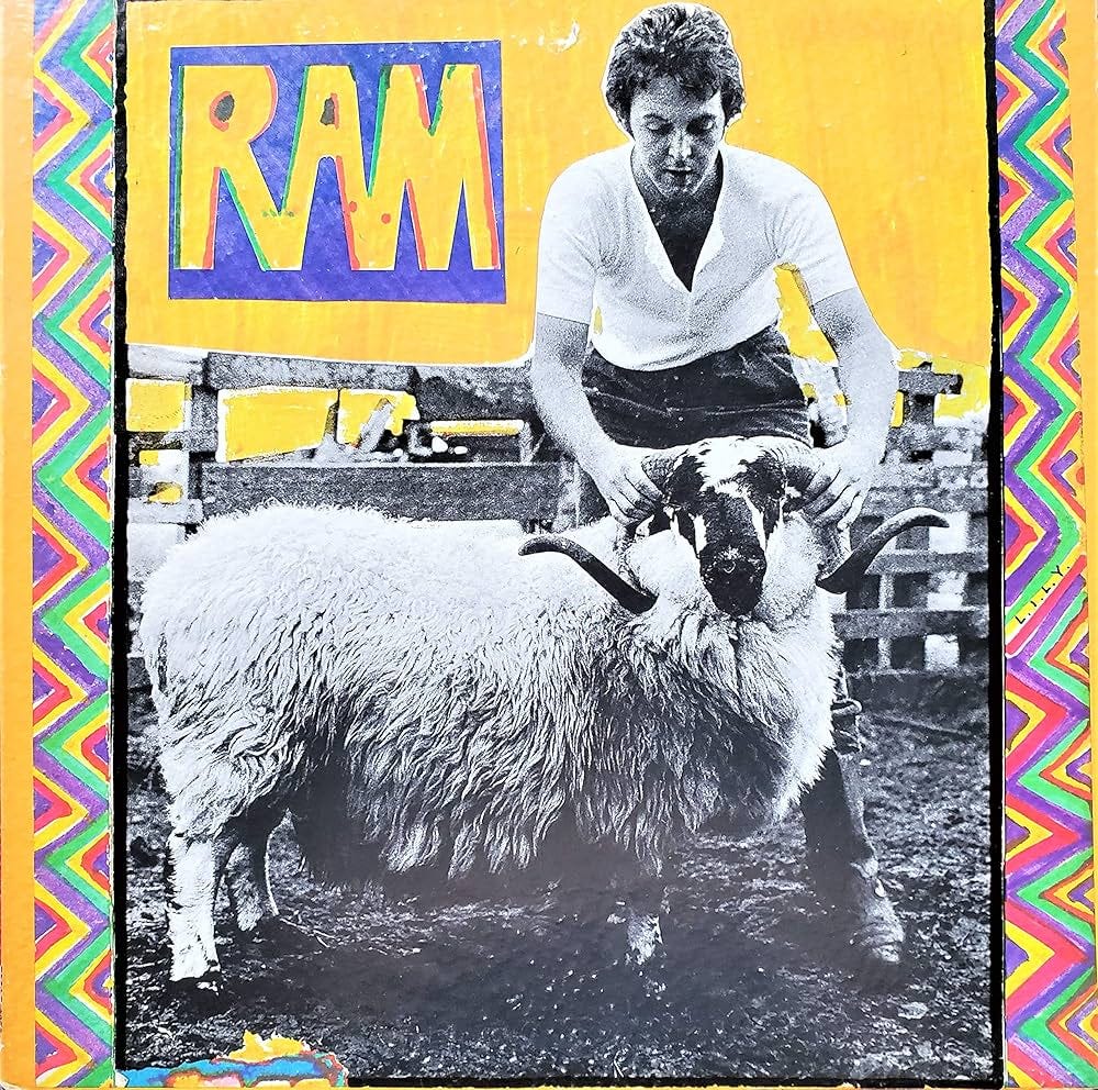
Ram - Paul & Linda McCartney (May 17, 1971)
View additional album images: 25
The album cover of Ram by Paul and Linda McCartney is a quirky and colorful representation of its rustic, playful tone. At the center, a black-and-white photograph shows Paul McCartney firmly gripping the horns of a ram, emphasizing a connection to rural life and the natural world. The stark image is framed by a vibrant, psychedelic border of zigzagging, multicolored patterns that contrast with the simplicity of the photograph, adding an eccentric and energetic touch. The bold, hand-drawn "RAM" title in bright yellow, purple, and green further enhances the whimsical and homemade aesthetic of the design. This cover art reflects the album’s mix of intimacy, individuality, and pastoral charm, embodying the free-spirited creativity of McCartney’s post-Beatles era.
Listen to the album on YouTube here.
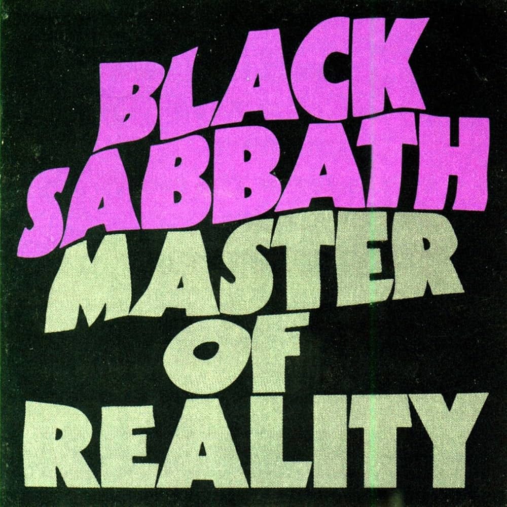
Master of Reality - Black Sabbath (July 21, 1971)
View additional album images: 26
The album cover of Master of Reality by Black Sabbath features a minimalist yet striking design that emphasizes bold typography to make its statement. The title and band name dominate the black background, with "Black Sabbath" displayed in a vivid purple and "Master of Reality" in a muted gray. The chunky, distorted font conveys a sense of heaviness and gravity, mirroring the weighty, doom-laden themes of the music within. The stark contrast between the colors and the dark backdrop creates a dramatic visual impact, reinforcing the raw power and pioneering spirit of Black Sabbath’s sound. This design encapsulates the essence of the album’s groundbreaking contribution to heavy metal.
Listen to the album on YouTube here.
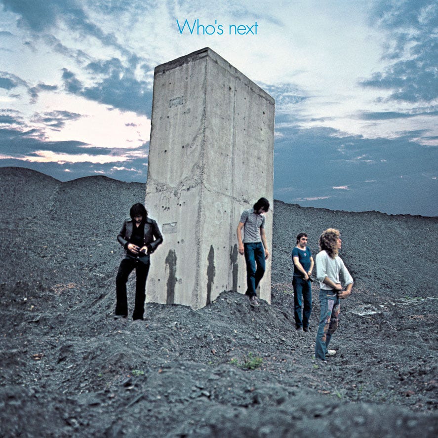
Who's Next - The Who (August 14, 1971)
View additional album images: 27
The album cover for Who's Next by The Who presents a stark and enigmatic scene set against a desolate, industrial landscape at dusk. The band members stand around a towering, monolithic concrete slab, with streaks of moisture running down its surface, suggesting that the structure has been urinated on—a rebellious and irreverent gesture that encapsulates the band's raw energy and countercultural ethos. The barren ground, dark and rugged, contrasts with the expansive, dramatic sky, creating a surreal and cinematic atmosphere. The sparse typography, with the album's title simply written in blue at the top, lets the striking imagery speak for itself. This iconic cover mirrors the bold, innovative sound of the album, pushing boundaries both visually and musically.
Listen to the album on YouTube here.
Concerts
The arrival of music concerts in town, heavily promoted through local radio stations, became a powerful force in shaping youth culture and attitudes. Hearing ads for upcoming shows featuring rock bands, folk singers, or emerging soul artists created a sense of excitement and belonging, as live music became a shared experience that unified listeners beyond the records they played at home. The marketing of these concerts on the radio amplified the idea that music was not just entertainment but a lifestyle—one tied to rebellion, freedom, and identity. Attending concerts meant participating in something larger than oneself, fueling a collective spirit of change, adventure, and a passionate embrace of the new cultural tides sweeping across America.
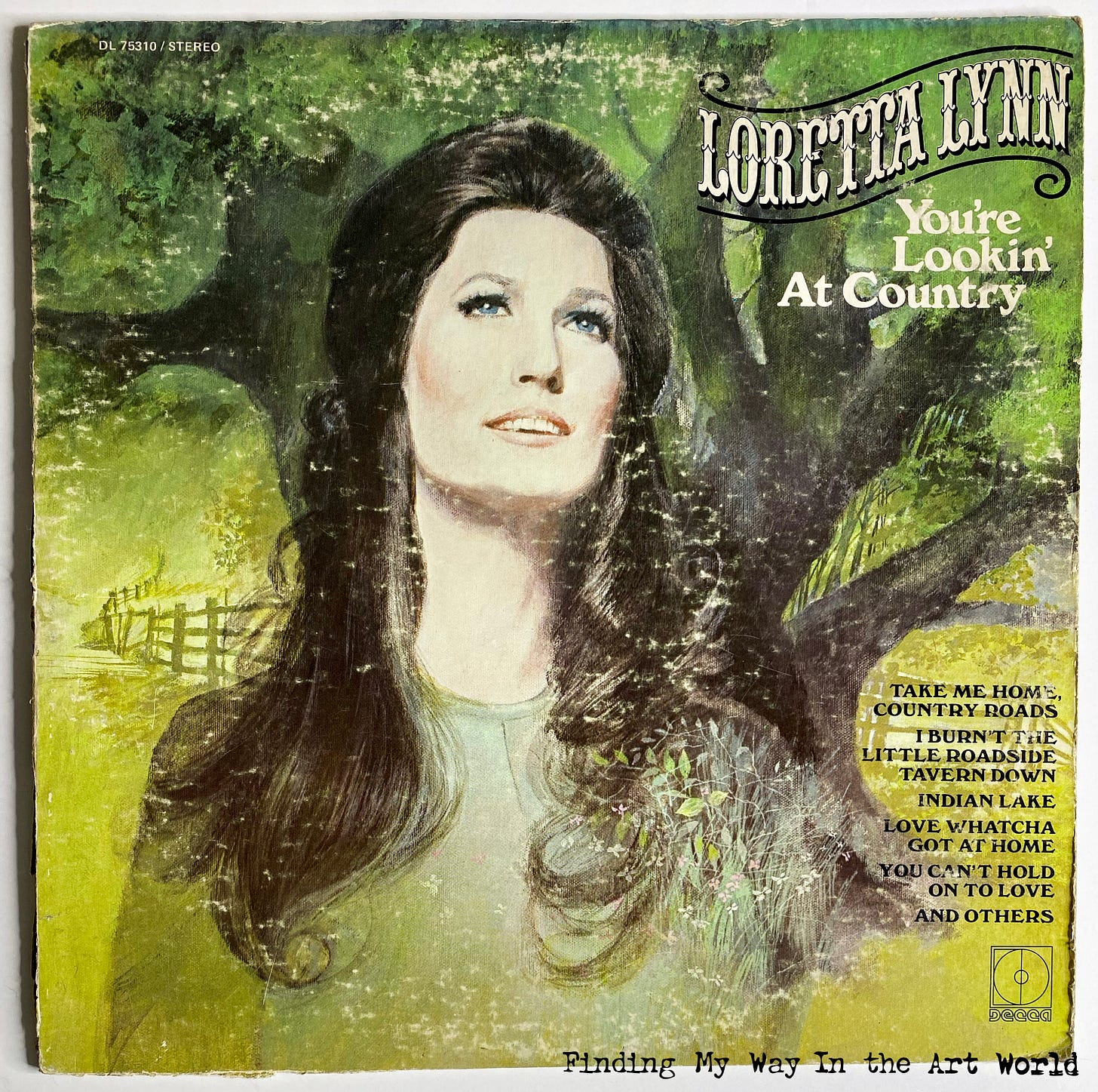
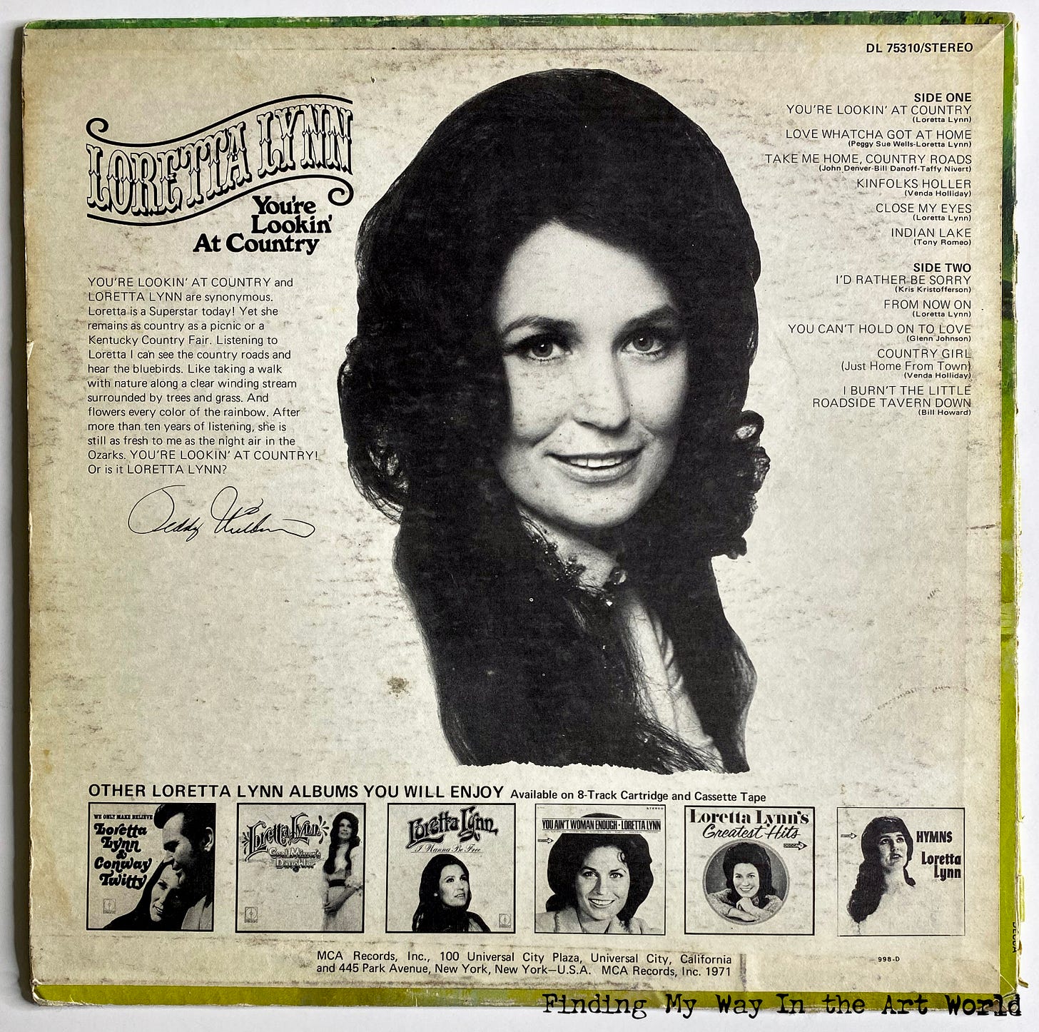
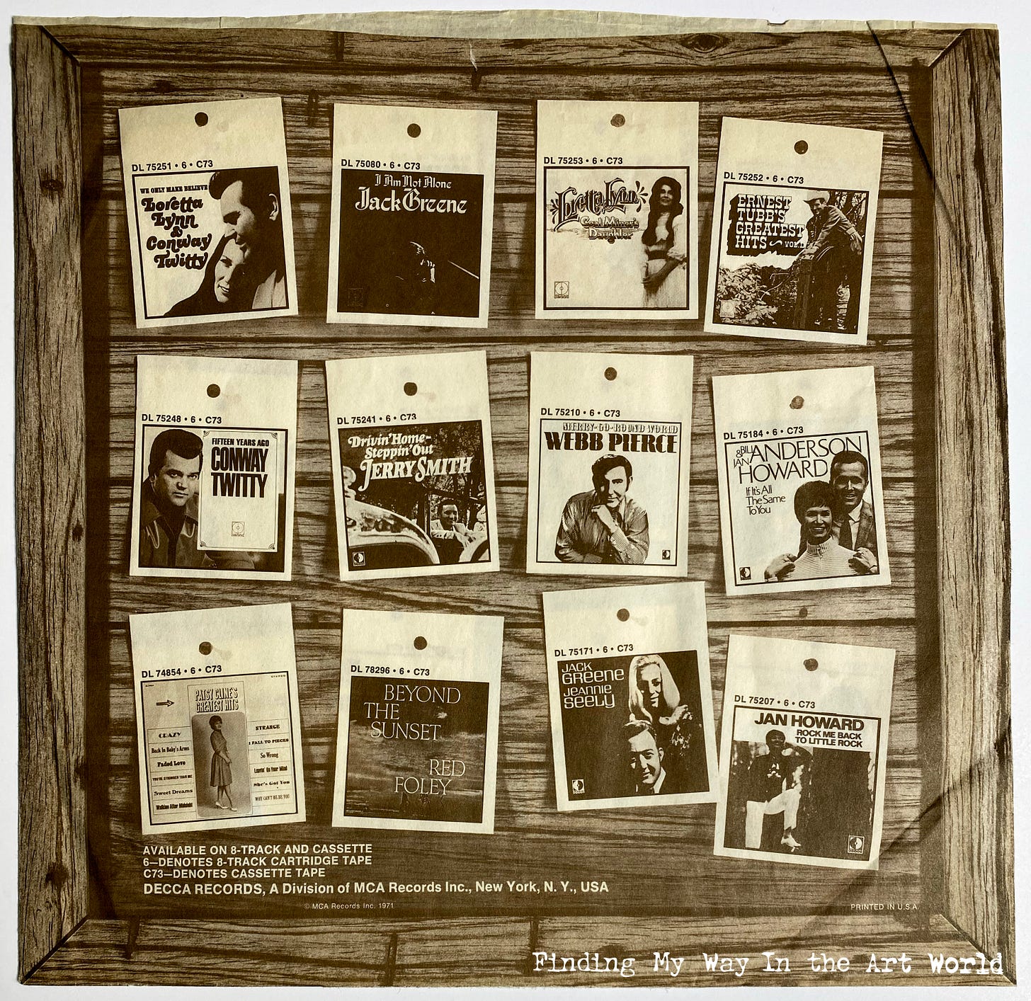
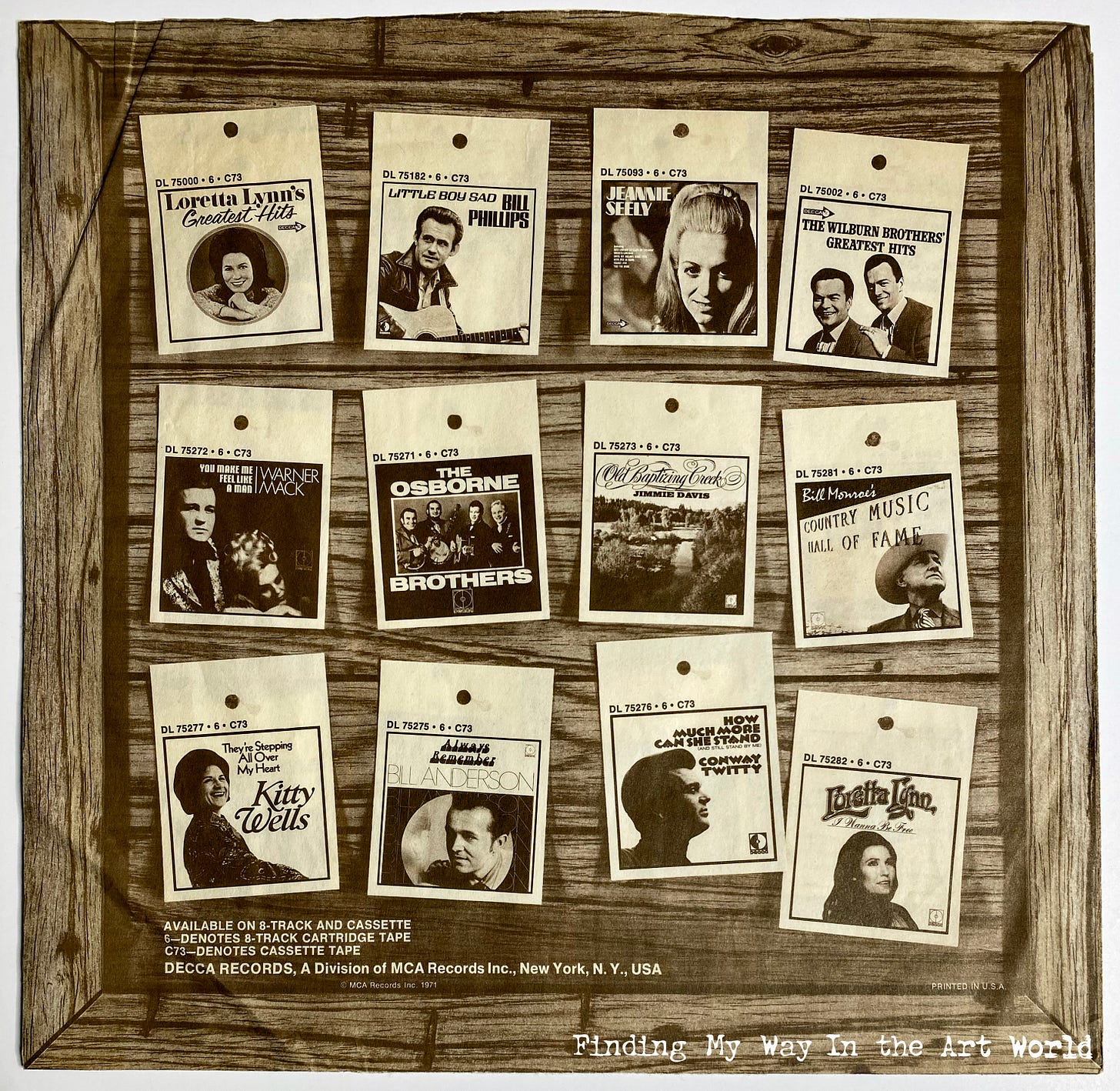
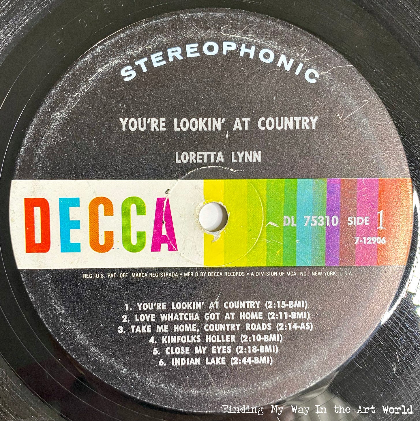
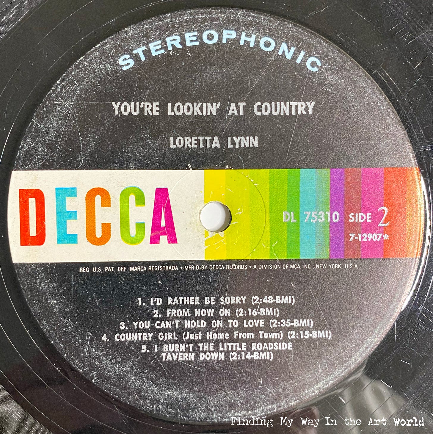
You’re Lookin’ At Country - Loretta Lynn (September 20, 1971)
View additional album images:28
The album cover painting of Loretta Lynn's You’re Lookin’ At Country captures a quintessentially wholesome and nostalgic vision of rural America, perfectly complementing the album's themes. The artwork features Loretta standing confidently on a country road, under strong, green, beautiful trees, embodying the essence of country living. Her warm smile and relaxed pose convey authenticity and charm, inviting the viewer into her world. In the background, a winding wooden fence evokes a sense of reminiscence and a connection to the land. The title, written in bold but friendly lettering, reinforces her pride in her roots, making the cover as much a statement of identity as the music within.
Listen to the album on YouTube here.
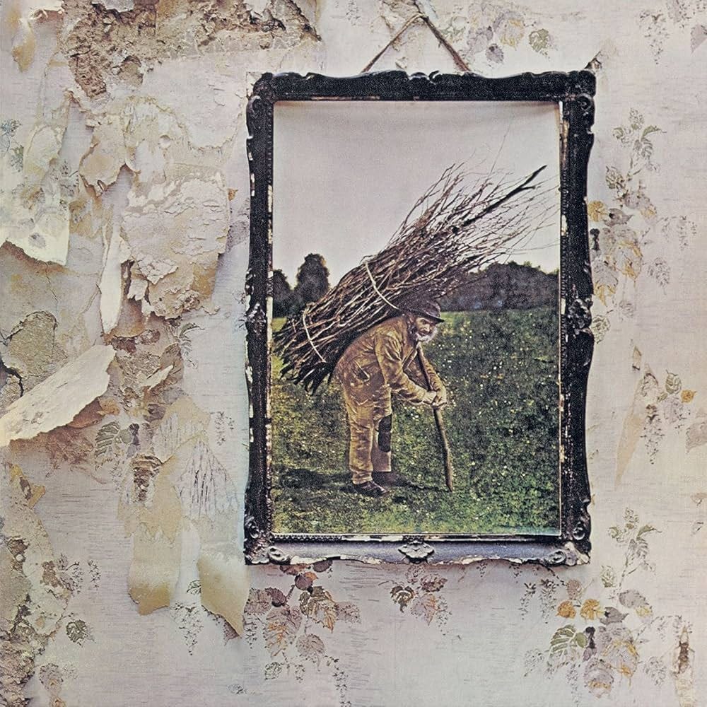
Led Zeppelin IV - Led Zeppelin (November 8, 1971)
View additional album images: 29
The album commonly known as Led Zeppelin IV (also referred to as Zoso or Runes) features a mysterious and symbol-laden design that eschews any mention of the band's name or album title on the cover. The front cover displays a framed image of an old man bent under a bundle of sticks, hung against a weathered wall that itself appears to be peeling away to reveal a modern cityscape—juxtaposing the rural and the urban. The back cover continues this theme of ambiguity with a rustic, faded appearance and no identifying text. Inside, the gatefold features a stylized illustration of the Hermit from the Tarot deck, standing atop a mountain with a lantern, symbolizing wisdom and inner guidance. Each band member is represented by a unique rune-like symbol, adding an air of mysticism and secrecy to the release. The minimalist, cryptic design complemented the band's desire to let the music speak for itself and has since become one of the most iconic and recognizable covers in rock history.
Listen to the album on YouTube here.
Television
In the late 1960s, television became a central fixture in the American family, transforming daily life and influencing cultural priorities. As a source of entertainment, news, and education, the TV brought families together in living rooms, creating shared experiences. It became a window to the world, exposing viewers to the social changes of the era, from civil rights movements to the Vietnam War, shaping public opinion and awareness. Advertisers leveraged television’s reach, influencing consumer behavior and shifting family priorities toward products and lifestyles depicted on screen. The medium also redefined leisure time, as scheduled programming dictated routines and diminished other forms of entertainment like radio or outdoor pastimes. Television not only entertained but also became a powerful cultural force, embedding itself into the rhythms of American family life and shaping the collective identity of the era.
TV Programming Overview of 1966-1971
From 1966 to 1971, American television offered a vibrant and diverse array of programming that shaped family entertainment and childhood memories. Saturday mornings were packed with colorful shows like The Banana Splits Adventure Hour (1968–1970), blending live-action antics with animated segments like Arabian Knights, while Sid and Marty Krofft’s surreal puppet series H.R. Pufnstuf (1969) and The Bugaloos enchanted young viewers. Animated favorites such as Scooby-Doo, Where Are You! (1969), Josie and the Pussycats (1970–1971), and reruns of The Flintstones and The Jetsons filled the mornings with humor, mystery, and music, alongside imaginative offerings like Shazzan (1967–1968) and The Quick Draw McGraw Show (1959). Evenings brought the family together around sitcoms like The Andy Griffith Show, Bewitched, and I Dream of Jeannie, while variety shows such as The Ed Sullivan Show and The Carol Burnett Show delivered live performances and comedy. Dramas and Westerns like Mission: Impossible, Hawaii Five-O, Gunsmoke, and Bonanza offered action and intrigue, and science fiction found its place with Star Trek (1966–1969), introducing futuristic themes and social commentary. The Twilight Zone and Rowan & Martin's Laugh-In added inventive storytelling and satire, while game shows like The Dating Game and The Newlywed Game brought an interactive spirit to daytime TV. The Tonight Show Starring Johnny Carson became a late-night staple, blending humor, celebrity interviews, and sketches. This dynamic era of television not only reflected the broad tastes of American audiences but also laid the foundation for formats and genres that would influence the medium for generations.
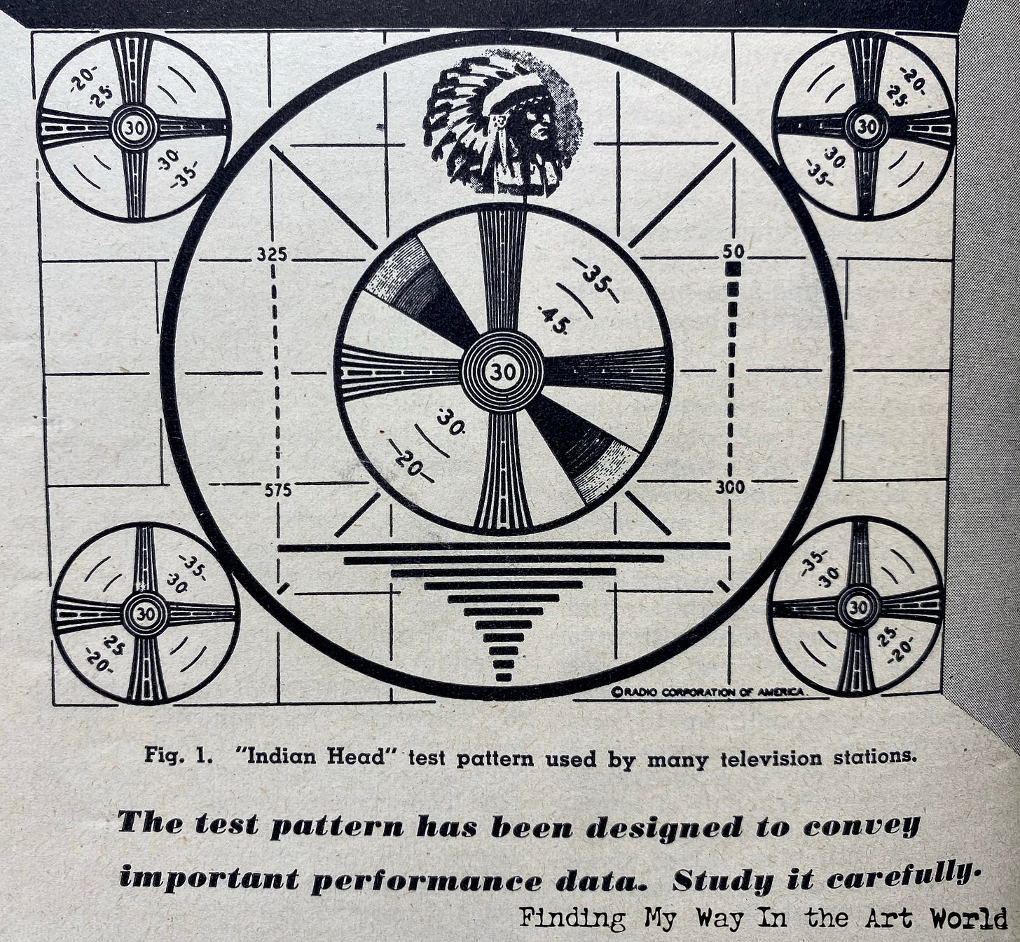
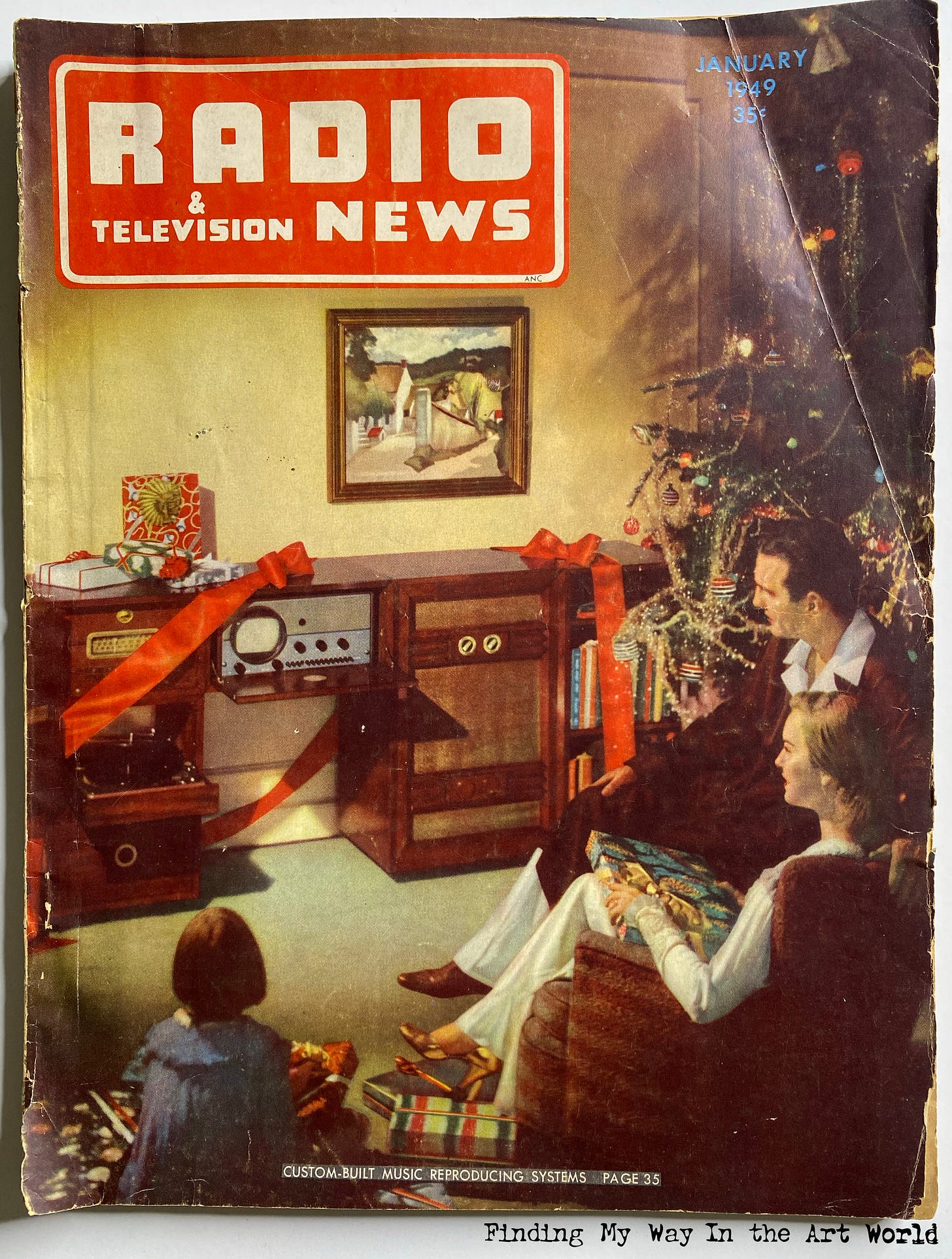
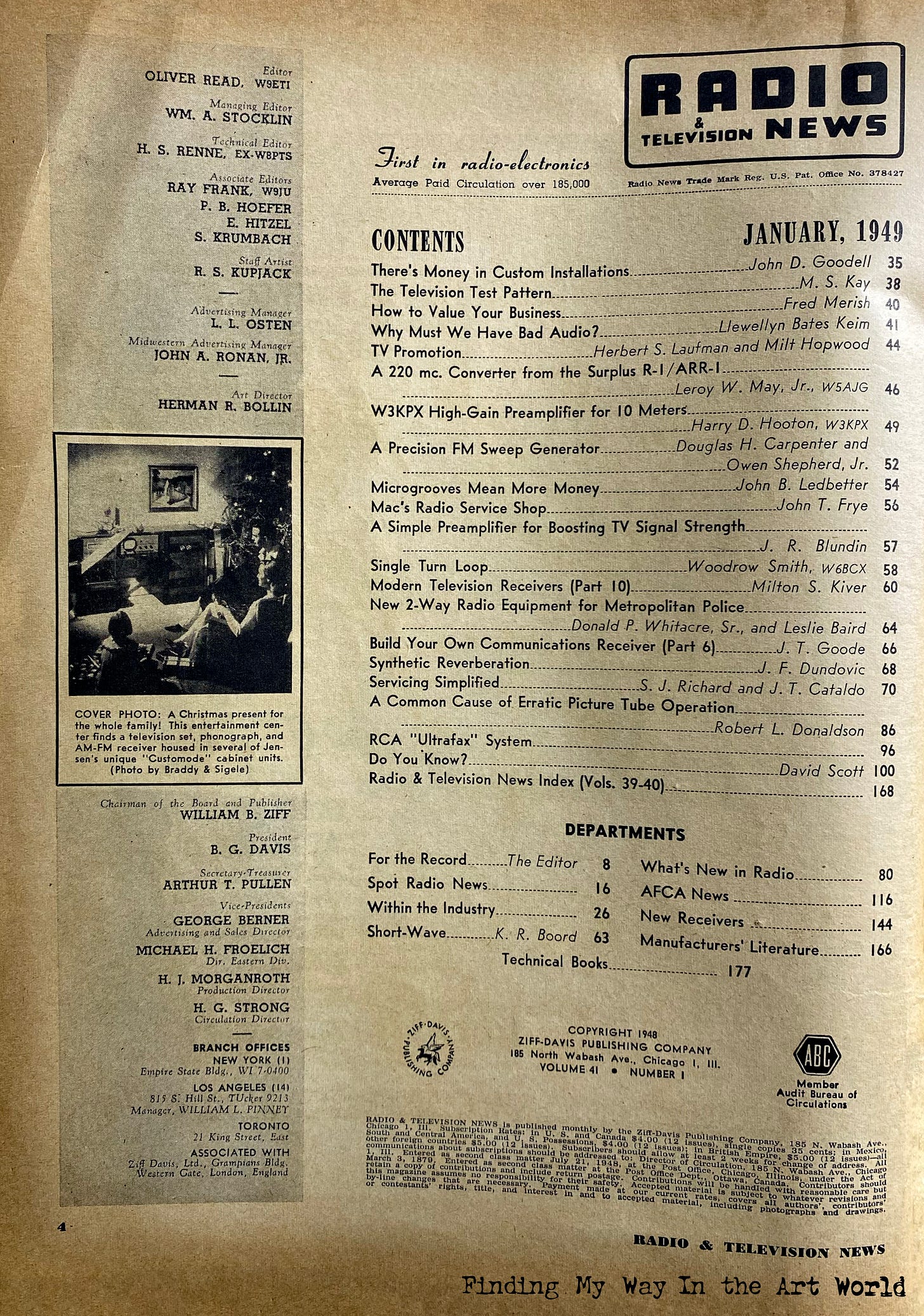
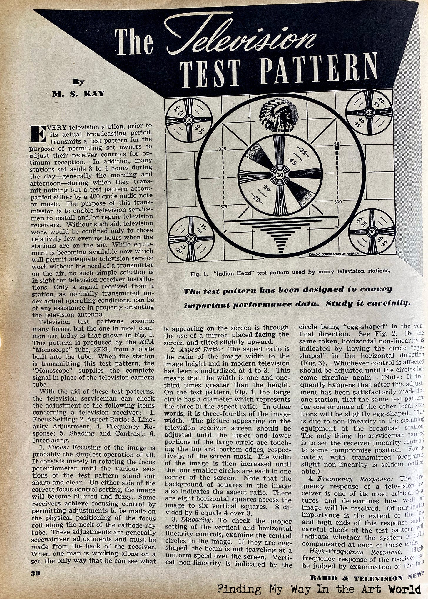
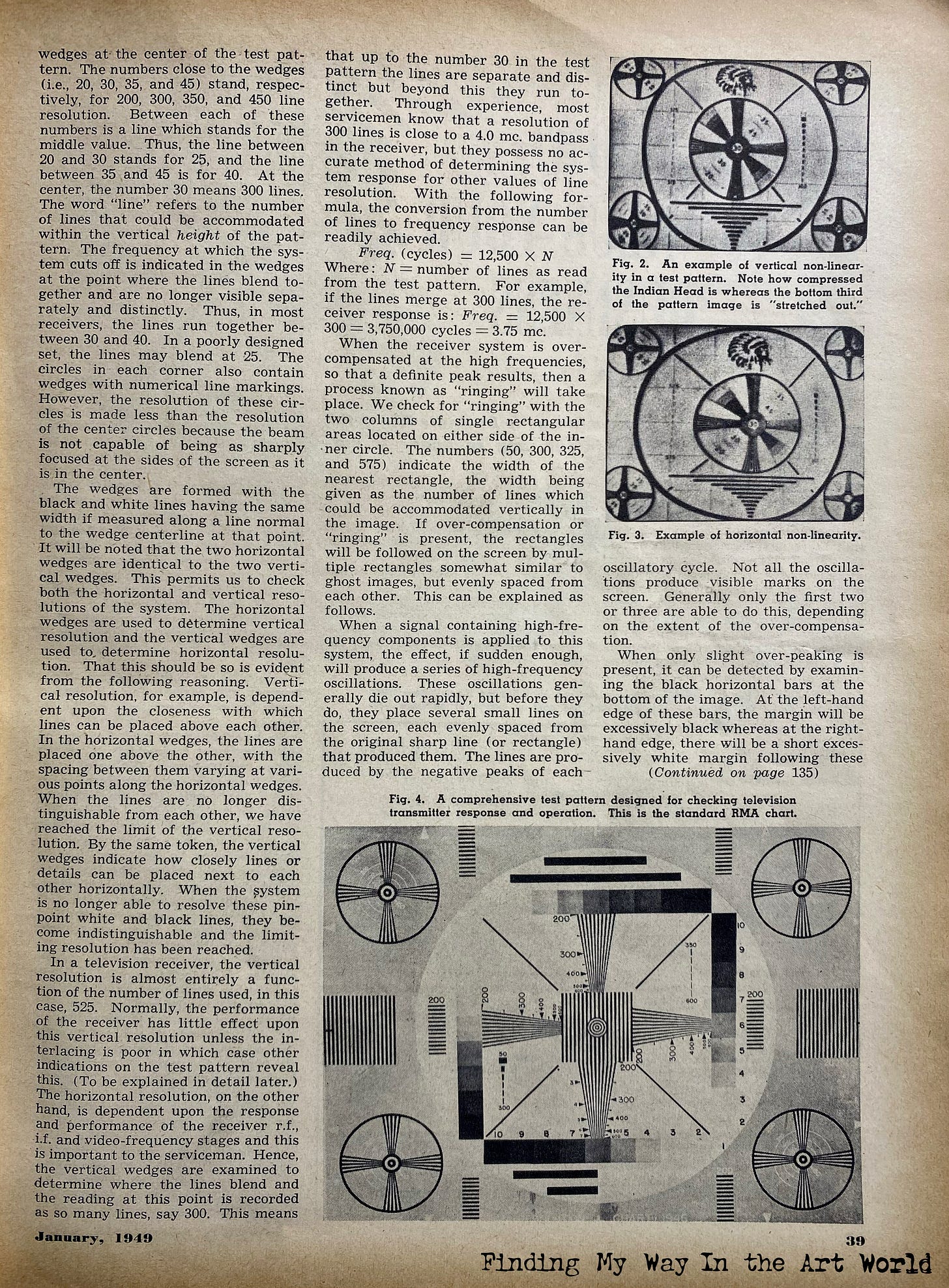
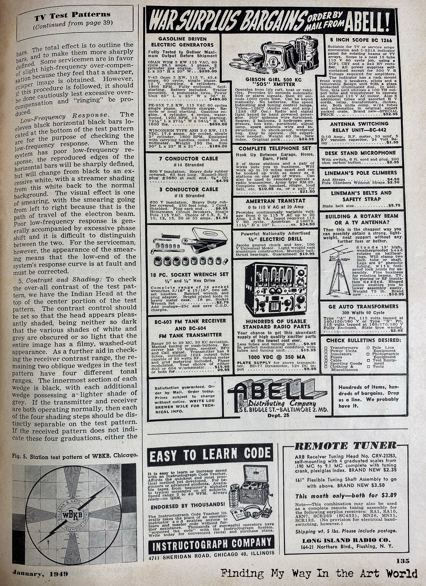
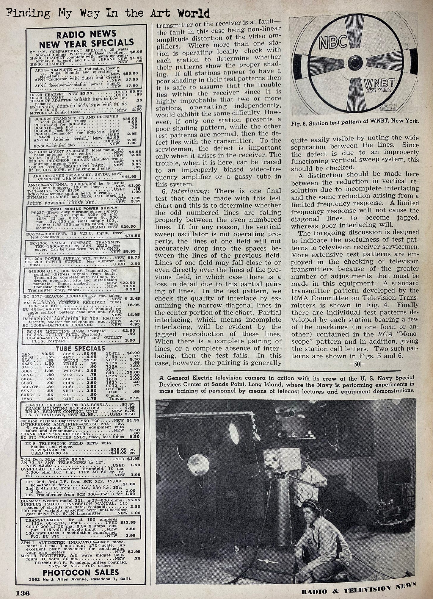
The Indian Head Test Pattern
View the article from Radio & Television News magazine, January 1949: 30
The Indian Head RCA test pattern, first introduced in 1939 for black-and-white televisions, became an iconic piece of early broadcast imagery. Featuring an illustration of a Native American chief in full headdress surrounded by a series of geometric lines, grids, and circles, the pattern served as a tool to calibrate television sets, ensuring proper picture alignment and contrast. The design’s intricate layout, reminiscent of a map or code, gave it a mysterious and enduring quality. The choice of a Native American chief symbolized nobility and heritage, reflecting the fascination with Indigenous culture in American society at the time. RCA likely chose this imagery as a blend of tradition and modernity, linking the technological marvel of television with an image of timeless Americana.
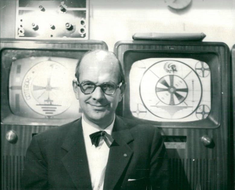
Throughout the 20th century, Native American imagery held a prominent place in American popular culture, symbolizing rugged individualism, authenticity, and a connection to the natural world. From sports team mascots to Hollywood Westerns, the representation of Native Americans as stoic and noble figures resonated deeply with audiences. This fascination peaked in the 1950s and carried through the 1970s, as Indigenous themes were romanticized in films, television, and advertising. While these depictions often lacked nuance, they reflected a societal yearning for authenticity and identity during times of cultural and technological change. The Indian Head test pattern is one such example, embedding this symbolic imagery into a daily technological ritual that captivated viewers for decades. We will touch a little bit upon this theme within this book, exploring how these representations influenced cultural perceptions and artistic expressions of the era.
View the original August 23, 1938 Indian Head illustration by an artist named Brooks here.
The Crying Indian Commercial
The "Crying Indian" commercial from 1971, produced by the Keep America Beautiful campaign, became one of the most iconic public service announcements of its time. The commercial featured actor Iron Eyes Cody, a man of Italian-American descent widely recognized for portraying Native Americans in film and television, as the titular "Crying Indian." The ad opens with Cody paddling a canoe down a polluted river, passing industrial smokestacks and litter-strewn shores. He eventually steps onto a roadside filled with trash as a car speeds by, throwing garbage at his feet. The camera zooms in on Cody’s face as a single tear rolls down his cheek, while a narrator states, "People start pollution. People can stop it." The commercial struck a powerful chord with Americans, symbolizing environmental degradation and personal responsibility for the planet’s health. It reinforced the burgeoning environmental movement of the 1970s and cemented its imagery as a lasting emblem of ecological awareness.
Movies
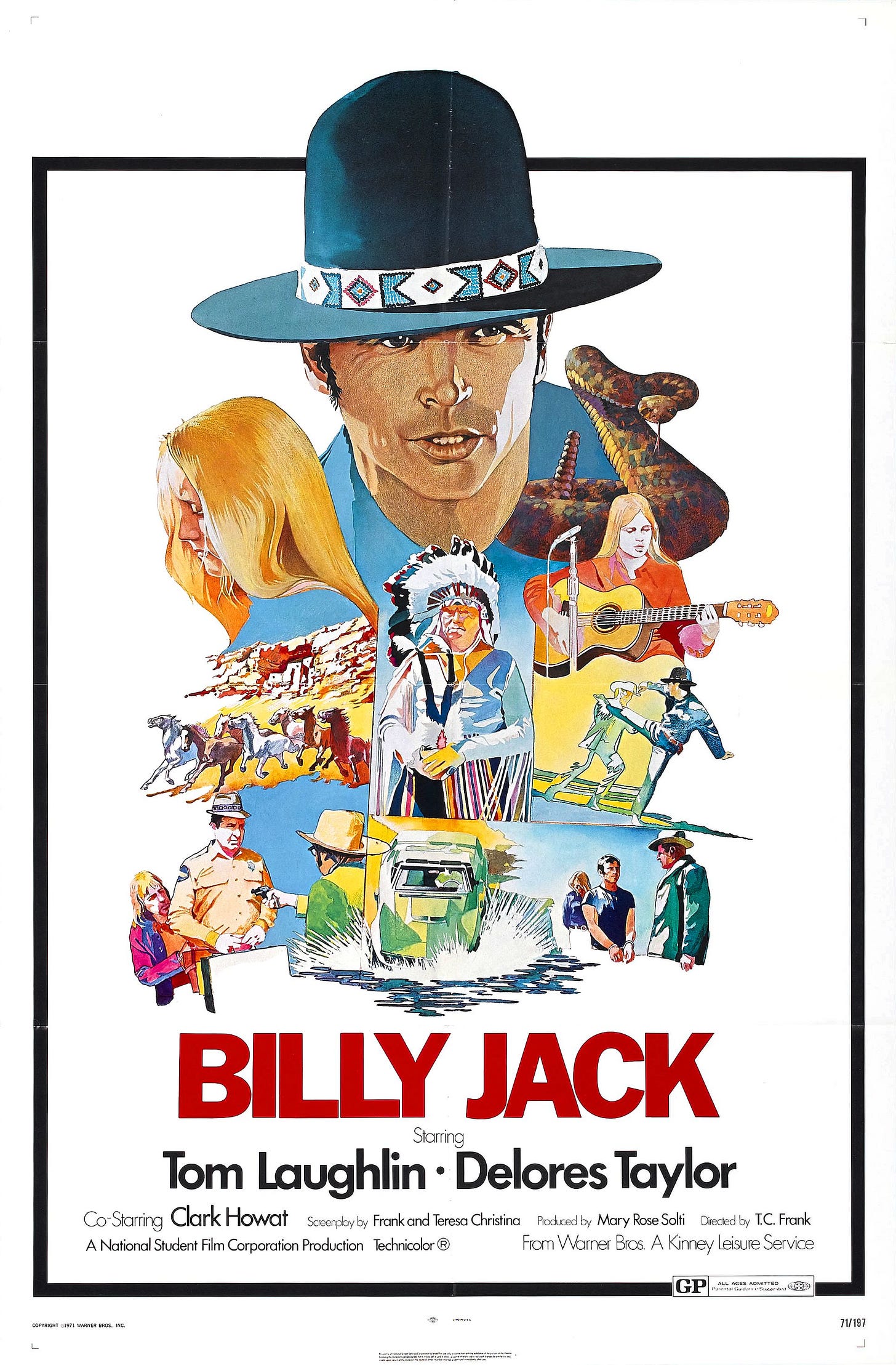
Between 1966 and 1971, American cinema underwent a powerful transformation, with movies increasingly reflecting the changing social and cultural dynamics of the time. Filmmakers explored themes of anti-establishment rebellion, counterculture movements, and the harsh realities of war, offering audiences stories that challenged traditional Hollywood norms. Films like The Good, the Bad and the Ugly (1966), The Graduate (1967), 2001: A Space Odyssey (1968), Easy Rider (1969), Patton (1970), and A Clockwork Orange (1971) captured the spirit of the era, balancing thought-provoking dramas, gritty Westerns, groundbreaking science fiction, and experimental storytelling. This period saw bold directors push the limits of film both technically and thematically, while lighter musicals such as Funny Girl and Hello, Dolly! provided contrast against the backdrop of social upheaval. Whether tackling rebellion, romance, surrealism, or gritty realism, the films of this period resonated with a generation hungry for change, setting the foundation for the innovative explosion that would define 1970s cinema.
Styles
From 1966 to 1971, fashion was a vibrant reflection of the era's social and cultural shifts. Mini skirts, made famous by designer Mary Quant, became iconic symbols of youthful rebellion, often paired with bold go-go boots. The mod style flourished, bringing A-line dresses, geometric patterns, and bright colors into the mainstream, particularly under British influence. Simultaneously, the counterculture movement popularized tie-dye shirts, bell-bottoms, paisley prints, and fringe-trimmed suede jackets—many drawing inspiration from bohemian and Native American aesthetics. Accessories like love beads, turtlenecks, and peasant blouses added to the expressive and free-spirited styles of the day. Hairstyles also evolved, with long, natural hair favored by hippies, the afro emerging as a proud symbol of Black identity, and trendsetting mod cuts like the sleek Twiggy style. Shag haircuts and pronounced sideburns signaled a more relaxed approach to grooming for both men and women.
These fashion choices were deeply intertwined with lifestyle trends that defined the late 1960s and early 1970s. The hippie movement encouraged ideals of peace, love, communal living, and resistance to societal norms. Many embraced a back-to-nature philosophy, adopting practices like organic gardening and natural foods in pursuit of a simpler, more sustainable life. Meanwhile, the growing prevalence of marijuana and LSD gave rise to a flourishing drug culture that influenced everything from music and visual art to spiritual exploration. Together, these styles and trends painted a vivid portrait of a generation seeking self-expression, social change, and a deeper connection with both nature and each other.
Dress and Grooming
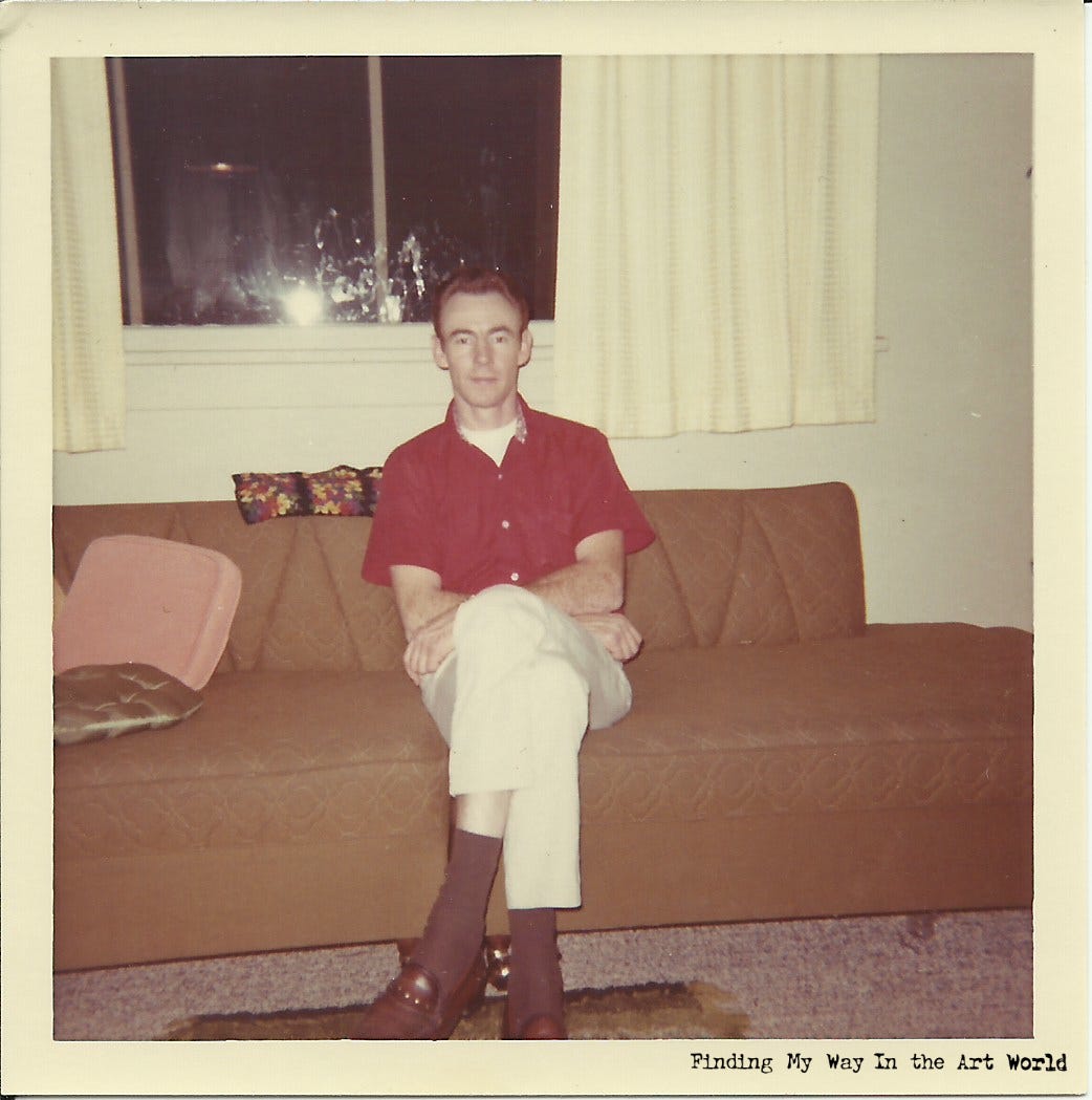
In the late 1960s, fashion underwent a dramatic transformation, reflecting the era's social and cultural shifts. Casual wear became increasingly vibrant and expressive, with men and women embracing bold patterns, psychedelic prints, and bright colors. Bell-bottom jeans, tie-dye shirts, and miniskirts were staples, paired with accessories like chunky jewelry and wide belts. For men, casual styles included turtlenecks, Nehru jackets, and colorful button-down shirts. Formal attire also began to relax, but classic looks still prevailed for special occasions. Women often wore elegant sheath dresses or floor-length gowns with metallic accents, while men favored slim-fitting suits, often in unconventional colors like powder blue or mustard yellow. Hairstyles, from long, natural locks to bouffants, further complemented the decade's daring approach to both casual and formal dressing.
Clothing
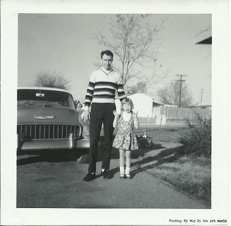
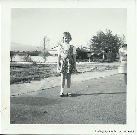
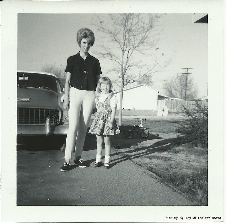
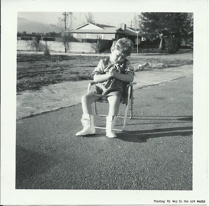
Tattoos
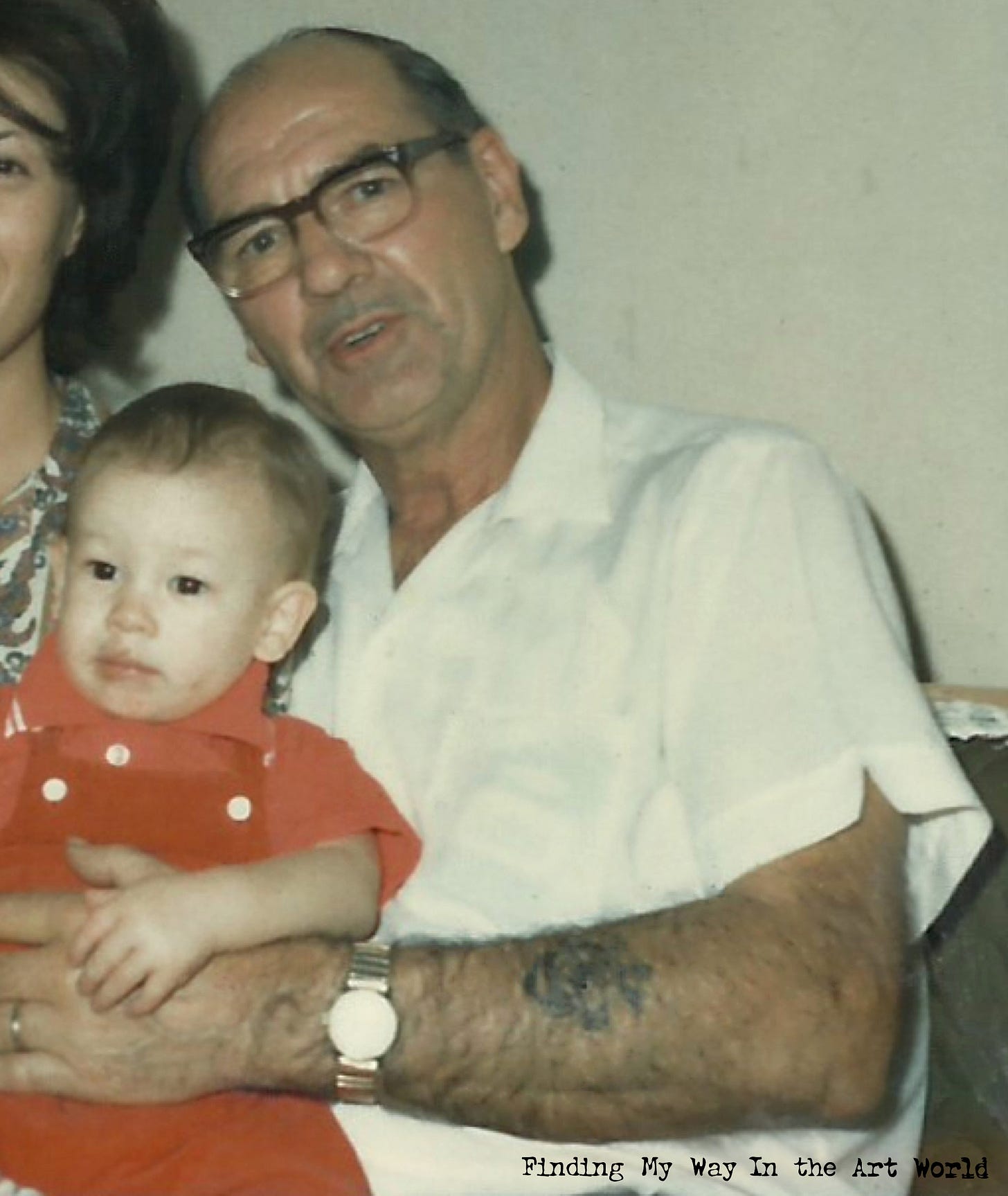
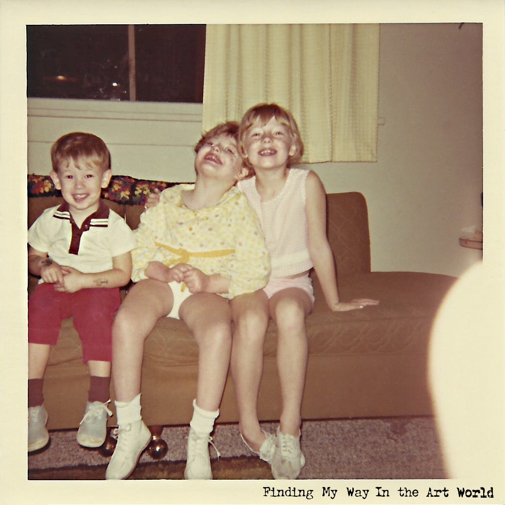
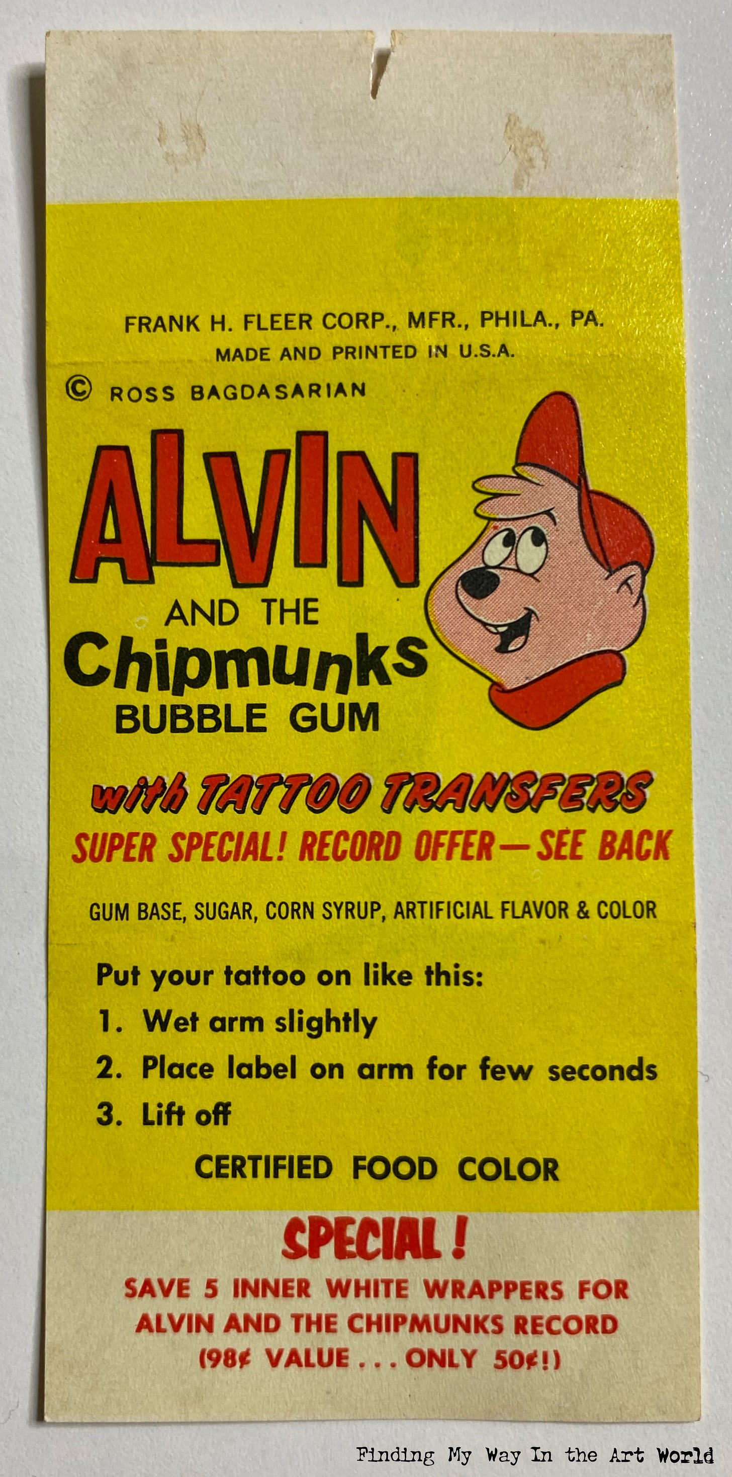
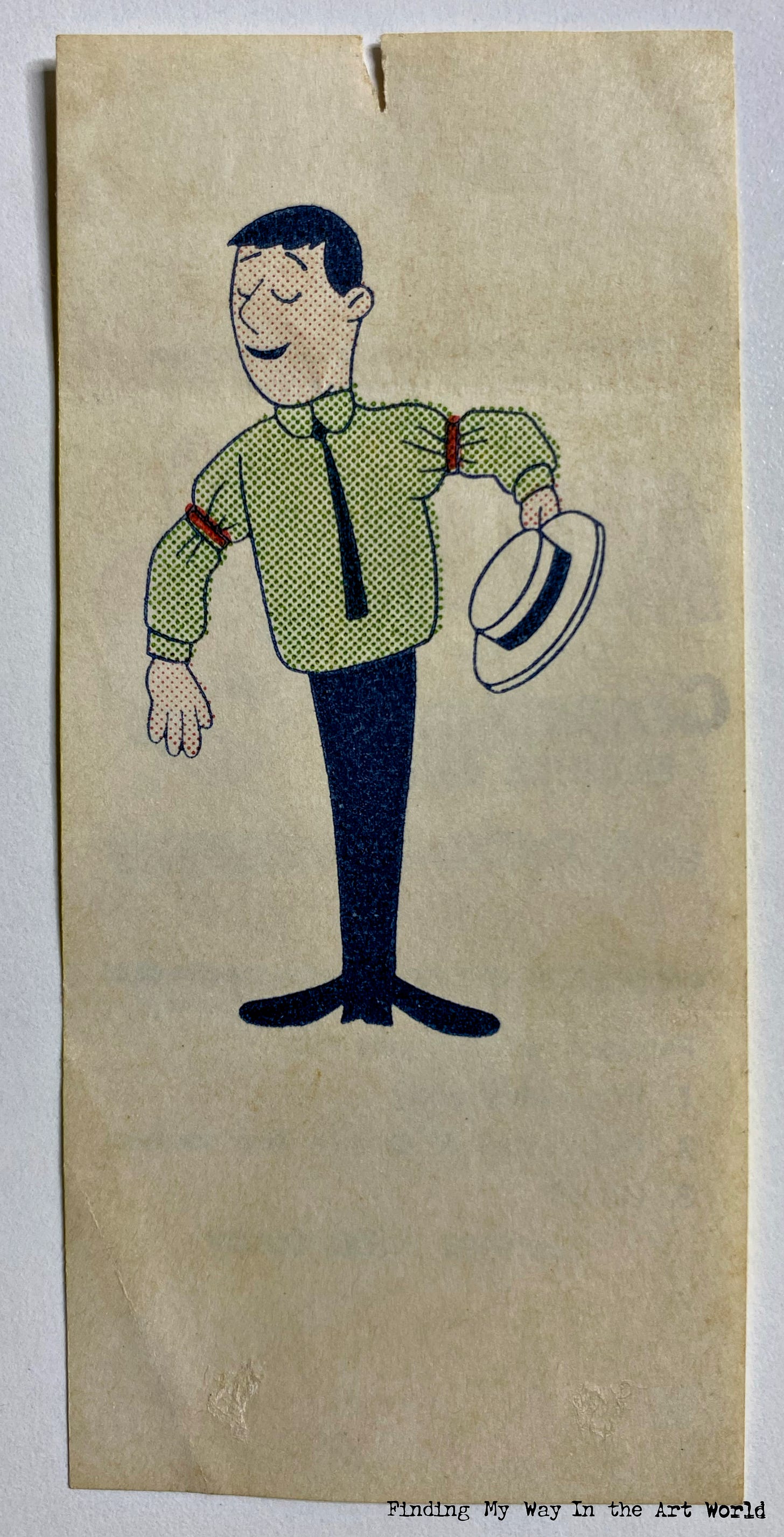
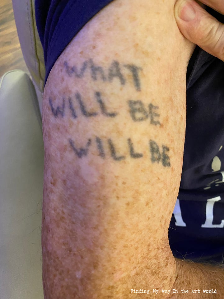
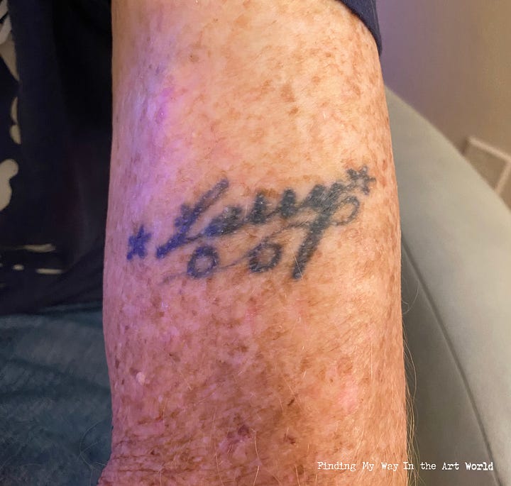
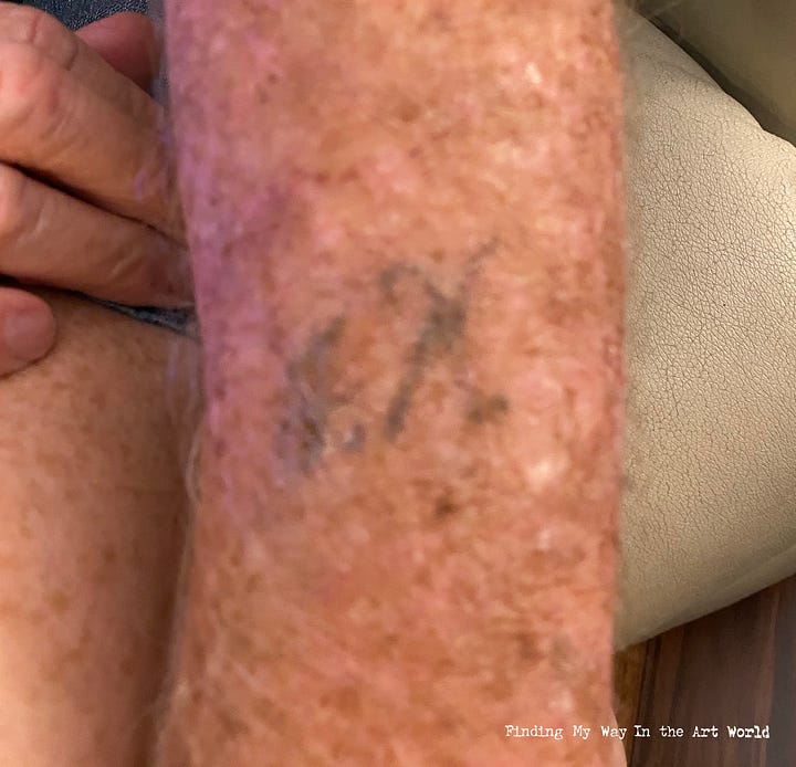
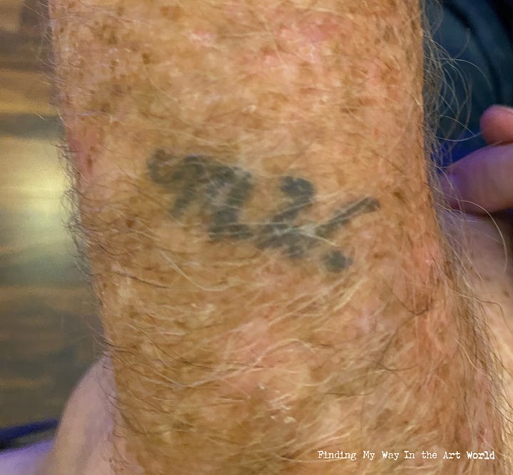
The men in my life—my dad, my uncle Rex, and my uncle Ed—all had tattoos on their arms. It was such a normal part of their appearance that nothing was ever said about it, and to me, it just seemed like a common thing. Tattoos were never promoted or discussed, but there was an unspoken understanding that getting one ourselves would probably be frowned upon. Their tattoos were simply there, quietly part of who they were, without any need for explanation.
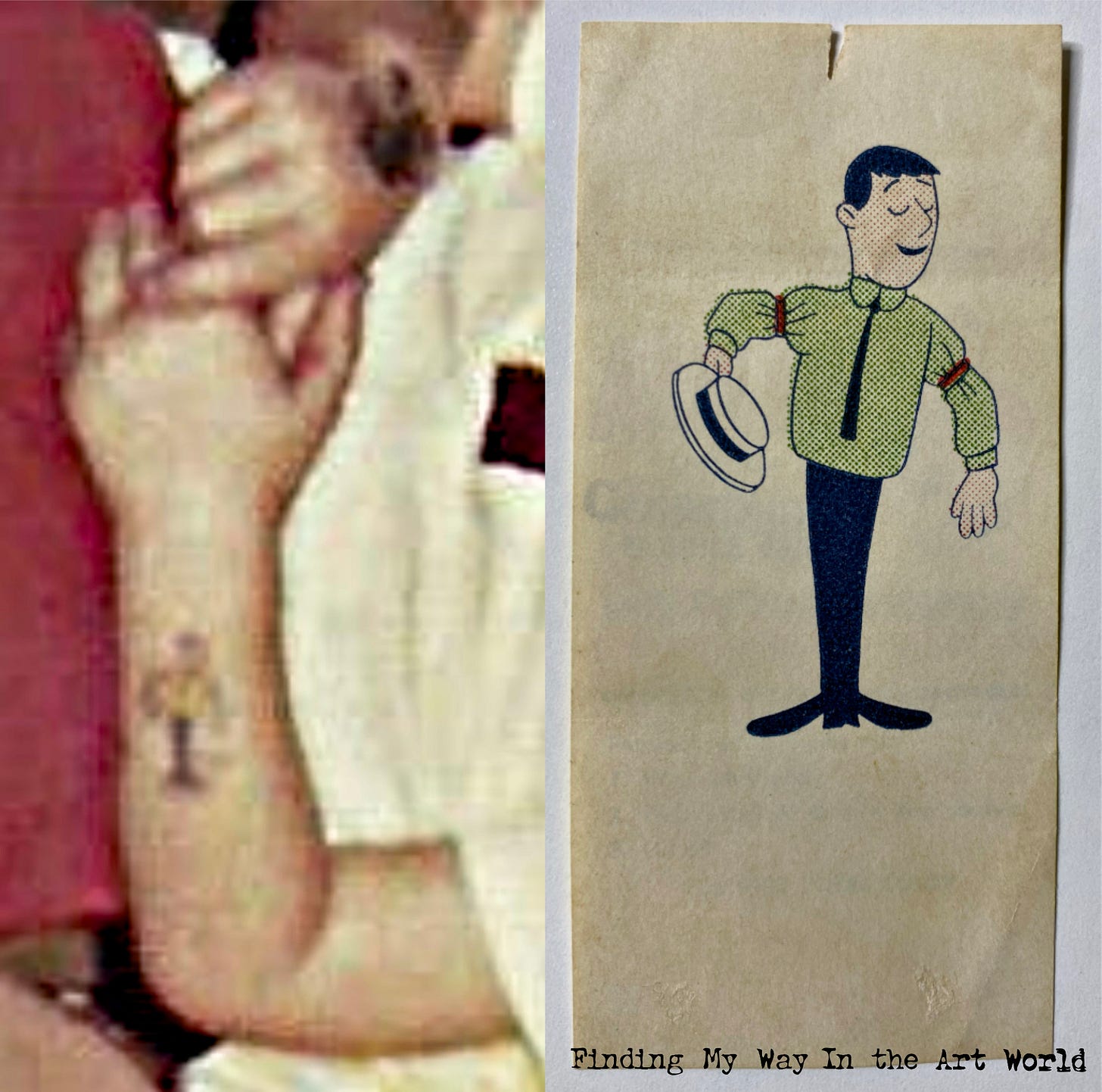
Architecture and Furnishings
House décor during this time reflected the era’s embrace of bold colors, natural materials, and eclectic styles, blending mid-century modern influences with a growing appreciation for earth tones and bohemian elements. Avocado green, harvest gold, and burnt orange dominated color palettes, appearing in everything from kitchen appliances to shag carpets. Wood paneling and macramé wall hangings were popular features, adding warmth and texture to living spaces. Open floor plans became more common, emphasizing communal living, while furniture leaned toward low, sleek profiles with clean lines. Patterned wallpaper in geometric or floral designs adorned walls, and houseplants like spider plants and philodendrons brought a natural, vibrant touch indoors. The overall aesthetic balanced practicality with a sense of individuality, making 1970s homes both cozy and stylish.
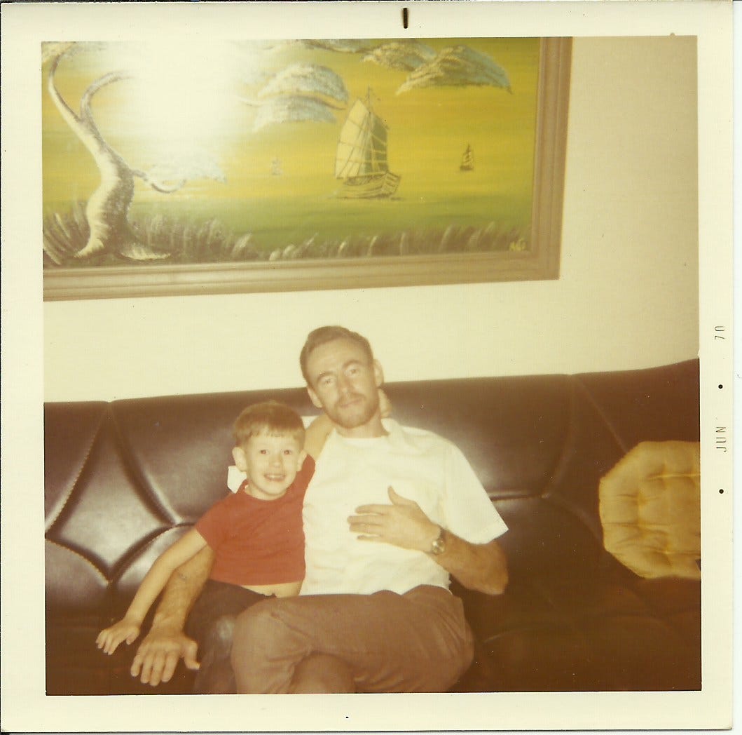
Our house was decorated in an inexpensive version of the latest popular styles: Black leather, wrought iron, shag rugs, and long curtains. Every day I saw the same thing in our living room: Above our couch was a green and yellow painting of a landscape of the water’s edge, with a luxurious tree and three sailboats floating on the water.
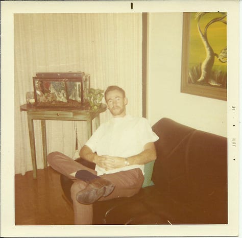
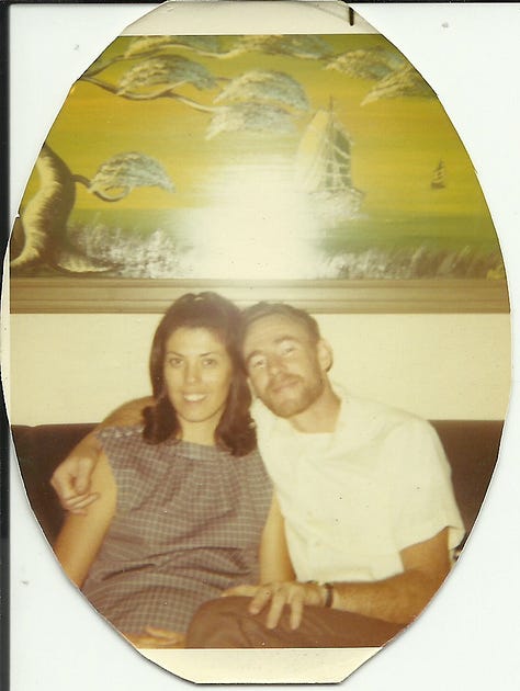
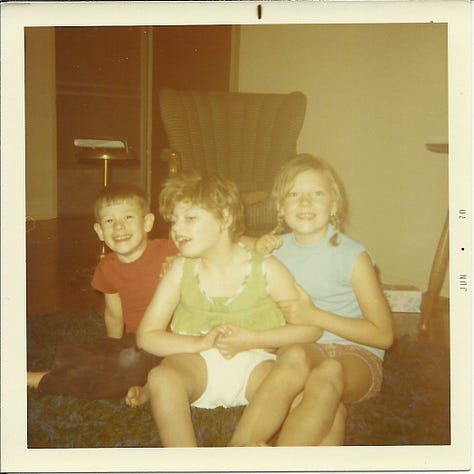
In 1971 we bought a patio table with chairs. Through all of the decades of my dad updating the seat cushions, it is still in our family, and is a silent reminder of the times I imagined it was a spaceship console flying through the universe.
Transportation and Technology
Technology and Entertainment:
8-Track Tapes - Portable music for cars and home use.
Transistor Radios - Small, portable radios that let teens listen to their favorite stations anywhere.
Color TV - Becoming more common in homes, enhancing entertainment.
Drive-In Theaters - A social hotspot for teens and families.
Between 1966 and 1971, vehicles played a pivotal role in American life, serving as both essential tools for travel and symbols of personal freedom and progress. Family road trips became a quintessential part of the era, with station wagons and sedans providing the space and comfort needed for long journeys across the country. Advances in automotive technology during this period brought significant improvements in safety, performance, and design. Innovations like seat belts becoming standard, radial tires offering better durability and handling, and the rise of more powerful V8 engines catered to both safety-conscious families and performance enthusiasts. The muscle car boom, led by iconic models like the Ford Mustang, Chevrolet Camaro, and Dodge Charger, reflected the growing demand for stylish, high-performance vehicles. Meanwhile, the emergence of compact cars like the Volkswagen Beetle and the rise of Japanese imports like the Toyota Corolla signaled a shift toward efficiency and practicality. These trends highlighted the evolving priorities of consumers and the importance of vehicles not just for transportation, but as expressions of identity and lifestyle during a transformative time in American culture.
Motorsports
Between 1966 and 1971, dragsters and car racing were at the height of their popularity, deeply embedded in the culture of the time. The Riverside International Raceway, located in Riverside, California, became a hub for motorsports enthusiasts, hosting major events like NASCAR races, Formula One trials, and endurance events such as the 24 Hours of Le Mans. Its challenging road course attracted top drivers and eager fans, bringing the thrill of racing closer to home for many Californians. Overhead, the iconic Goodyear Blimp often appeared at these events, adding to the spectacle and cementing its status as a symbol of big sporting occasions. This period celebrated speed, engineering, and the excitement of competition, with drag races, stock car events, and high-performance vehicles captivating audiences and shaping the era’s automotive legacy.
Motor Trend 500. PUSH PLAY > TO FIND YOUR WAY: Highlights of the parade in Riverside, California, 1966. (28 seconds)
Video content description: 31
Visual Influence of Music and Television
1969: Johnny Cash at San Quentin – Johnny Cash, popular photo of him using the middle finger.
Printed Matter
Desert Magazine
Desert Magazine was a monthly publication that celebrated the landscapes, culture, and history of the American Southwest and adjacent desert regions. From the late 1960s into the 1980s, its issues featured articles on outdoor recreation, geology, Native American heritage, and the unique flora and fauna of arid lands. It offered readers practical advice for camping, off-road adventures, and lesser-known travel destinations, often inspiring families to explore the deserts in their own backyards or venture into uncharted territory. My dad had a subscription, and its issues were a constant presence in our home—one could always be found in the bathroom, tucked into a basket near the toilet, serving as a popular reading choice before electronic devices dominated casual moments. With its vivid photography and informative articles, Desert Magazine influenced countless travel and camping decisions, making it a treasure trove of ideas for those seeking the serenity and adventure of the Southwest.
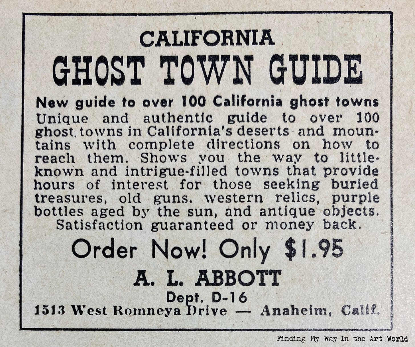
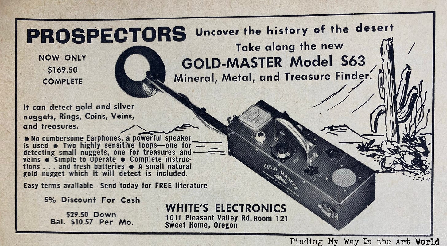
View Desert Magazines on Archive.org.
TV Guide Magazine
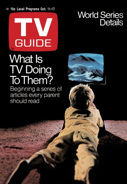
Each week, my mom picked up a copy of TV Guide magazine while checking out at the Alpha Beta grocery store. This small magazine became central to our family’s living room routine, helping us plan our weekly TV viewing. Its colorful covers and black-and-white advertisements served as snapshots of what was being promoted as the most popular shows on television, which, in turn, reflected broader trends in American culture during that time.
The TV Guide issues hold a special place in my memories because of the impact their artwork and ads had on me. These compact magazines offered a consistent and easily accessible source of artistic styles, right from the comfort of our couch or rocking chair. The covers, in particular, with their bold use of color and design, left lasting impressions and fed my developing visual curiosity.
By the time I was three years old, I was already flipping through the pages of TV Guide and marveling at its vibrant covers. For this reason, we’ll begin analyzing issues from 1969 onward, exploring how they influenced me. My interest in TV Guide waned during the late ‘80s and had virtually disappeared by the ‘90s, likely because I had moved out on my own and never bought it for myself. After that, it became something I only glimpsed occasionally when visiting my parents or others.
Cover photos source: TV Guide Magazine Archive.
Cover Artist: Gerald Scarfe
Comments on the artwork of Gerald Scarfe:
Although none of these covers of TV Guide are remembered by me, most of these artist’s work will play a greater role in my art interests later on in life. Gerald Scarfe is one of them. He would eventually illustrate the album graphics for Pink Floyd’s The Wall.
Cover Artist: Jack Davis
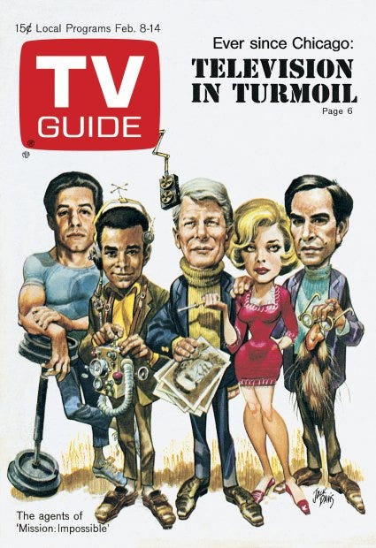
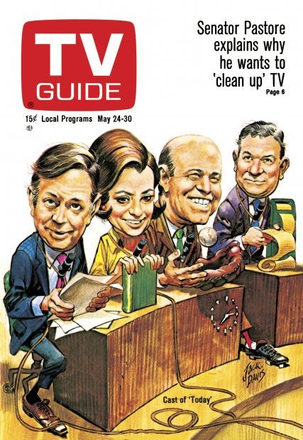
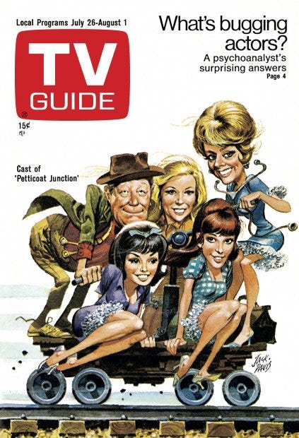
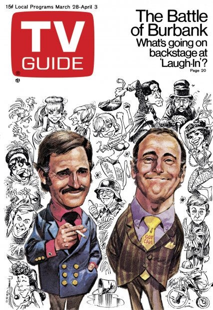
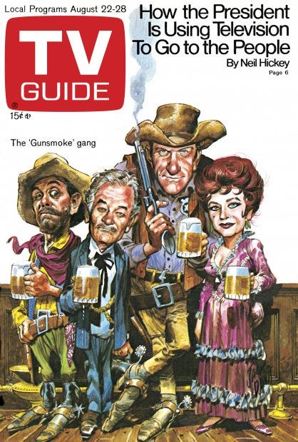
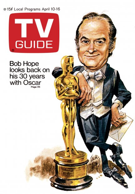
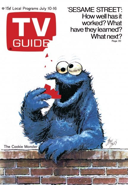
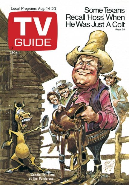
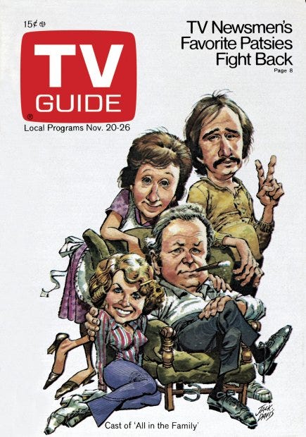
Comments on the artwork of Jack Davis:
One of the most notable features of these Jack Davis covers are that the heads of the characters are bigger than their bodies (except the Cookie Monster). Artist for Cracked magazine.
Cover Artist: Bob Peak
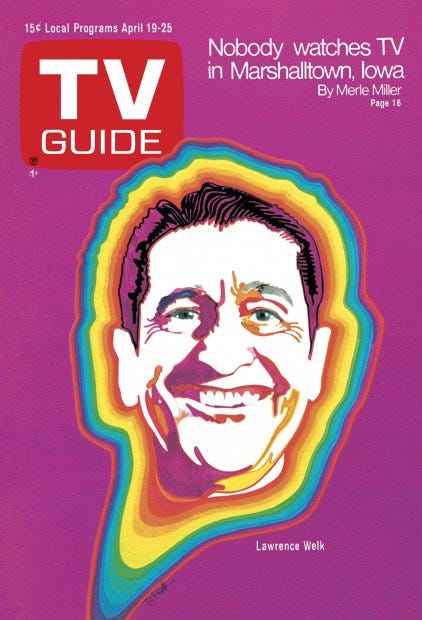
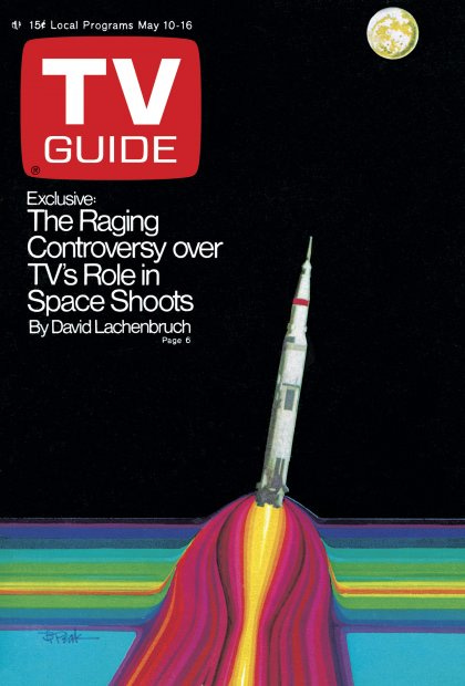
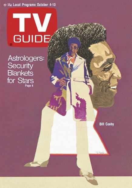
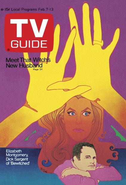
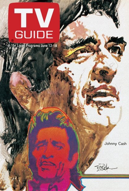
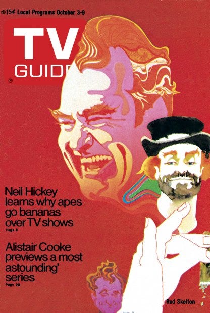
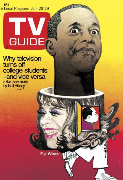
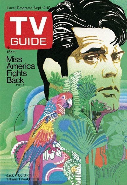
Comments on the artwork of Bob Peak:
A lot of color, is the first thought with Bob Peak’s work.
Cover Artist: Ronald Searle
Comments on the artwork of Ronald Searle:
I don’t know anything about this artist or know whether his work ever popped up elsewhere in my lifetime.
The Mongoose and Snake Coloring Book
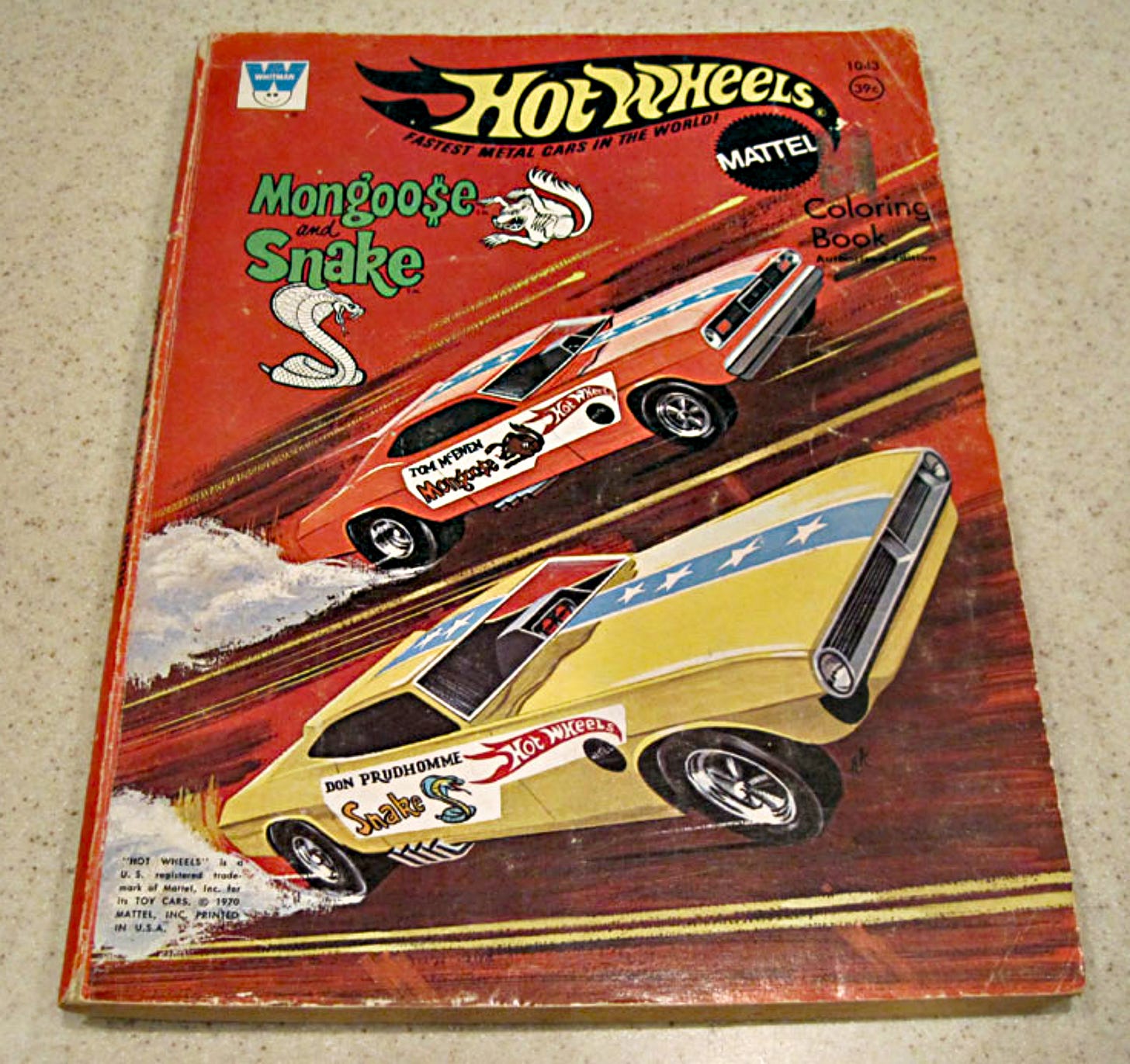
The 1970 "Mongoose and Snake" coloring book, inspired by the legendary Hot Wheels drag racing rivalry between Don "The Snake" Prudhomme and Tom "The Mongoose" McEwen, was a thrilling treasure for young racing enthusiasts. Its cover featured a bold, action-packed illustration of the iconic Funny Cars, the Snake and Mongoose, roaring down the track in a blaze of speed and competition. Inside, black-and-white pages depicted scenes of daring drag races, intricate Hot Wheels car designs, and dynamic depictions of the Mongoose and Snake cars in mid-race. For a 5-year-old boy, this coloring book was nothing short of magical—a chance to bring vibrant colors to the cars of his dreams and feel a part of the high-speed excitement. The thrill of carefully filling in the lines with crayons while imagining the roar of engines and the cheers of the crowd would have ignited a sense of adventure and creativity, making it a cherished pastime.
World Events
Between 1966 and 1971, the world experienced a series of transformative events that shaped history. In 1967, the Six-Day War dramatically altered the Middle East, with Israel seizing territories such as the West Bank and Gaza. Meanwhile, the Summer of Love in San Francisco symbolized the peak of the counterculture movement, celebrating peace, love, and resistance to the establishment.
The tumultuous year of 1968 was marked by profound tragedies, including the assassinations of Dr. Martin Luther King Jr. and Senator Robert F. Kennedy, which fueled civil unrest and anti-Vietnam War protests in the U.S. Globally, the Prague Spring in Czechoslovakia briefly heralded political liberalization before Soviet forces invaded to restore Communist control.
By 1971, rising geopolitical tensions were evident as the U.S. grappled with the Vietnam War, and President Richard Nixon’s administration announced plans to end the gold standard, signaling a major shift in global economic policy. Amid these challenges, cultural revolutions and milestones like the Apollo 11 moon landing in 1969 and the Woodstock Festival reflected a period of both innovation and upheaval.
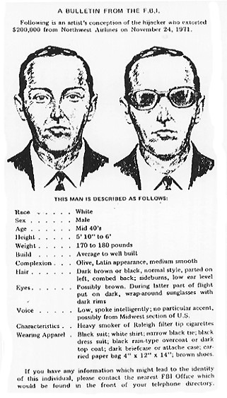
The Resulting Art
My mom saved a lot of my childhood art in a box.
When I decided to start work on this book project I visited my parents. With their permission, I started going through old boxes full of photo albums and memorabilia in their garage. I was delighted with what I found!
If it wasn’t for my mom saving all of these memories, the early parts of this story would be rather thin as far as my artwork goes. But here they are! Sculptures and paintings that I did at 5 years old.
And to top it off, my first dictated story was saved, hand written by either my teacher, Mrs. Weinberger, or her teacher’s aide.
Some of the titles for the art done during my youth have been created by me recently, as they had none written on them. This will allow them to be identified by a name, for future reference.
Dinosaur, 1971.
[No image available.]
Non-photographed work: Paper-mache’ and chicken wire dinosaur sculpture. Group work, 1971.
Presentation: A Brontosaurus dinosaur in the same pose as the Cabazon dinosaur, with an opening in the top of it’s back, and a seat inside of the body. It was constructed in a small storage room that was adjacent to the classroom.
Medium: Paper Mâché and chicken wire.
Notable art techniques:
Comments:
This was a group effort by Mrs. Weinberger’s kindergarten class of 1971.
I remember once asking her if I could work on the project while everyone was working on other things. She allowed me to, and I sat in the opening at the top and added paper mâché to the chicken wire.
With the large Cabazon dinosaur being constructed during the beginning of 1971, and my kindergarten class starting early in September of 1971, it seems very likely that Dinosaur was created during this same year.
Worked on free-hand.
1971-72 Art Book, 1971.
Kindergarten Wonders. PUSH PLAY > TO FIND YOUR WAY: Turning the pages of my kindergarten art collection, 1971. (2 minutes, 10 seconds)
Watch the 1971-72 Art Book, showcasing the compilation, page-by-page, in the order that it was presented. I have since removed the staples, photographed each piece, and am protecting them in an acid-free portfolio.
Rainbow Rain 1, October 6, 1971.
Presentation: Rainbow Rain 1 appears to be the first known artwork that I ever did. Nothing else artistically exists with a date prior to this. As simple as it is, it is a great beginning to start analyzing my artwork. So, what do we have here?
Medium: Paint on paper.
Notable art techniques:
Comments:
Rain falling down in multi-colored drops. Each one has a tree and house in them. Rainbow Rain 1, however, includes a yellow sun that has a green mouth, nose, and eyes. We also see in this painting a yellow chimney at the top of the blue house. There is green smoke coming out of it. The blue house looks like it may have a red door and green window.
Drawn free-hand.
Rainbow Rain 2, October 13, 1971.
Presentation: I have titled these as Rainbow Rain 1 and Rainbow Rain 2 because they were painted a week apart, and because they have similar imagery in them.
The tree in Rainbow Rain 1 was a single green trunk with a large green bulb at its top. Rainbow Rain 2 shows that I had more than one way to paint a tree. Here we see a tree with a blue trunk that branches out in brown with offshoots of green leaves on each end.
Medium: Paint on paper. The house is in two colors of green with a green door. Is that a white tree with oranges on the left, or something else?
A rainbow of black and of two shades of green, arches over the main events in this painting.
Notable art techniques:
Comments:
Drawn free-hand.
Fire Truck, October 21, 1971.
Presentation:
Medium: Paint on paper.
Notable art techniques:
Comments:
More on this painting soon. Was it inspired by the Snake and Mongoose coloring book?
Drawn free-hand.
Pilgrim Family, October 29, 1971.
Presentation:
Medium: Paint on paper.
Notable art techniques:
Comments:
More on this painting coming soon. Thanksgiving and the pilgrim story takes place in November in the United States. So, is this a pilgrim hat that the man wears, or is it the hat of Billy Jack?
Drawn free-hand.
Squash Head, October, 1971.
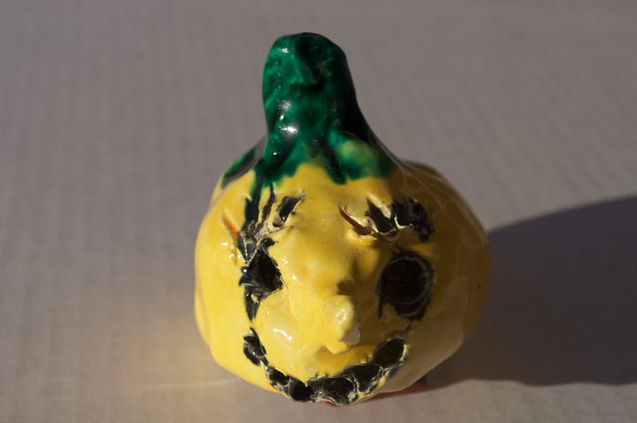
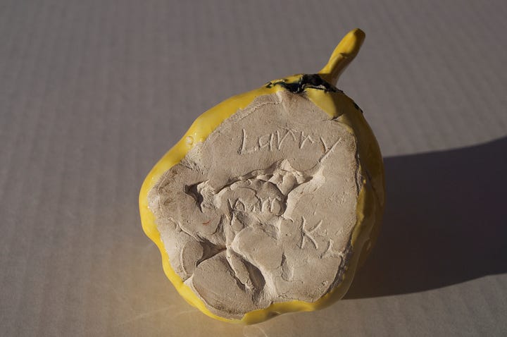
Presentation: A squash with a smiling face. He has a green stem on the top of his head.
Medium: Clay and colored glaze.
Notable art techniques:
Comments:
This could very well have been sculpted during October because it seems to be a variation of a jack-o’-lantern. Jack-o’-lantern’s are a common art subject during October in American schools, and they relate to the holiday Halloween. It’s notable that this isn’t a pumpkin. My mom was raising my sister and I as Jehovah’s Witnesses, and we didn’t celebrate Halloween.
Squash Head has an exceptionally long nose. The face is yellow. The holes are all painted black. He has a green stem sticking out of the top of his head.
On its underside has been written Larry pm K2. Three colors were chosen for this sculpture: Yellow, green, and black.
Squash Head looks as though a pencil was used to poke the holes for the eyes and mouth, and also for the lines of the eyelashes. (Or are these eyebrows?) The eyes are larger holes, as the pencil was pushed further into the clay.
Designed free-hand.
Pilgrim Boy, November 18, 1971.
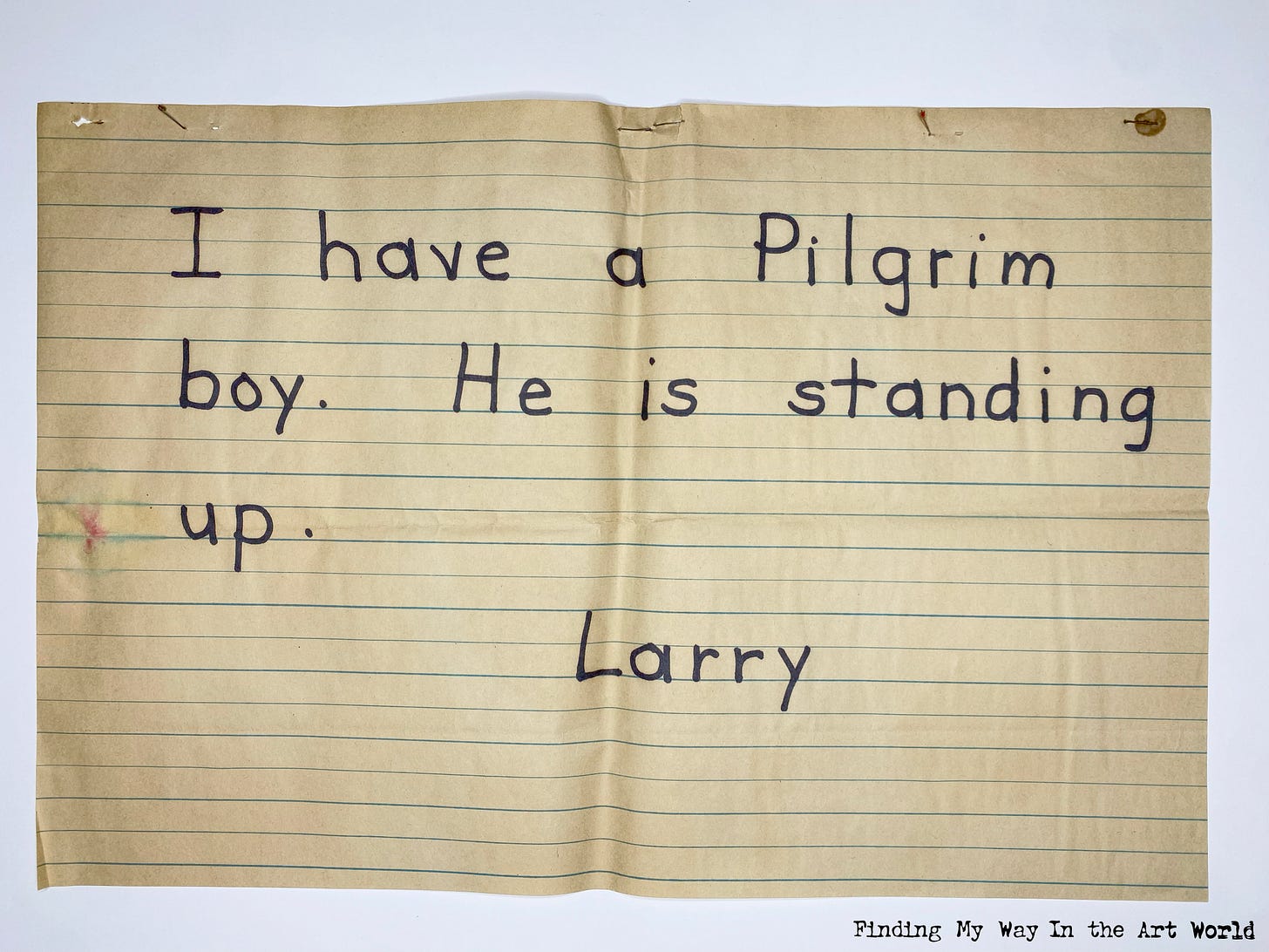
Presentation:
Medium: Dictated story, marker on lined paper.
Notable art techniques: —.
Comments:
Pilgrim Boy Standing Up, November 18, 1971.
Presentation: This is the same pilgrim boy from the written story above. The placement of the story, along with this artwork, in the 1971-72 Art Book, shows that the two go together (See video above).
Medium: Paint on paper.
Notable art techniques: Details of fingers and buttons.
Comments:
Are yellow faces significant? Is this just childish randomness? Was pink not available? Were there outside influences that made me choose yellow over pink or white? Maybe these analytics are too deep for artwork done at such a young age. Let’s keep processing all of the facts and see what we come up with.
The face is yellow. Hands and fingers are green. The shirt is purple, and the pants are blue. The shoes and arms are white. The ground he stands on is brown.
Drawn free-hand.
My Color Book, 1971.
My Color Book is undated. But, kindergarten would have been the appropriate time for children to learn their colors. For this reason I have catalogued it as 1971. Below is a video showing the book page-by-page in the order that it was presented. I have since removed the staples, photographed each piece, and am protecting them in an acid-free portfolio.
My Color Book (Paper Stories). PUSH PLAY > TO FIND YOUR WAY: Turning the pages of my kindergarten art collection, 1971. (1 minute, 6 seconds)
Clown, 1971.
Presentation:
Medium: Paper cut out on paper.
Notable art techniques:
Comments:
Traced and drawn free-hand.
Red Apple, 1971.
Presentation:
Medium: Paper cut out on paper.
Notable art techniques:
Comments:
Traced and drawn free-hand.
Angry Orange, 1971.
Presentation:
Medium: Paper cut out on paper.
Notable art techniques:
Comments:
Traced and drawn free-hand.
Brown Acorn, 1971.
Presentation:
Medium: Paper cut out on paper.
Notable art techniques:
Comments:
Traced and drawn free-hand.
Purple Grape Face, 1971.
Presentation:
Medium: Paper cut out on paper.
Notable art techniques:
Comments:
Traced and drawn free-hand.
Red Watermelon Slice, 1971.
Presentation:
Medium: Paper cut out on paper.
Notable art techniques:
Comments:
Traced and drawn free-hand.
Pine Tree, December, 1971.
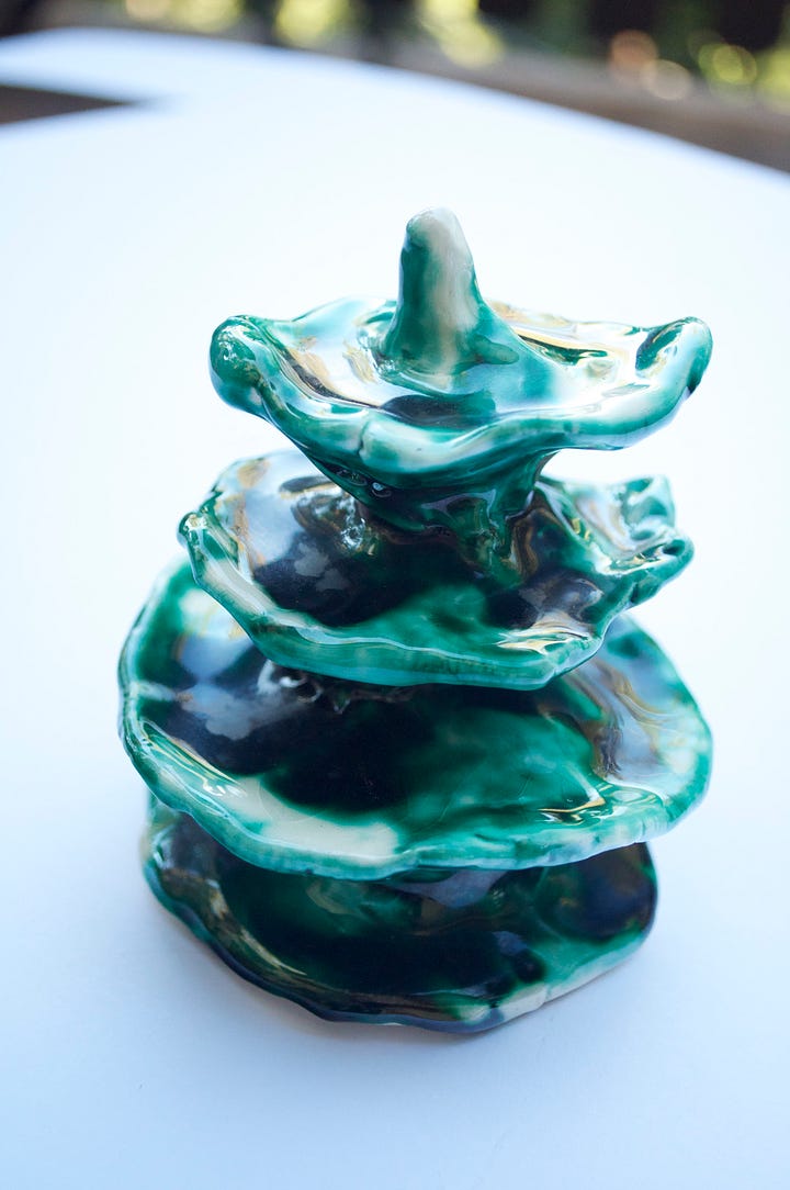
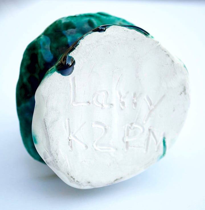
Presentation: Pine Tree does not have a date on it. But it is identified as K2 PM on the bottom: kindergarten 2, which met in the afternoon. Pine Tree could have been sculpted during December, as Christmas pine trees would have been a popular subject for artwork in a kindergarten class.
Medium: Clay and colored glaze. Pine Tree was painted a solid green.
Notable art techniques:
Comments:
As Jehovah’s Witnesses we did not celebrate Christmas, and so it is notable that the tree does not have any ornaments on it.
Designed free-hand.
© L.HUNT
THERE’S MORE TO THIS STORY!
The fully illustrated, printed book Finding My Way In the Art World: Book 1, 1966-1971 is available HERE.
Finding My Way In the Art World Soundtrack: Book 1, 1966-1971 is available HERE.
The Songs:
1966 Through 1971 Overture (Sa Cha Da Da La La)
California Dreams
Prospecting From a Mining Town
California Amusements (Dreams Unfold)
Floral Anaheim
Bring Back Those Days
Salton Sea Dreams
A Dinosaur In the Desert
Cigarettes, Beer, and Tattoos
Kindergarten Wonders
My Color Book (Paper Stories)
1966 Through 1971 Remembered
FIGURES CROSS-REFERENCED WITH ARCHIVAL NOTES
This section lists every figure published in this book alongside its corresponding archival note number for research and catalog reference. Archival Note numbers refer to the permanent catalog maintained by L.HUNT.
(SAMPLE PLACEHOLDER)
Book 01: Finding My Way In the Art World, 1966-1971
Figure 01.001 – AN-21.004
Early sketch of abstract form, 2003
ARCHIVAL NOTES (AN) FOR BOOK 1
This section contains cataloged references to all figures, uncut home movie QR codes, and supporting materials for the first book of this series. Each entry is labeled with a unique archival number for cross-reference in the index.
AN 1.001 - Uncle Ed's Super 8 Film Reel - Marion, Indiana, 1957
Location(s): Marion, Indiana. Whinery’s Tavern, a rodeo, and playful gatherings. Related edited video: Fig. —.
This folder contains the uncut Super 8 footage, film reel photos, and screenshots of frames from the film.
AN 1.002 - Uncle Ed's Super 8 Film Reel, Anaheim, California, June 1967
Location(s): Anaheim, California. Neighbors, the Anaheim Stadium, southern California scenes, and hotel management. Related edited video: Fig. —.
This folder contains the uncut Super 8 footage, film reel photos, and screenshots of frames from the film.
AN 1.003 - Uncle Ed's Super 8 Film Reel - Hunt Family Visit With Ed and Thelm, 1967
Location(s): Anaheim, Riverside, and Fullerton, California. Featuring: Hunt Family, Othella Tucker, Debbie Tucker, Ed and Thelm Whinery, Hollywood Walk of Fame, Titan Theatre, California State College. Related edited video: Fig. —.
This folder contains the uncut Super 8 footage, film reel photos, and screenshots of frames from the film.
CONTINUE READING 1972:
Chapter 2: 1972
Life Events Music Television Movies Printed Matter World Events Resulting Art “Thanks For the Gumball!” Mickey mouse gumball machine:
Video content description of Our Desert Past: History of Eagle Mountain.
0:00 - A
Go to video.
Video content description of Floral Anaheim.
0:00 - A
Go to video.
Video content description of Bring Back Those Days.
0:00 - A
Go to video.
Video content description of
0:00 - A
Go to video.
The "Keep on Truckin’" illustration, created by underground cartoonist Robert Crumb in 1967, quickly became an iconic symbol of counterculture and individuality in the 1970s. Featuring a character confidently striding forward with exaggerated, outstretched legs, the image originally appeared in Crumb’s comic strip "Mr. Natural" in the debut issue of Zap Comix. Inspired by blues lyrics and infused with Crumb’s signature surrealism, the phrase and imagery captured the free-spirited ethos of the era. During the 1970s, "Keep on Truckin’" transcended its comic roots, appearing on posters, T-shirts, bumper stickers, and even mud flaps for big rigs and vans, cementing its place in both popular culture and automotive decor.
Additional album photos forthcoming.
Additional album photos forthcoming.
Additional album photos forthcoming.
Additional album photos forthcoming.
Additional album photos forthcoming.
Additional album photos forthcoming.
Additional album photos forthcoming.
Additional album photos forthcoming.
Additional album photos forthcoming.
Additional album photos forthcoming.
Additional album photos forthcoming.
Additional album photos forthcoming.
Additional album photos forthcoming.
Additional album photos forthcoming.
Additional album photos forthcoming.
Additional album photos forthcoming.
Additional album photos forthcoming.
Additional album photos forthcoming.
Video content description of Motor Trend 500 parade in Riverside, California, 1966.
0:00 - A parade float with two women reclining on it, one in a black outfit and one in a red outfit. Both are waving checkered flags. On the front of the float is the text 500, with a large gold cup trophy displayed. There is a marching band following it on the street behind the float.
0:04 - The DRAG-U-LA dragster from The Munsters television show cruises down the parade route. The custom-built car body was designed around a real coffin, with antique lamps on the front and rear, along with organ pipes on each side of the car in place of exhaust pipes.
0:07 - Miss Riverside rides the front of a float along with a couple of other women. A large Mission Hamburgers sign is seen in the background.
0:10 - Another float has a Riverside Raceway flag and the text 500 on its front. Three women ride the float, two waving checkered flags, and one on a throne sitting beneath the Raincross symbol.
0:16 - The Goodyear blimp floats over the raceway.
0:20 - The line of race cars drive the track with the crowds looking on.


